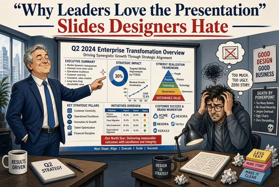
There is a particular kind of presentation slide that can make a designer quietly reach for the delete key.
It has a blunt headline. A table. A few numbers. Maybe three columns, a short recommendation, and almost no visual drama.
And then the CEO says: “This is exactly what I needed.”
That reaction can be frustrating if you think good presentation design is primarily about making slides look impressive. But after working on enough business decks, I have learned that executives and designers are often optimizing for completely different things.
The designer asks, “Does this slide look good?”
The executive is usually asking, “Can I understand this in ten seconds, and does it help me decide what to do?”
The “ugly” slide usually has one job
Designers tend to notice composition first. Executives tend to notice usefulness.
A slide that contains a dense comparison table may look ordinary in a design review. But if the table lets a manager compare three suppliers, see the price difference, identify the risk, and choose an option without asking five follow-up questions, the slide has done its job exceptionally well.
This is why some of the most valuable business slides are visually unremarkable.
They are not trying to win a design competition. They are trying to remove a decision from someone's mental workload.
One thing people overlook is that executive presentations are often working documents as much as they are presentation materials. The audience may need to refer back to a number, compare alternatives, or forward a slide to someone who was not in the meeting.
In that situation, decoration can become secondary to information architecture.
Executives don't need the slide to be beautiful. They need it to be obvious.
Imagine a quarterly business review.
On one slide, there is a large photograph, a stylish headline, three oversized numbers, and a beautifully designed chart. It looks excellent on a screen.
On another slide, there is a simple heading: “Revenue grew 8%, but margin fell 3 points because of increased acquisition costs.” Under it is a compact chart and a short breakdown of the drivers.
The second slide is unlikely to win a Behance competition.
But it tells the executive what happened, why it happened, and where the problem sits.
That difference matters.
Good executive slides often make the interpretation visible instead of forcing the audience to perform it themselves. The headline does not merely name the topic. It tells the audience what the data means.
That is also why a well-built financial data visualization slide can be more useful than a highly stylized infographic. When someone needs to understand financial performance quickly, the visual hierarchy has to serve the decision rather than compete with it.
Why designers sometimes dislike the slides executives actually use
There is a genuine conflict here, and pretending otherwise makes presentation advice less useful.
Designers are trained to notice alignment, typography, spacing, proportion, visual rhythm, repetition, and consistency. Those things matter.
But executives are usually evaluating the slide against a different set of criteria:
- Can I understand the main point immediately?
- Can I compare the important options?
- Can I see what changed?
- Can I challenge the assumption behind the recommendation?
- Can I use this slide after the meeting?
A slide can score highly on the first list and poorly on the second.
That is where designers get annoyed.
For example, a designer may want to replace a six-row table with a cleaner visual summary. That can improve the presentation considerably. But if the executive needs to inspect all six rows because each represents a different business unit, the “cleaner” version may actually remove useful information.
Good design is not always about reducing information. Sometimes it is about making necessary information easier to interrogate.
The boardroom changes what “good design” means
A presentation shown in a boardroom has a different job from a presentation created for a conference stage.
Conference slides can be atmospheric. They can create emotion, establish a brand, or support a speaker who controls the narrative.
Boardroom slides are often closer to evidence.
People interrupt. They ask for the number behind the number. They compare this quarter with the previous one. Someone asks, “What happens if we remove that assumption?” Another person wants to know which region caused the decline.
Suddenly, the beautiful minimalist slide with one giant number becomes less useful.
The boring slide with the underlying breakdown becomes the important one.
This is why I would not recommend applying a “less information is always better” rule to executive presentations. It works until the audience needs to investigate something.
The better rule is more specific: put the information people need at the level at which they are likely to question it.
The slide designers hate is often the slide people reopen
There is another reason executives can prefer practical slides: presentations do not necessarily end when the meeting ends.
A decision-maker may later forward one slide to a colleague. A finance manager may copy a number into a forecast. A department head may return to the deck before the next meeting.
In those situations, the slide is no longer being consumed with a presenter explaining every detail.
It has to stand on its own.
A visually spectacular slide can become surprisingly weak when removed from the context of the presentation. A straightforward slide with a descriptive headline, clear numbers, and enough context can become much more useful outside the room.
That is one reason reusable PowerPoint presentation layouts often favor structured business formats: the structure gives the audience somewhere to look when the presenter is no longer there to explain the story.
But executives don't actually hate good design
This is where the designer-versus-executive argument becomes too simplistic.
Executives do care about design. They simply tend to notice bad design differently.
They may not complain that the baseline grid is inconsistent. They may never mention that two icons are misaligned.
Instead, they experience the consequences.
A chart takes too long to understand. A recommendation is buried in a paragraph. Two numbers that should be compared are separated across the slide. A color makes one category look more important than it actually is. A title tells you the subject but not the conclusion.
These are design problems, even if nobody in the meeting calls them design problems.
The strongest executive slide therefore combines the two perspectives. It has enough structure to survive scrutiny and enough visual discipline to make that scrutiny fast.
That is very different from making every slide visually spectacular.
The best compromise: design for the decision, not the designer
If a slide looks boring but makes the decision obvious, I would keep the boring slide.
If a slide looks beautiful but makes the audience work to understand what matters, I would redesign it.
The interesting part is that this approach does not lead to ugly presentations. Quite the opposite. Once the hierarchy is correct, typography, spacing, charts, and visual elements become much easier to control.
The design starts serving the argument instead of decorating it.
For teams that repeatedly build this type of material, a structured template system can also remove unnecessary design decisions. ImagineLayout, for example, offers editable PowerPoint and Keynote templates designed around business use cases, while its custom presentation design service is aimed at teams that need a presentation system built around their own brand and workflow.
The goal is not to make every executive slide exciting.
The goal is to make the important thing impossible to miss.
And perhaps that is the real reason leaders love the slides designers sometimes hate: the slide stops asking to be admired and starts doing its job.
Comments (0)