Gradients in Presentations: When They Work and When They Don't
A gradient can make a slide look expensive or make it unreadable in a conference room — here's how to tell which one you're building.
Design tips, tutorials, product updates, and industry insights.
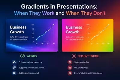
A gradient can make a slide look expensive or make it unreadable in a conference room — here's how to tell which one you're building.

A practical guide to consistent presentation design — where consistency actually breaks in real projects, and how to audit a deck before you send it.

A practical guide to picking presentation photos that support your message instead of decorating it — with real selection criteria, not just stock site links.

A practical guide to building presentation templates that stay on-brand past the first use — covering ownership, exceptions, and what brand books leave out.

How to use negative space in slide design to guide attention, not just look clean — with real trade-offs for data-heavy decks and stakeholder reviews.

Practical alignment rules for slide design—grids, spacing, optical balance, and the small fixes that make presentations look professionally built.

A practical guide to pairing fonts in slide decks — pairing logic, sizing hierarchy, common mistakes, and how many typefaces you actually need.

Practical rules for using icons in slides — sizing, pairing, colour, and the mistakes that make a deck look amateur instead of polished.
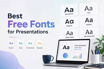
A practical, no-fluff guide to the free fonts that actually hold up on slides — readable at a distance, licensed for commercial use, and easy to pair.