Open ten random client decks and nine of them will use the same font. Not because anyone chose it — because nobody did. Calibri ships as the default, nobody swaps it out, and the presentation ends up looking exactly like every other presentation built on a laptop with factory settings. The strange part is how little it takes to break that pattern. One font change, done right, does more for how "current" a deck feels than a new color palette, a new layout, or another hour in the slide master.
That's not a design opinion so much as a measurable one. When The New York Times let Errol Morris run a public experiment on typeface and trust, the roughly 45,000 readers who took part rated the same quote as more believable in one typeface than in five others — a difference researchers found statistically significant, not just a hunch. Fonts carry judgment before anyone reads a word. In a pitch deck, that judgment lands in the first four seconds, well before your first bullet point does any work.
What "modern" actually means in a typeface
People usually reach for "clean" or "minimal" when they try to describe a modern font, and both words are doing more hiding than explaining. What actually reads as modern is a narrow set of structural traits: low contrast between thick and thin strokes, open counters (the enclosed space inside letters like "a" and "e"), and a slightly taller x-height that holds up at a distance. Fonts built in the last decade for screens — rather than adapted from print typefaces — tend to have all three by default. That's the real reason a 2010s deck feels dated even when the layout is fine: the font was designed to be read on paper, and it shows the moment it's projected on a wall.
The seven fonts
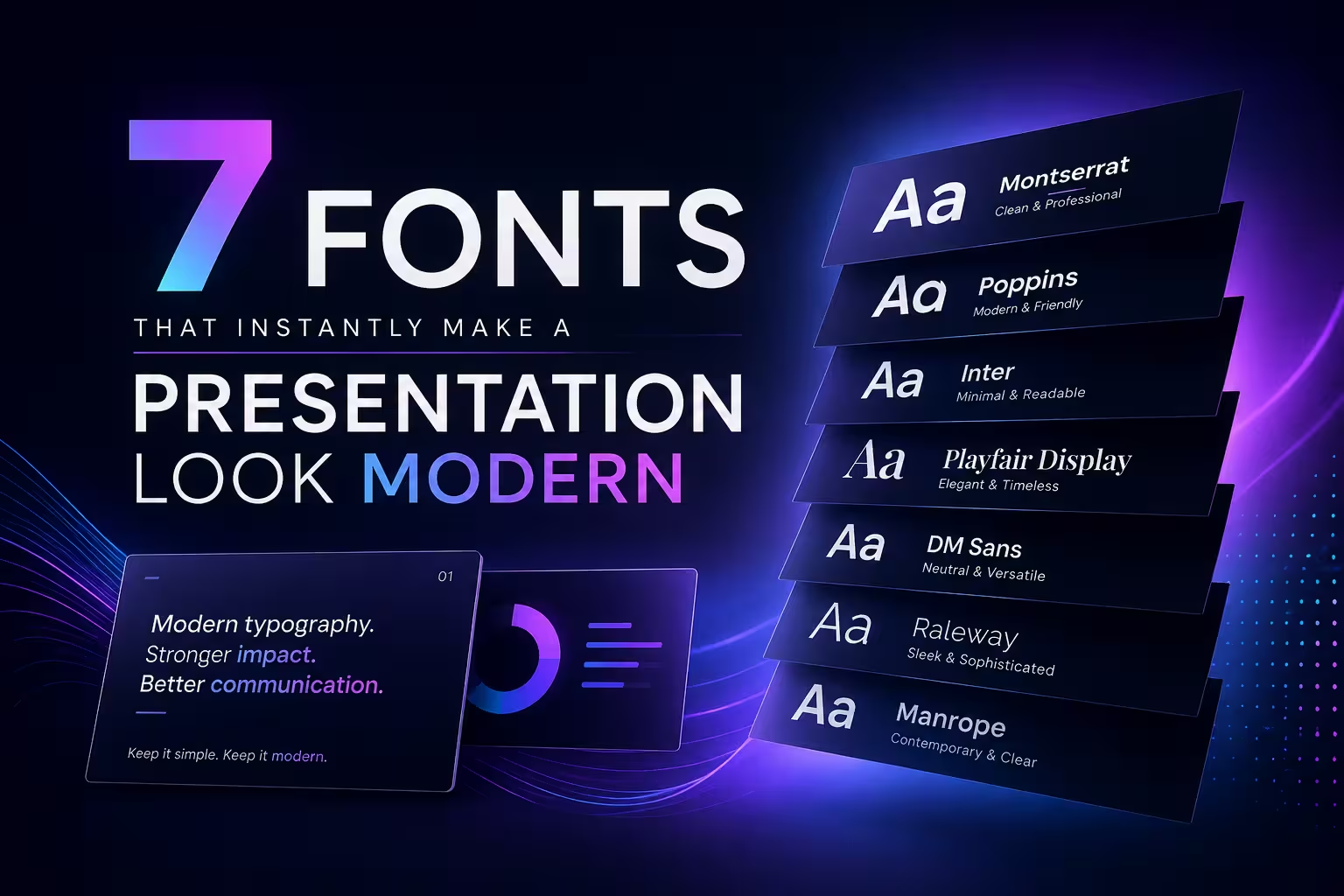
All seven below are free, install cleanly on both Mac and Windows, and are common enough that a file won't break when it opens on someone else's machine — which matters more than it should, since a beautiful font that silently falls back to Arial on a client's laptop has cost you nothing but embarrassment.
- Inter — built specifically for UI and screens, which is exactly why it reads as native to 2026 rather than borrowed from a magazine. Strong workhorse for body text.
- Space Grotesk — a geometric sans with just enough personality in the letterforms to work as a title font without tipping into "trying too hard."
- Manrope — rounder and friendlier than Inter, a good fit for internal decks or anything that shouldn't feel corporate-stiff.
- General Sans — has real weight variation from thin to extrabold, which makes it flexible for building hierarchy inside a single font family instead of mixing two.
- Archivo — slightly condensed, holds up well in dense data slides where space is tight and Helvetica starts to feel cramped.
- Poppins — geometric and rounded; the most overused font on this list at this point, which is worth knowing before you pick it — see below.
- Montserrat — same caveat as Poppins. Excellent font, badly overexposed in the template market specifically.
Here's where the list stops being simple. Poppins and Montserrat are genuinely well-designed, and they'll still get recommended in every "best fonts for presentations" roundup published this year — but that ubiquity is starting to work against them. When a font shows up on the cover of half the pitch decks a VC sees in a week, it stops signaling "modern" and starts signaling "template." I still use both, but rarely as the title font anymore; they do better work now as the quiet body-text choice under something less common up top.
The pairing mistake that undoes all of it
Picking a good font and then leaving PowerPoint's default line spacing untouched is the single most common way people waste a good typeface. Most of these newer fonts were drawn with tighter default leading than older system fonts, which means the "1.0" line spacing that looked fine in Calibri often reads as cramped in Inter or Space Grotesk. Nudge it up to 1.1–1.15 and the same font suddenly looks intentional instead of squeezed. It's a thirty-second fix that almost nobody makes, because nothing in the software tells you it's needed — you only notice once you compare two versions side by side. For a deeper breakdown of hierarchy and weight rules that hold up outside the software's defaults, our guide to presentation typography goes further into where those rules actually apply.
Where a "modern" font quietly fails you
There's a trade-off nobody mentions in the standard font roundups: several of these typefaces ship with a beautiful thin or light weight that looks gorgeous on your retina display and turns nearly illegible the moment it's projected through a cheap conference-room bulb onto a screen forty feet from the back row. I've watched this happen in real rooms — a title slide that looked sharp on the laptop preview went soft and gray on the projector, and the presenter had no idea until someone in the back asked them to read it out loud. The fix isn't avoiding thin weights; it's never using anything below "regular" weight for text that has to survive bad lighting, and saving the delicate thin cuts for on-screen use only, where you control the display.
One more thing worth knowing before you commit
None of these seven fonts will matter much if the rest of the deck is still fighting them — dense paragraphs, six colors, boxes drawn around everything. A font swap reads as modern fastest when it's paired with the kind of restraint covered in our slide design rules, and if you're rebuilding a deck from the ground up rather than patching one, it's worth reading through what actually changed in how modern PowerPoint decks are built in 2026 before you pick a template to build on.
If you only change one thing this week, don't reach for Poppins because it's on every list — open your last deck, check what the body text actually looks like at arm's length, and ask whether it looks like it was chosen or just left alone.
Comments (0)