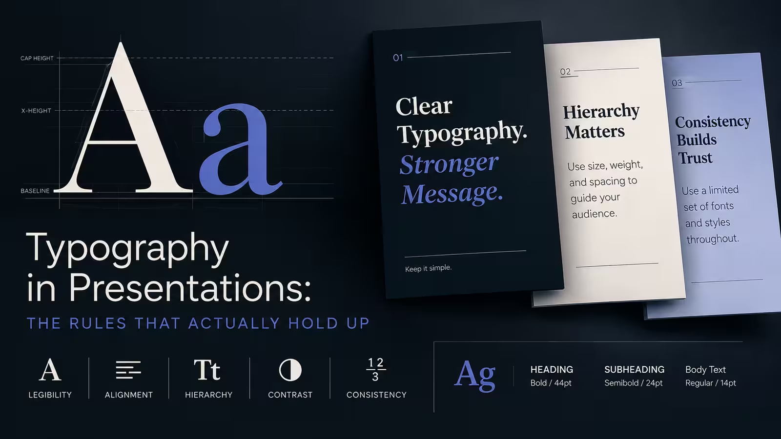
Ask ten designers how many fonts you should use on a slide and nine of them will say two. Ask them why, and most will struggle to get past "it looks cleaner." That's not wrong, exactly — it's just not the reason that matters most. The real reason has less to do with taste and more to do with what happens to your carefully chosen typeface the moment it hits a ten-year-old conference room projector under fluorescent lighting.
I've sat through enough client reviews to notice a pattern: the slides that get compliments in the design software rarely match the slides that get compliments in the room. Typography is one of the few areas where the gap between "looks right on my monitor" and "reads right from row twelve" is enormous — and most advice about presentation typography completely ignores that gap.
The Two-Font Rule Isn't About Aesthetics — It's About Failure Points
Every font you introduce into a deck is a new thing that can break: a missing license on someone else's machine, a substitution that silently reflows your carefully sized text boxes, a rendering quirk when the file opens in Google Slides instead of PowerPoint. Two fonts isn't a stylistic ceiling. It's a risk ceiling.
Here's where it gets more specific than the standard advice: the risk isn't evenly distributed across your fonts. A heading font that only appears in five words per slide can afford to be a little unusual — if it fails to load, the fallback is barely noticeable. A body-text font carrying three lines per slide across forty slides is a different story; any substitution there reflows layouts you spent hours fine-tuning. Treat your body font as the one you can least afford to be adventurous with, not the heading.
Hierarchy Isn't Just Size — Except When Size Is All You've Got
The standard line is that hierarchy comes from combining size, weight, and color, not just cranking up the point size on your title. That's true in a vacuum. In a dim conference room with a washed-out projector, though, color contrast is often the first thing to degrade — blues and dark grays flatten into a similar gray under bad lighting, and suddenly your carefully designed color-coded hierarchy reads as one undifferentiated block of text.
So the nuance worth adding: build your hierarchy so that size and weight alone could carry it if color failed entirely. If you can squint at a grayscale printout of your slide and still tell what matters most, your hierarchy will survive a bad room. If it only works in full color on a calibrated screen, it's fragile in exactly the setting most presentations actually happen in.
Line Length Matters More Than Line Spacing, and Almost Nobody Talks About It
Most typography checklists mention line spacing (leading) and stop there. But on a slide, line length does more damage than tight leading ever will. Text boxes that stretch nearly the full width of a 16:9 slide force the eye to travel a long horizontal distance per line, which is fine on a printed page you're holding eighteen inches away and miserable on a screen twenty feet from the back row.
One thing people overlook: the fix usually isn't "add more line spacing," it's "narrow the text box." A column of text at roughly 40-60 characters per line reads faster from a distance than a wider column with generous leading between the lines. If your slide software defaults to a full-width text placeholder, that default is working against you before you've typed a single word.
Serif vs. Sans-Serif: The Distinction That Actually Applies to Screens
The serif-versus-sans-serif debate gets repeated constantly, usually landing on "sans-serif for screens, serif for print" as if that settles it. It doesn't fully hold up anymore — modern serif fonts designed for digital use (built with sturdier strokes and open counters) render fine on high-resolution displays and laptop screens.
Where the old rule still applies with real force is projection, not screens generally. Thin serifs and light font weights are the first casualties of a low-lumen projector or a slightly out-of-focus setup — the fine strokes disappear or flicker. So the practical version of this rule isn't about serif versus sans-serif at all; it's about stroke weight under projection. I wouldn't recommend a light-weight serif for a projected keynote even if it looks elegant on your laptop, but that same font can work fine in a document shared as a PDF or viewed on personal screens.
How Far Away Is Your Audience, Actually?
This is the question almost nobody asks before choosing a font size, and it's the one with an actual answer. Presentation consultant Dave Paradi built a widely referenced table that cross-references screen width against font size to calculate the maximum comfortable reading distance, working from a conservative visual-acuity baseline rather than a guess. The takeaway that matters for slide writers: font size isn't a fixed number you can memorize — 24pt might be perfectly readable in a small meeting room and genuinely illegible in a large hall with the last row forty feet from the screen.
In my experience, most people size their body text for how it looks on their editing screen, which sits about two feet from their face — a distance that has nothing to do with how the room will actually be arranged. If you don't know the room yet, err toward larger text and shorter lines; you can always add a slide, but you can't retroactively make small text readable once the talk has started.
Where Templates Help — and Where They Quietly Don't
Starting from a template with professionally paired typography already built in solves a real chunk of this — font pairing, baseline hierarchy, and consistent sizing are handled before you type a word. What a template can't do is know your room, your projector, or how far your text box is from the actual edge once you drop in a long client name that wraps differently than the placeholder text did. Templates are a strong starting hierarchy, not a guarantee that it survives contact with your actual content.
If you're building from scratch rather than adapting one, it's worth browsing a library of existing PowerPoint templates just to see how experienced designers size headers against body copy — even if you don't use one directly, the proportions are a useful reference point.
Some Rules Complicate Themselves
Keep everything left-aligned for readability — except when a single, large centered statement is the entire point of the slide, in which case centering it is the more confident choice, not a lapse in discipline. Avoid all-caps for body text because it slows reading — except for short labels and section markers, where the visual weight of caps is doing useful signaling work rather than asking anyone to actually read a sentence in them. Typography rules tend to hold up right up until the exception makes more sense than the rule, and knowing where that line sits is most of the actual skill.
Before your next deck goes out, try this: open one slide, squint until the text blurs slightly, and see what still reads. Whatever survives that test is your real hierarchy — everything else was decoration that happened to also be legible under ideal conditions.
Comments (0)