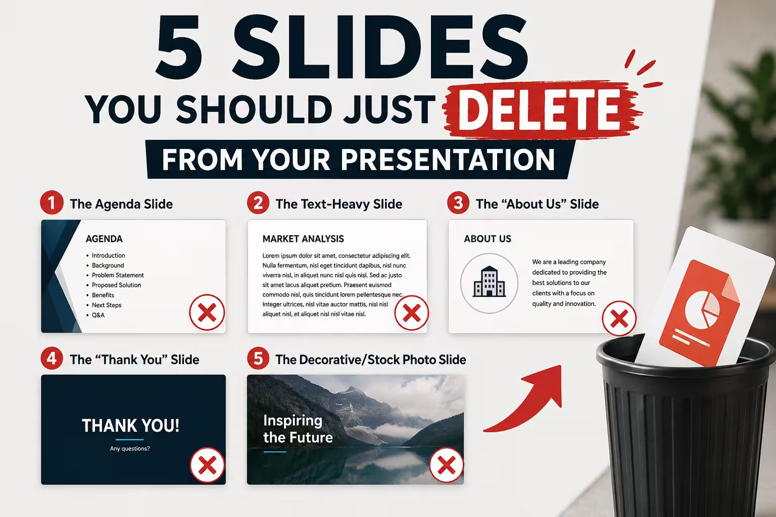
Open almost any deck for a second round of feedback and you'll notice something odd: nobody asks to add a slide. They ask to fix one. Trim this, reword that, make the chart bigger. Meanwhile the slide that's actually hurting the presentation — the one nobody reads, nobody needs, and everybody skims past — stays exactly where it was in draft one. Deleting is the edit nobody suggests, because it feels like admitting the slide shouldn't have been built in the first place.
I've sat in enough pre-presentation reviews to notice the same five slides surviving edit after edit, mostly untouched, mostly unnecessary. None of them are wrong in every context — that's part of why they're hard to catch. Each one is legitimate somewhere. The problem is that they get included by default, not by decision.
The agenda slide, when the talk is under fifteen minutes
Four bullet points, a slightly different order than the actual talk ends up following, gone from memory by the second slide. That's the agenda slide in most short presentations — a formality copied from a template rather than something the room actually needs.
An agenda slide earns its place when the audience has to track parallel workstreams, when you're handing the floor to multiple speakers, or when the session runs long enough that people might check out and need a map back in. None of that applies to a fifteen-minute update to your own team. In that setting the agenda slide isn't orientation — it's a stall before the talk actually starts, and the audience can feel the difference between a genuine roadmap and a slide that exists because "presentations have an agenda slide."
The company history slide, placed before anyone cares
Founded in [year]. Offices in [number] countries. Trusted by [logo grid]. It's the slide that answers a question nobody in the room has asked yet — because they don't know if what you're proposing matters to them, and background credibility only lands once relevance is established.
This is the one I'd actually argue for cutting even in pitch contexts where "about us" feels mandatory. Move the same information later, right where a skeptical listener would naturally ask "wait, who's saying this?" — and it stops being throat-clearing and starts being evidence. The content isn't the problem. The position is.
The stock-photo transition slide
A handshake, a skyline, two people pointing at a laptop neither of them is looking at — a single visual with no data, no argument, sitting between two real sections as a kind of visual breath. It's meant to feel like pacing. Most audiences read it as padding, because there's nothing on it to actually process.
The exception is a genuinely long, dense presentation — forty-plus slides of specs or figures — where a visual break does real work by resetting attention before a shift in topic. Outside that, a plain section-divider with just the next heading does the same pacing job without asking the audience to pretend a stock photo means something.
The "everything we measured" data slide
This is the slide that started as three metrics and grew, over successive drafts, into a table with nine rows because someone asked "can we also show X" and nobody wanted to say no. By the time it's presented, it's not a chart anymore — it's a spreadsheet with a title.
Here's the part that's easy to miss: this slide usually isn't wrong to build. It's wrong to present. A GfK-commissioned survey of over a thousand office workers, published as the Ultimate Global PowerPoint Study, found that formatting alone eats roughly 37% of the total time people spend working in PowerPoint — a good share of it going into exactly this kind of slide, reshuffled and reformatted long after the underlying decision about what to show should have been made. Keep the full table in an appendix or a leave-behind document. Show the room the one number the decision actually hinges on, and let people ask for the rest if they want it.
The "Thank You" closing slide
It's the slide people remember least, because there's nothing on it to remember — just a word, sometimes a logo, occasionally a stock photo of hands clapping. It occupies the single most attentive moment left in the room: the last few seconds before people start packing up or reaching for their phones.
Replace it with the thing you actually want the audience to walk away holding — a specific next step, a contact name, a single takeaway restated in one line. Not because "thank you" is rude to say out loud, but because a slide is a strange place to spend it when the room's last moment of attention could be doing something instead.
What deleting a slide actually costs
None of this is an argument for a shorter deck as a virtue in itself — a lean presentation missing the one slide that answers the room's actual question is worse than a long one that answers it. The point is narrower: each of these five slides tends to survive on habit rather than a decision, and habit is exactly the kind of thing an edit pass should catch and doesn't.
Next time you're trimming a deck, don't start by asking what to shorten. Ask which slides are there because you built a presentation before, and this is what presentations have. Those are the ones worth cutting first — and if you're rebuilding what's left, a diagram template usually does more work than another bullet list, and a slide-count baseline for your context is a better starting point than a habit.
Comments (0)