How to Make a Presentation Your Classmates Won't Laugh At
The slides aren't what gets people laughing — it's the five seconds before you've said a word.
Design tips, tutorials, product updates, and industry insights.
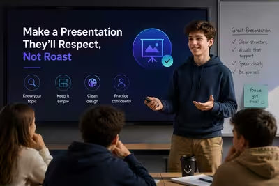
The slides aren't what gets people laughing — it's the five seconds before you've said a word.
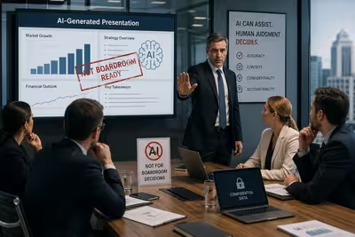
The same reason Jeff Bezos banned PowerPoint in 2004 is why a growing number of boards are drawing a hard line around AI-generated slides in 2026.
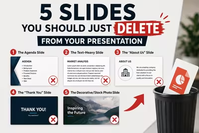
Before you touch a single font or color, cut these five slides — your deck gets stronger the moment they're gone.
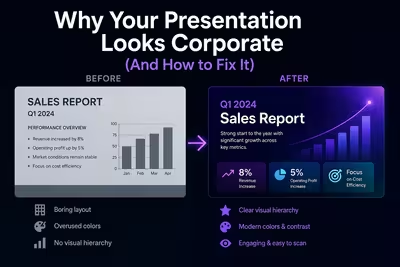
It's not the colors or the font — it's the six invisible defaults that make every deck look like it came from the same template.
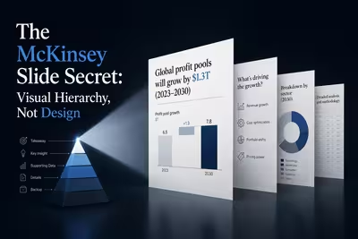
Copy McKinsey's fonts and spacing and the slide still won't land — here's the one thing that actually makes their decks readable in three seconds.
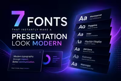
The gap between a deck that looks like 2015 and one that looks like it belongs in 2026 is smaller than you'd think — it's usually just one file.
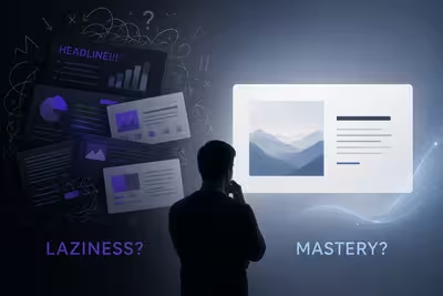
A stripped-down deck can be the smartest thing in the room — or proof nobody did the work; here's how to tell which one you're looking at.

The format everyone buried around 2015 is quietly outperforming video in inboxes and internal decks — and it's not nostalgia doing the work.
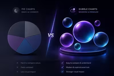
Bubble charts score worse on every chart-reading accuracy test than pie charts do — so why does the slide with bubbles always feel like the pricier deck?