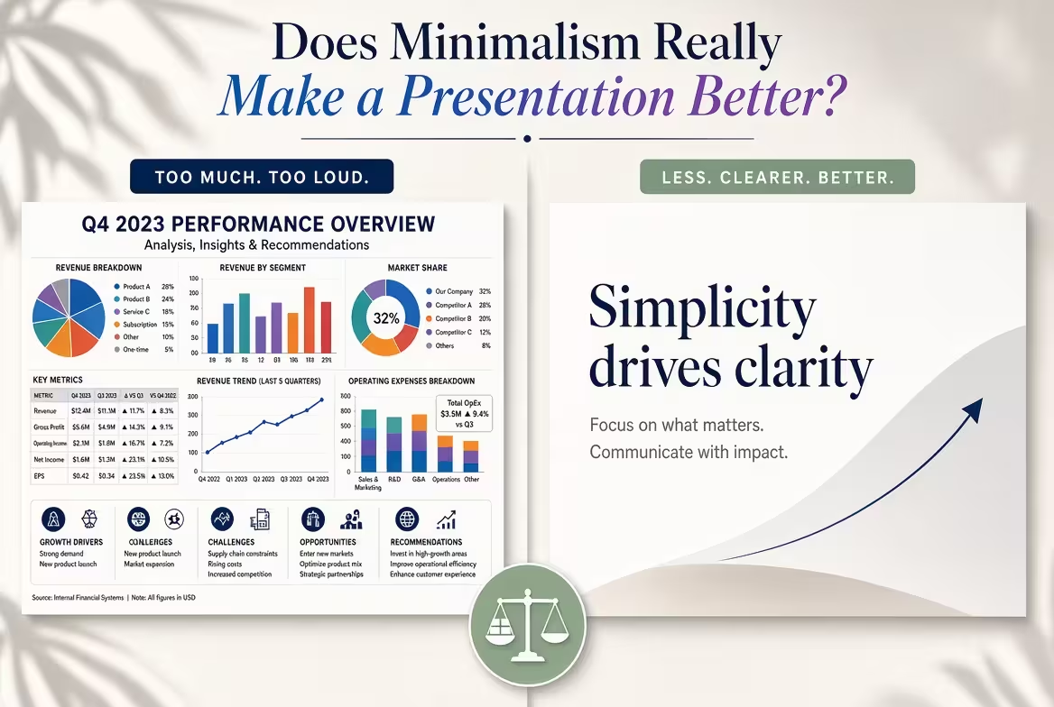
I once watched a founder pull two versions of the same pitch deck up side by side. One had ten slides — clean, one idea per screen, generous margins, the kind of deck every "minimalist presentation" article tells you to build. The other had twenty-seven, dense with numbers, comparisons, and footnotes. The ten-slide deck got a polite "we'll follow up." The twenty-seven-slide deck got a second meeting. Nobody in that room complained about clutter.
That's the part the minimalism-always-wins advice tends to skip over.
What "minimalism" actually promises
Strip away the aesthetic language and the pitch for minimalist slides is really an attention argument: fewer elements per slide means less competing for the viewer's eye, which means the one thing you actually want them to notice gets noticed. That's a reasonable mechanism. It's also not the same claim as "shorter decks perform better" or "less text always helps," which is where a lot of minimalism advice quietly drifts.
In my experience, the confusion starts because people use "minimalist" to describe two different things at once — a visual style (lots of white space, restrained color, one message per slide) and a length strategy (cut everything nonessential). A slide can be visually minimalist and still be part of a thirty-slide deck. The style and the slide count are separable decisions, and most of the "minimalism is better" arguments only work if you keep them tangled together.
What the data on investor attention actually shows
Here's where it gets more interesting than a style preference. DocSend, the document-sharing platform now owned by Dropbox, has tracked how long investors actually spend reading pitch decks across a large volume of real fundraising documents. One finding from that research is worth sitting with: in 2020, decks that went on to successfully raise funding held an investor's attention for over four minutes on average, while decks that failed to raise held attention for roughly ninety seconds.
Notice what that isn't measuring. It isn't slide count, and it isn't whether the deck used two fonts or six. It's engagement — whether the investor kept reading past the point where they could politely stop. A minimalist deck that gets skimmed in ninety seconds because there's nothing to chew on loses to a denser deck that holds attention for four minutes, every time. Fewer elements per slide doesn't automatically buy you more total attention across the deck; it just changes how that attention gets distributed.
The variable that actually decides this — and it isn't aesthetics
A pitch deck and a quarterly business review are not doing the same job, and this is where most "should your deck be minimal" arguments fall apart. A pitch is a one-sitting decision: the audience either says yes to a next step or they don't, right there in the room. A dense operational review is a reference document — someone is going to reopen it a week later to check a number, or forward it to a colleague who wasn't in the meeting.
Minimalism is the right call when the job is "decide quickly." It's the wrong call when the job is "verify carefully," because stripping a deck down to ten slides can just as easily strip out the evidence the audience needs to trust the ask. I wouldn't recommend building a diligence deck the way you'd build an elevator pitch — the same discipline that makes a pitch land makes a reference document useless.
Cutting slides doesn't automatically fix a cluttered argument
This is the part that complicates the tidy "just cut it down" advice. I've watched people take a bloated thirty-slide deck and hack it down to a round number — ten, seven, whatever felt clean — and the deck still doesn't work. Deleting slides without editing the underlying argument doesn't produce clarity. It produces compression: four unresolved ideas crammed onto one slide instead of spread across four.
The actual fix has to happen before the cutting starts. A genuinely short deck takes longer to prepare than a long one, not less, because someone had to decide which comparison mattered and which three objections were worth pre-empting instead of the eleven they could think of. A deck only gets to look minimal after that sorting work is finished — minimalism is the visible result of an editing decision, not a substitute for making one.
Where the "less is more" mechanism actually lives
If minimalism isn't really about slide count, what's it doing when it does help? Mostly, it's doing contrast work. A slide with one headline, one supporting visual, and generous space around both reads faster not because there's less information, but because there's a clearer hierarchy telling the eye what to look at first, second, and third.
The same logic shows up in smaller decisions than layout — two well-chosen typefaces create that hierarchy through contrast rather than restriction, and a slide crowded with five competing fonts fails for the same reason a slide crowded with five competing ideas fails: nothing signals what matters most. Minimalism, done well, is really just hierarchy with the noise turned down. Done badly, it's hierarchy with the evidence removed along with the noise.
A more useful question than "should this be minimal?"
One thing people overlook: the question worth asking before opening a template isn't stylistic at all. It's "what does this specific audience need to do with this deck once I stop talking — agree quickly, or check my work slowly?" A cold pitch to someone who's never heard of you needs speed, so lean and minimal is doing its job. A data-room deck for someone conducting diligence needs depth, and a thirty-slide breakdown isn't cluttered in that context — it's complete.
Once that question is answered, the visual style tends to follow on its own, and arguing about whether minimalism is "better" stops being the useful part of the conversation.
So, back to that founder with two versions of the same pitch. The twenty-seven-slide deck didn't win because it was longer, and the ten-slide deck didn't lose because it was cleaner. One of them matched the job the room actually needed doing, and the other one didn't — which is a better question to ask about your next deck than whether it looks minimal enough.
Comments (0)