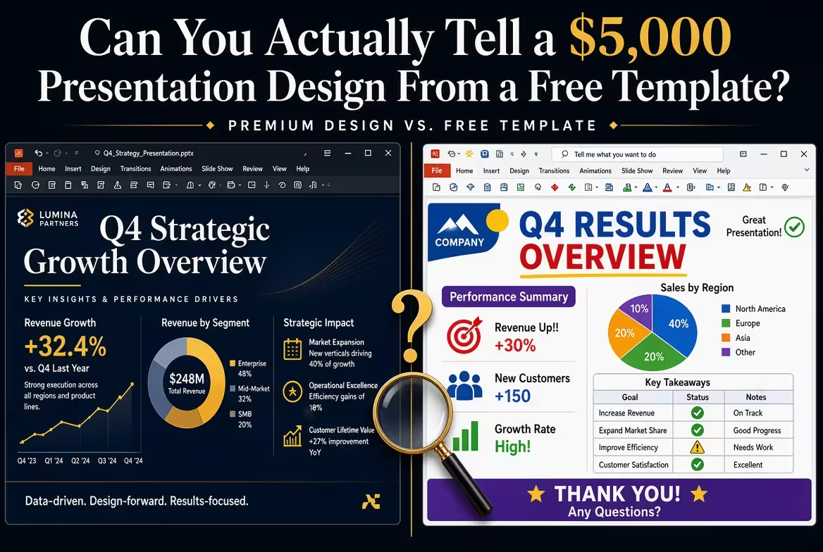
Show a room of experienced marketers two decks side by side — one from a $5,000 agency engagement, one built on a free template someone downloaded in ten minutes — and ask them to guess which is which. In my experience running that exact exercise informally with design teams, the group splits almost evenly. Sometimes they pick the free one as the expensive one. That should worry anyone budgeting five figures for a pitch deck.
It doesn't mean the money was wasted. It means most people are judging presentations by the wrong signals, and once you know what actually separates a paid design from a free one, the gap becomes obvious — but it's rarely where you'd expect.
What people notice first isn't what costs money
Ask someone what makes a deck "look expensive" and they'll say clean fonts, a consistent color palette, maybe some icons that match. All of that is now table stakes. A decent free template — the kind with 220-plus diagram layouts and pre-built chart and diagram templates to pull from — gets you 80% of the way to "looks professional" without anyone touching a design tool.
What it can't do is know your content before you have it. And that's where the actual split happens.
The tell: what happens when your data doesn't fit the layout
Every template assumes a shape of content. Five bullet points, three columns, one hero stat. The moment your actual numbers don't match that shape — you've got seven regions to compare, not four, or your key metric needs three decimal places to make sense — a template starts working against you. You either cut real information to fit the design, or you cram it in and the design breaks.
A custom design doesn't have this problem because it was built around your specific data in the first place. This is the single clearest tell in a side-by-side comparison: look at the slide holding the most complex table or chart in the deck, not the title slide. Templates flatter simple content and struggle with messy content. Paid design does the opposite — it's built to absorb whatever the data actually looks like, which is also why agency work leans so heavily on custom chart construction rather than dropping numbers into a stock graph.
Where the $5,000 actually goes
Agency pricing research from 24Slides puts average per-slide costs for professional design work at roughly $265, which puts a $5,000 budget at somewhere between fifteen and twenty fully custom slides — not the eighty-slide monster decks most people picture when they hear "presentation design." That reframing matters. You're not paying for volume. You're paying for a smaller number of slides that were each built to hold one specific argument, with a designer making dozens of micro-decisions per slide that a template made once, generically, for every possible user.
Some of that budget also goes somewhere invisible in the final file: revision rounds. A template gives you a finished thing on day one. A custom engagement usually includes two or three passes where the designer reacts to your actual content — tightening a chart that was too busy, cutting a slide that didn't earn its place. That process, not the final polish, is most of what separates the two.
The formatting tax nobody budgets for
Here's the complication most comparisons skip. A GfK survey covering more than a thousand office workers found that people spend around 20 hours a month working in PowerPoint, and roughly 8 of those hours go to repetitive formatting steps rather than actual content — adjusting spacing, fixing fonts, aligning objects that shifted when text changed. That's true whether you started from a blank slide or a free template.
A paid design doesn't just look different — it's usually built with a master-slide structure specifically so your team stops paying that formatting tax every time a number changes. A free template can be structured well too, but it wasn't built around your workflow, so someone in your organization ends up doing that structural work manually anyway, quietly, project after project. The $5,000 sometimes isn't buying a better-looking deck. It's buying back those hours for everyone who has to update it after the designer leaves.
When the free template quietly wins
I wouldn't recommend custom design for every situation, and this is the part agencies don't lead with. If your content is genuinely simple — a status update, an internal recap, five slides nobody outside the room will see twice — a well-chosen template from a library like a template store with a custom-design option for when you outgrow it gets you to "credible" faster and cheaper than any commissioned project could justify. The tell in reverse: when a deck's complexity is low and its lifespan is short, a $5,000 design is buying polish nobody will notice, on content that won't exist next quarter.
The real question isn't template versus custom. It's whether your content has the kind of irregular, evolving complexity that a fixed layout can't absorb — and whether your team is going to be rebuilding this deck, in some form, for the next two years.
Next time you're in a meeting sizing up someone else's deck, skip the title slide and the color palette. Find the ugliest, most data-dense slide in it. That's where the money — or the lack of it — actually shows.
Comments (0)