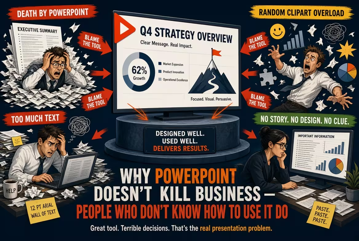
PowerPoint gets blamed for problems it didn't create
Every few years, someone announces that PowerPoint is killing productivity.
The slides are boring. Meetings are too long. Executives stare at screens instead of discussing the real issue. Teams spend hours formatting presentations instead of doing actual work.
And the obvious conclusion is: maybe PowerPoint is the problem.
I don't buy it.
PowerPoint is just a tool. A spreadsheet doesn't cause a bad forecast, and a camera doesn't cause a bad photograph. The quality of the result depends heavily on the person using it — and, more importantly, on whether they understand what the tool is supposed to accomplish.
The real problem is usually much earlier than the moment someone opens PowerPoint.
The worst presentations are usually thinking problems first
I've seen people spend an hour adjusting fonts on a slide whose main argument wasn't clear.
They change the colors. Move the chart. Add icons. Try another template. Reduce the text. Add an animation.
Nothing improves because the underlying question hasn't been answered:
What exactly are we trying to make the audience understand or decide?
If the answer is unclear, PowerPoint becomes a place to hide the uncertainty.
People start filling empty boxes because an empty slide feels uncomfortable. They paste data because data looks authoritative. They add another chart because the previous chart doesn't quite prove the point.
Eventually, the deck contains twenty slides and still doesn't contain an argument.
This is why I often recommend writing the slide headlines before designing the slides. The same principle appears in consulting-style presentation work: the logic should be tested before the visual treatment. ImagineLayout's discussion of how McKinsey structures presentations makes the same distinction between building the argument and decorating it. See how the presentation logic comes before the design.
PowerPoint becomes dangerous when people confuse information with communication
A spreadsheet can contain 10,000 useful numbers.
That doesn't mean you should put 10,000 numbers on a slide.
But the opposite mistake is just as common: removing so much information that the audience can no longer verify what you're saying.
Good presentation design lives between those two extremes.
Consider a sales report.
A weak slide might contain a screenshot of a dashboard with twelve metrics, six colors, and several tiny labels. Technically, everything is there.
Another weak slide might show one enormous number — “Revenue: $12.4M” — with a decorative graphic underneath. It looks cleaner, but now the audience has no idea whether the number is good, bad, growing, or below plan.
A useful slide might instead show the revenue figure, its change against the relevant benchmark, and the two or three factors that explain the movement.
That's not a PowerPoint trick.
It's business reasoning expressed visually.
For data-heavy presentations, a structured financial data visualization PowerPoint template can help with the mechanics, but it cannot decide which number actually matters. That decision still belongs to the person building the presentation.
The software is rarely responsible for the 47-slide deck
PowerPoint didn't decide that the meeting needed 47 slides.
A person did.
PowerPoint didn't decide that every sentence from a 20-page report should become a bullet point.
A person did.
PowerPoint didn't decide to use five different chart types because the presenter wanted to “make the deck more visual.”
A person did.
This distinction sounds obvious, but it changes how you improve presentations.
If you blame the software, the solution is to find another tool.
If you blame the process, you can actually fix something.
Sometimes switching tools helps. But moving the same bad content from PowerPoint to Google Slides, Canva, or another presentation platform doesn't magically create a better argument.
The file format changes. The thinking doesn't.
Good PowerPoint users know when not to use PowerPoint
There is an even more uncomfortable point: sometimes the best presentation slide is no slide at all.
If a discussion requires a detailed financial model, open the model.
If the audience needs to read a contract, give them the contract.
If the decision depends on a complicated operational process, perhaps a diagram or live walkthrough is more useful than another page of bullets.
PowerPoint is excellent at creating a shared visual frame for a conversation. It is not automatically the best container for every kind of information.
Good presenters understand that distinction.
They don't ask, “How can I put this into PowerPoint?”
They ask, “What does this audience need in order to understand or decide?”
The real skill isn't knowing PowerPoint. It's knowing what to leave out.
This is where experienced presentation designers have an advantage.
They know that a slide isn't a storage container for everything the presenter knows.
It is a controlled view of the argument.
Sometimes that means a diagram. Sometimes it means a chart. Sometimes it means three lines of text. And sometimes — despite everything we've been taught about minimalist presentations — it means a dense table because the audience genuinely needs to compare the underlying details.
The important question isn't whether the slide is minimal.
The question is whether every element earns its place.
That is also why professionally built PowerPoint templates can be useful. A good template removes repetitive layout decisions, gives teams reusable structures, and lets people spend more time thinking about the message instead of rebuilding boxes from scratch.
PowerPoint doesn't make bad meetings. Bad meeting design does.
There is a pattern I see repeatedly: a presentation is blamed when the real problem is the meeting itself.
There is no clear decision to make.
The audience wasn't chosen carefully.
The presenter doesn't know what they want from the room.
The deck contains information but no hierarchy.
The meeting runs for an hour because nobody decided which questions actually need an hour.
Then everyone leaves frustrated and someone says, “We should stop using PowerPoint.”
But remove PowerPoint and the same meeting can easily become a 60-minute conversation with no structure at all.
The tool wasn't the problem.
The absence of a communication strategy was.
Use PowerPoint like a tool, not a hiding place
The best PowerPoint presentations I've worked on have something in common: the software becomes almost invisible.
You don't notice the clever transition.
You don't admire the template.
You don't think about how long the designer spent aligning the icons.
You understand the situation, see the evidence, and know what question comes next.
That is what good presentation design should accomplish.
So no, PowerPoint isn't killing business.
People are hurting their businesses when they use presentation software to compensate for unclear thinking.
Learn the tool, certainly. Learn grids, charts, layouts, typography, and visual hierarchy.
But learn the more difficult skill first: deciding what the audience actually needs to see.
Once that becomes clear, PowerPoint stops being the problem — and starts being exactly what it was supposed to be.
Comments (0)