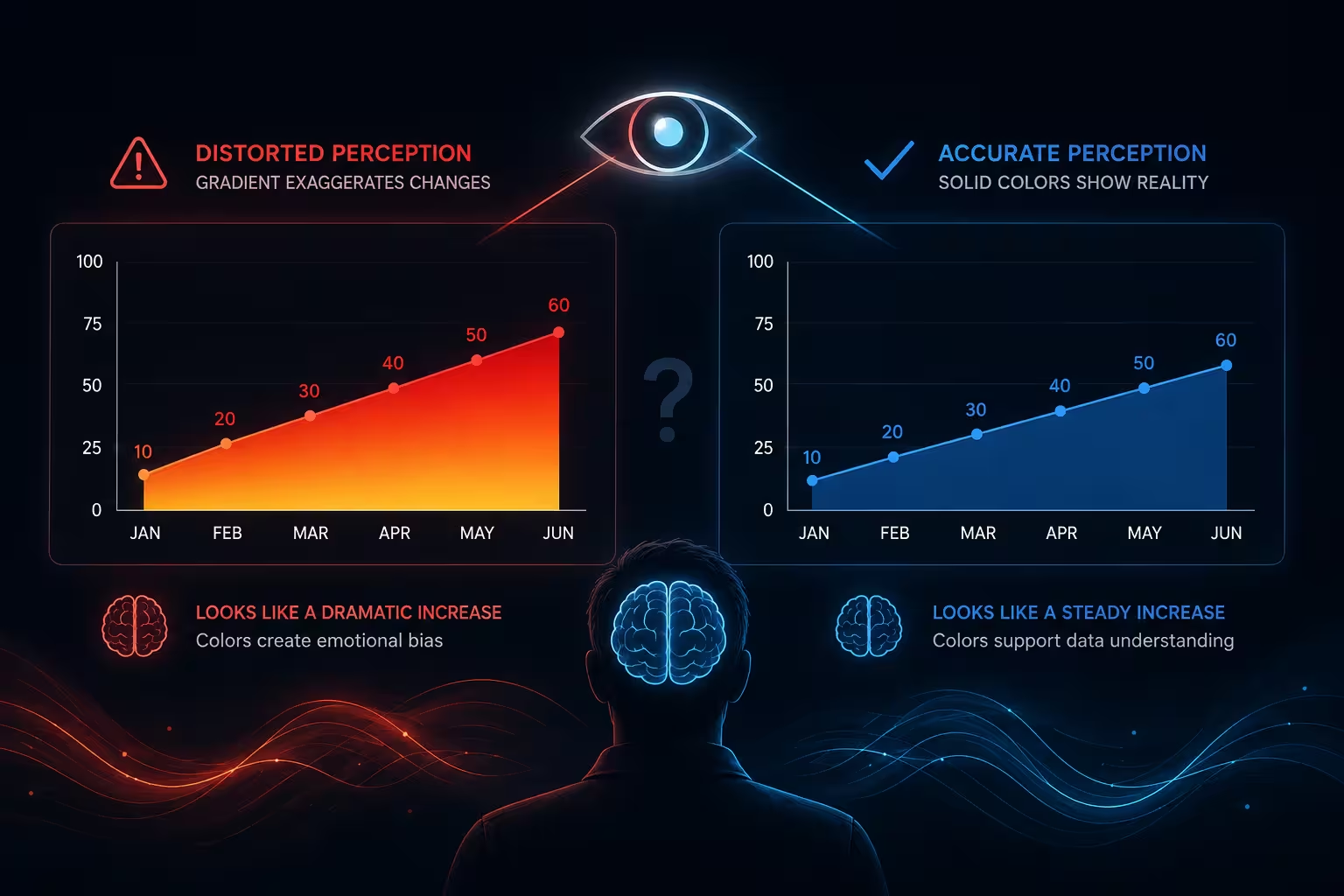
A client once sent me a "final" version of a quarterly dashboard three hours before the board meeting. Every KPI tile used the same blue-to-red gradient, from soft sky blue at low values to deep red at high ones. It looked expensive. It also made two unrelated metrics — churn rate and support ticket volume — look like they were moving in sync, purely because both landed in the orange band of the scale. They weren't related at all. The gradient had invented a correlation that didn't exist.
That's the part people miss about color gradients: the problem isn't that they're ugly or overused. It's that a smooth gradient asks the human eye to do something it's structurally bad at — read continuous color as continuous quantity, with even, predictable steps.
Color doesn't have a built-in ruler
Numbers have an obvious order. Three is more than two, less than four, no interpretation required. Color doesn't work that way. When you shade a chart from yellow through orange into red, you're relying on the viewer's brain to silently convert hue into magnitude — and hue was never built for that job.
This is the exact critique that pushed the "rainbow colormap" out of favor in scientific visualization. In their widely cited 2007 IEEE paper, researchers David Borland and Russell Taylor argued that rainbow-style color scales confuse viewers because they lack a natural perceptual order, and that uneven brightness across the scale can hide real differences in the data or invent ones that aren't there. A gradient that jumps in brightness partway through — most rainbow and multi-hue scales do — creates a visual "edge" at that point, even when the underlying number is changing at a perfectly steady rate.
I've seen this play out on ordinary sales charts, not just scientific ones. A revenue heat map that shifts from yellow to green around the same value every time draws the eye to that boundary as if something changed there. Nothing did. The gradient just has a bright spot in the middle of its range.
The chart works fine on your laptop — then it doesn't
Here's where it gets more annoying than a design nitpick. A gradient calibrated on a color-accurate monitor, in a quiet office, at full brightness, is not the gradient your audience sees.
Project the same slide onto a conference-room screen with the lights half up, and the fine distinctions between adjacent shades — the ones carrying your actual data — wash out first, because subtle hue shifts have far less contrast than a hard color boundary. Print it in grayscale for a board packet, which happens more often than most designers assume, and a five-step gradient can collapse into two or three visually distinct blocks. Screenshot it and paste it into a Slack thread, and JPEG compression will smear the transitions further.
None of this shows up when you're designing the chart. It shows up in the room, when someone squints at the screen and asks which region actually performed better — and the honest answer is that the chart can no longer tell them.
Then there's the reader you didn't design for
Color vision deficiency isn't a rare edge case you can reasonably ignore. Colour Blind Awareness puts the rate at roughly 1 in 12 men and 1 in 200 women — meaning a mid-size stakeholder meeting will very plausibly include someone who can't reliably separate the red end of your gradient from the green or orange end. Red-to-green gradients are the worst offender, since that's exactly the distinction most color vision deficiencies blur.
This isn't a caveat to tack on at the end of a color checklist. It sits underneath the same core issue as the projector problem: a gradient is only doing its job if every viewer decodes it into roughly the same number. Once a meaningful share of any room can't, the chart has stopped communicating data and started communicating "warm colors versus cool colors," which is a much blunter signal than the one you intended.
Gradients aren't the villain — used without a category, they are
None of this means banish gradients from every chart. A well-built sequential gradient — one hue, increasing only in intensity, like pale to deep blue — genuinely does the job for a single continuous variable, and it holds up far better under projector glare and grayscale printing than a multi-hue rainbow does, because there's only one thing shifting: intensity, not hue.
Where gradients earn their keep is exploration, not comparison. A heat map matrix used to eyeball where a large dataset clusters — which region of a 10x10 grid is "hot" relative to the rest — is a reasonable use, precisely because the viewer isn't expected to read off precise values, just spot the general pattern. If you look at how heat map matrix templates are typically built, the better ones pair the gradient with actual numbers printed in each cell, so the color is doing rough pattern-spotting while the digits carry the real precision. That combination is the tell of a gradient used correctly: color for the gestalt, numbers for the fact.
Where gradients fail is the opposite job — asking someone to compare two specific values precisely, like "which of these six regions grew faster." That's a bar chart's job, not a gradient's, because bars give you length, and length is one of the few visual encodings people read almost as accurately as they read text.
A quicker test than memorizing color theory
I wouldn't recommend trying to memorize perceptual color science before your next deck is due. A faster gut check: convert the chart to grayscale and squint at it from across the room. If you can still tell which regions are meaningfully different, the gradient is carrying real information. If everything blurs into two or three vague zones, the color was doing more decorating than communicating, and you're better off with a small set of distinct, named categories — or handing the precision back to labels and numbers, the way a well-built chart template usually structures it by default.
The client's dashboard, in the end, kept its gradient for the heat map slide showing regional order volume — genuinely exploratory, genuinely fine — and lost it everywhere else, replaced with five distinct, colorblind-checked categories for anything the board needed to compare directly. Nobody in that meeting confused churn with ticket volume again.
Comments (0)