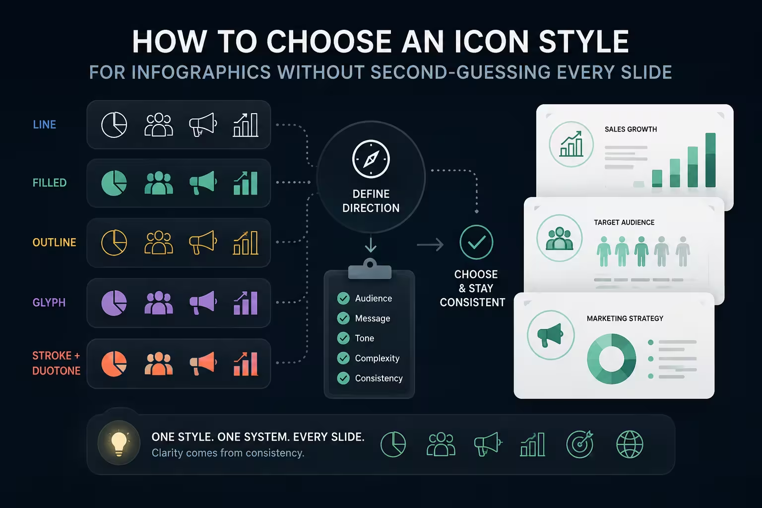
Somewhere around slide eight of a client deck, I once watched a perfectly good infographic quietly lose credibility. Nothing was wrong with the data. The colors matched the brand guide. But three of the icons had a hairline outline, two were solid fills, and one — clearly dragged in from a free icon pack at 2 a.m. — had a drop shadow nobody else's icon had. No one in the room could have told you what was bothering them. They just stopped trusting the chart next to it.
That's the strange thing about icon style: it's rarely the reason a slide gets praised, but it's very often the reason a slide gets distrusted. And most advice on the topic stops at "pick a style and stay consistent," which is true and also useless, because it doesn't tell you which style, for which data, at which size.
Line weight is the tell, not the fill
People assume the visible difference between icon styles is flat versus 3D, or filled versus outlined. It's usually not what gives a mismatched set away. It's stroke weight. A 2px line icon sitting next to a 1.5px line icon from a different set reads as "off" before a viewer can even articulate why — the eye registers weight inconsistency faster than it registers style inconsistency.
This is the actual reason mixing icon packs is risky: it's not that flat and 3D "clash" conceptually, it's that no two independent icon libraries share a stroke-weight standard, corner radius, or grid size. Pull five "line icons" from five different free sources and you'll get five subtly different stroke widths, even though every single one is technically a line icon. The fix isn't "use one style," it's "use one source." One icon library, one export batch, one grid — the style label matters far less than the shared production origin.
Match the icon style to what the data is doing, not what looks nice
Here's where most guidance gets vague: it treats icon style as a branding decision, disconnected from the chart or layout it sits next to. In practice, the icon style should track the type of infographic you're building.
- Statistical infographics (a big number next to a supporting icon) tolerate bolder, filled icons — they're meant to be read in half a second, and a solid shape holds up better than a delicate outline at that glance speed.
- Process or step infographics usually read better with consistent line icons, because you need the eye to trace a sequence without each step visually competing for weight.
- Comparison layouts — this vs. that, before vs. after — are the one place duotone or two-color icon sets earn their keep, since the second color can encode the comparison itself rather than just decorating.
Pick the icon style after you've decided what kind of infographic this is, not before. Reverse that order and you end up forcing a pretty icon set onto a layout it was never suited for.
The size problem nobody mentions until it's too late
Icon style choices that look sharp in a full-screen mockup often fall apart the moment they're actually used — shrunk into a legend, a dashboard tile, or a slide thumbnail in a shared deck. Thin outline icons in particular tend to disappear or blur at anything under roughly 20px, while filled or duotone icons hold their shape.
This matters more than it sounds like it should, because recognition happens faster than people expect. Coverage of a 2014 MIT study led by researcher Mary Potter reported that the human brain can process entire images seen for as little as 13 milliseconds, far quicker than the 100-millisecond estimate researchers had previously assumed. In other words, viewers are already identifying icon shapes almost instantly — which means a shape that's ambiguous at small size doesn't get a second chance to be understood; it just gets misread or skipped. If any part of your infographic will end up small — a printed handout, a mobile view, a PDF export — test the icon style at that size before you commit to it, not after the deck is finished.
When breaking your own consistency rule is the right call
"Stay consistent" is correct almost all of the time, which is exactly why it's worth naming the exception. If one category in your infographic genuinely needs to stand apart — a risk flag, a "new" tag, a single alert icon in an otherwise calm dashboard — giving that one icon a different style than the rest isn't a mistake, it's the whole point. The moment every icon shares identical weight and fill, you've also removed your own ability to signal "this one is different," which is often exactly the message the slide needs to send.
I wouldn't recommend doing this more than once per infographic, though. A single deliberate outlier reads as emphasis. Two or three starts reading as inconsistency again, and the viewer can no longer tell which mismatches were intentional and which were just leftover icons from an earlier draft.
Building a style you can actually finish
One thing people overlook: the constraint that decides your icon style often isn't aesthetic at all — it's coverage. A gorgeous hand-drawn icon set with 40 icons will not survive a 25-category infographic; you'll run out of matching icons around category 30 and end up either mixing sources (back to the stroke-weight problem) or hand-editing icons that were never meant to be edited. Before falling in love with a style, check whether the source library actually has enough icons, in enough categories, to cover the full data set — not just the three examples you saw in the preview.
For anyone building this repeatedly rather than once, working from a template set with pre-matched PowerPoint shape and icon assets avoids the coverage gap entirely, since the whole set was produced together instead of assembled from scattered downloads. And the same logic that applies to icon style — pick the visual based on what the data is doing, not what looks best in isolation — carries over directly to choosing between chart types and to picking a template that fits your industry's visual expectations rather than the one that's currently trending.
Next time an infographic feels slightly untrustworthy and you can't say why, check the icons before you check the data. Nine times out of ten, the numbers were never the problem.
Comments (0)