A colleague once sent me a slide the night before a board meeting: quarterly revenue, four points, connected by a smooth line climbing gently up and to the right. It looked confident. It looked like a trend. The problem was that it wasn't one — four quarters isn't a trend, it's four numbers, and the line between them was implying a continuity that didn't exist. Nobody in the room questioned it. That's the part that stuck with me.
Most articles on this topic hand you a one-line rule: bars for comparison, lines for trends over time. It's not wrong. It's just incomplete enough that people misapply it constantly, usually with a straight face and full confidence.
The rule isn't "time vs categories" — it's about what your x-axis implies
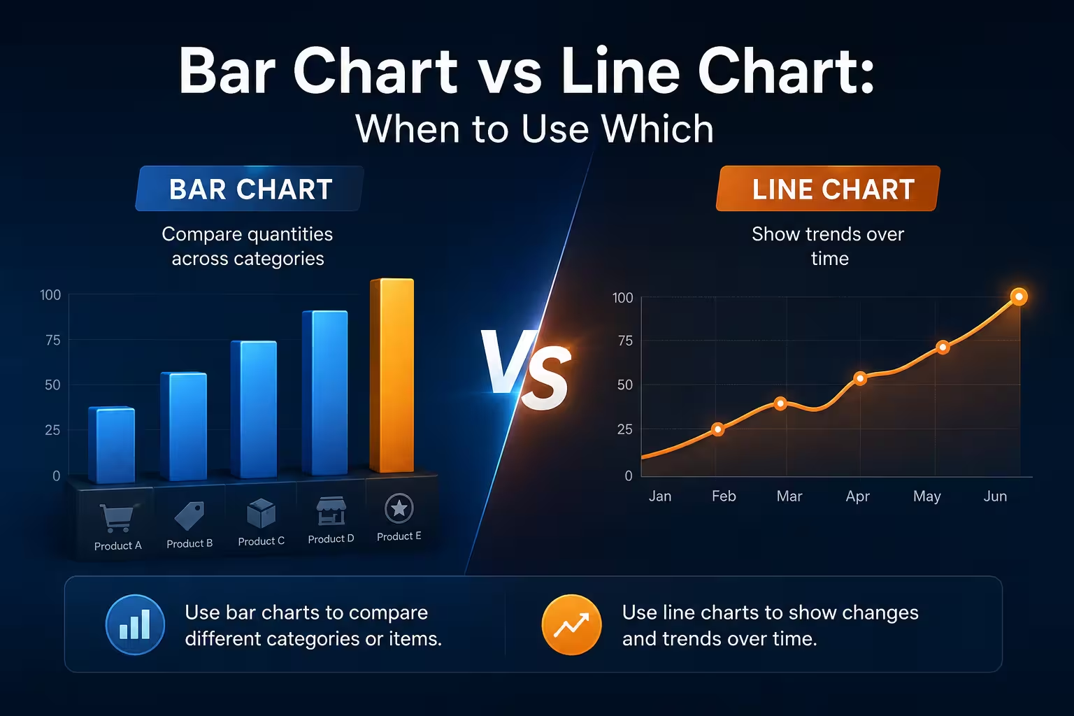
Here's the version I actually use when reviewing a deck. Look at what sits on the x-axis and ask: does moving from one point to the next mean anything? If your x-axis is January, February, March — moving right is a meaningful step, and a line connecting those points tells the reader something true about the space between them. If your x-axis is five product lines, or five regions, or five survey questions, there is no "between." Nike doesn't gradually become Adidas. A line drawn across unordered categories is drawing a relationship that isn't in the data — it just looks smooth enough that nobody stops to check.
This reframes the decision as a question about your data's structure, not its subject. Time-series data with a genuine sequence gets a line. Category data — even if it happens to have a date column somewhere in the spreadsheet — gets a bar.
Except when your time series only has three or four points
This is where I'd expect the article to just say "use a line for time," and move on. It's not that simple.
A line chart implies interpolation — it's visually suggesting a value existed between your data points, even when you only measured at discrete intervals. With twelve monthly points, that implication is harmless; the eye reads it as a smooth trend and the underlying reality is close enough. With four quarterly points, the same visual device starts overstating itself. The steep climbing line from my colleague's slide made a real 8% year-over-year gain look like sustained, accelerating momentum, mostly because there was so little data to argue with. A bar chart, in that case, would have shown the same four numbers without implying a shape to the space between them.
My rough threshold: below roughly six or seven points, I lean bar even for time-based data, unless the trend direction itself is the entire point of the slide and the audience already understands the data is sparse.
Bar charts have their own failure mode, and it shows up with too much data, not too little
Give a bar chart twenty-four monthly values and it turns into a picket fence. Every individual bar is still technically comparable to its neighbor, but the eye can no longer track a shape across the whole set — you lose the forest for a very orderly row of trees. This is where a line chart earns its keep: past a certain density, a continuous line lets the reader's eye do pattern recognition that a wall of discrete bars can't offer, because a line's slope is a single visual signal for "went up" or "went down," where a bar chart forces the reader to compare adjacent heights one pair at a time.
There's research behind why this matters more than it seems. Cleveland and McGill's 1984 graphical perception study ranked how accurately people judge different visual encodings, and found that position along a common scale and length — the encodings bar and line charts both rely on — are read far more precisely than angle or area, which is part of why both chart types outperform pies and 3D effects for this kind of comparison. But that same research is also a reason not to default to bars automatically once your category count grows: once there are enough of them, the length comparisons a bar chart depends on start competing with each other instead of supporting a single read.
Ranked categories are the case that breaks people's confidence
Suppose you're presenting customer satisfaction scores for five product lines. Categorical, unordered, textbook bar chart — except once you sort the bars from highest to lowest, the eye starts reading left-to-right motion the same way it reads a line chart's slope: as directional change. It isn't one, technically. But visually, a sorted bar chart borrows some of a line chart's storytelling power without borrowing its risk of implying a continuum that doesn't exist.
I wouldn't recommend leaving ranked bars unsorted just to avoid this ambiguity — sorting is still almost always the right call. But if a stakeholder later asks "so is this trending down," it's worth having the sentence ready that clarifies these are five separate categories, not five points on a timeline.
When neither chart is actually the right tool
One thing people overlook: sometimes the instinct to pick between bar and line is itself the wrong instinct. If you're trying to show a trend for four or five categories simultaneously — say, revenue by region across two years — a single line chart with five overlapping series usually turns into visual noise before it turns into insight, and a single bar chart grouped by category and year gets crowded fast too. In that situation, small multiples — the same simple chart repeated once per category, side by side — often communicates more clearly than either chart type scaled up to hold everything at once. It's a less satisfying answer than "pick bar or line," but it's the one that actually survives a room full of questions.
A working checklist, not a rule
- Ordered, continuous x-axis (time, sequential steps) with enough points to justify a trend line — use a line chart.
- Unordered categories, or a time series with only a handful of points — use a bar chart.
- Many series compared over time at once — consider small multiples before defaulting to either.
- Sorted bar charts read partly like trend lines to your audience — be ready to say so out loud.
You can find ready-made bar, line, and scatter chart layouts built for exactly these comparisons if you'd rather start from a structure than a blank slide, and the broader PowerPoint chart template library covers the less common formats — area, radar, bubble — for the cases where neither bar nor line is quite right.
Next time you're staring at four data points and reaching for a line chart because it "looks more like a trend," it's worth asking whether that's the story the data actually supports, or just the story the line is willing to tell.
Comments (0)