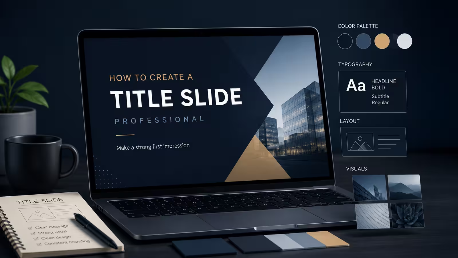
Open twenty decks at random and you'll find the same pattern: the body slides went through three rounds of revision, and the title slide got built in the last five minutes, usually by copy-pasting last quarter's version and swapping the date. That's backwards. The title slide is the only slide in the entire presentation guaranteed to have the full, undivided attention of every single person in the room — nobody's checking email during the title slide, because nothing's happening yet.
A study by communication researcher Vanessa Van Edwards tested this directly. She split 760 participants into two groups — one watched only seven-second clips of a talk, the other watched the complete presentations — and had both groups rate what they saw. The presentations rated most positively overall also scored highest within those first seven seconds, even with the sound turned off. For most speakers, those seven seconds are spent staring at the title slide while fumbling with an agenda they haven't said yet.
What the Title Slide Actually Has to Prove
Every other slide in a deck gets read alongside spoken context — the presenter is explaining, the audience is half-listening, half-reading. The title slide has none of that. It has to communicate on its own, with no voiceover, which means it's carrying more interpretive weight per word than any slide that follows it.
That changes what belongs on it. Name, title of the talk, presenter or company name, date if it's relevant to the audience — that's close to the ceiling, not the floor. One thing I wouldn't recommend: a subtitle that restates the title in slightly different words just to fill space under the headline. If the subtitle isn't adding a genuinely new piece of information — the specific client name, the quarter, the version number — it's decoration pretending to be content, and decoration is exactly what a slide with zero spoken support can't afford.
Type Choices That Break First
The title slide is usually where a deck's typography gets tested hardest, because it's often the largest single block of type in the whole presentation, blown up to fill most of the screen. Typography rules that hold up under real presenting conditions matter more here than almost anywhere else in the deck — a font substitution on a bullet slide is annoying, but a font substitution on the title, in 60-point type, is the first thing every viewer sees go wrong.
In my experience, the failure isn't usually the font choice itself — it's kerning and line-breaking on long company or client names. A title that fits cleanly on one line at 44pt during design can wrap awkwardly the moment someone swaps in a fourteen-word event name for a client presentation. Test the title slide with the longest realistic name you'll ever drop into it, not the placeholder text.
One Template, Many Rooms
Here's the complication most title-slide advice skips entirely: the same slide gets judged under wildly different conditions depending on where it's shown. A title slide that looks sharp on a laptop during a client call can lose most of its visual hierarchy the moment it's thrown onto a dim projector in a conference room with the lights half-up. Thin strokes and subtle color contrast — the things that make a title slide feel "designed" rather than default — are often the first casualties of bad projection.
This is part of why picking the right starting template matters more than most people assume before they even open the design software. Choosing a presentation template that fits the room, not just the industry, means checking whether the title slide's contrast survives worst-case lighting, not just whether it looks good on the screen you designed it on.
The Logo Problem
Branding on a title slide is one of those areas where more usually reads as less confident, not more official. A logo, a client logo (if it's a pitch), and maybe a small tagline is a defensible ceiling. Once a title slide starts carrying a corporate logo, a partner logo, a certification badge, and a QR code, it stops reading as "professional" and starts reading as a slide built by committee — because it usually was.
The same discipline that keeps a body slide from turning into visual noise applies here, just with higher stakes because there's no bullet content to distract from the clutter. The same principles that keep any slide from boring an audience — pick a hierarchy and commit to it, use color to point rather than decorate — apply doubly to the one slide that has to do all its work in silence.
Next time you're finishing a deck, try building the title slide first instead of last. Not because sequence matters for its own sake, but because a title slide built under time pressure, five minutes before the meeting, tends to look exactly like what it is.
Comments (0)