How to Use Icons to Improve Your Presentation
Practical rules for using icons in slides — sizing, pairing, colour, and the mistakes that make a deck look amateur instead of polished.
Design tips, tutorials, product updates, and industry insights.

Practical rules for using icons in slides — sizing, pairing, colour, and the mistakes that make a deck look amateur instead of polished.
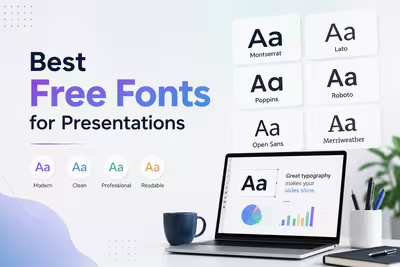
A practical, no-fluff guide to the free fonts that actually hold up on slides — readable at a distance, licensed for commercial use, and easy to pair.

Minimalist slides cut distraction and sharpen your message. Here's why simpler presentations often communicate more effectively than dense ones.
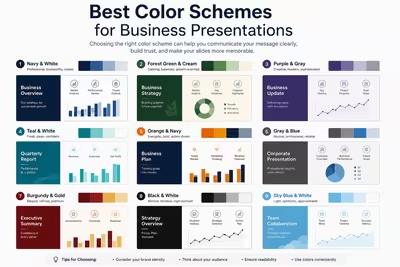
A practical breakdown of color schemes that actually work in business decks, from safe corporate palettes to accent strategies that hold up in a boardroom.
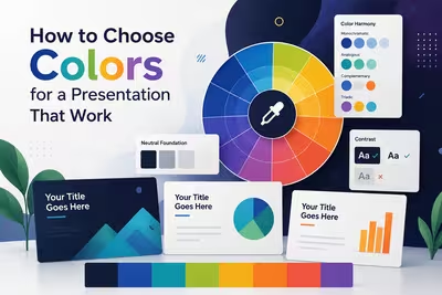
A practical guide to picking presentation colors that support your message instead of fighting it — with real trade-offs, not just theory.

Practical, tested ways to design presentations that work for people with vision impairments — contrast, structure, screen readers, and delivery habits.
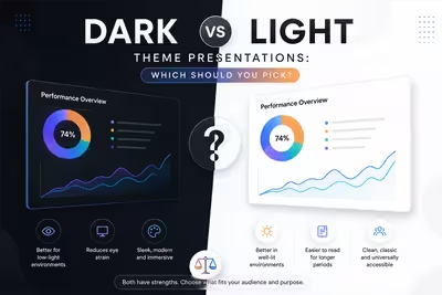
Comparing dark and light presentation themes across boardrooms, webinars, and pitch decks — with practical guidance on when each actually works better.

Most closing slides get rushed. Here's how to design a last slide that reinforces your message instead of just saying goodbye.
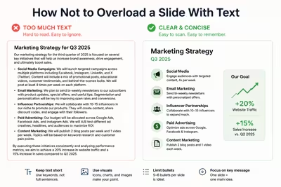
Practical ways to cut text from your slides without losing meaning — covering hierarchy, pacing, and what to move to speaker notes instead.