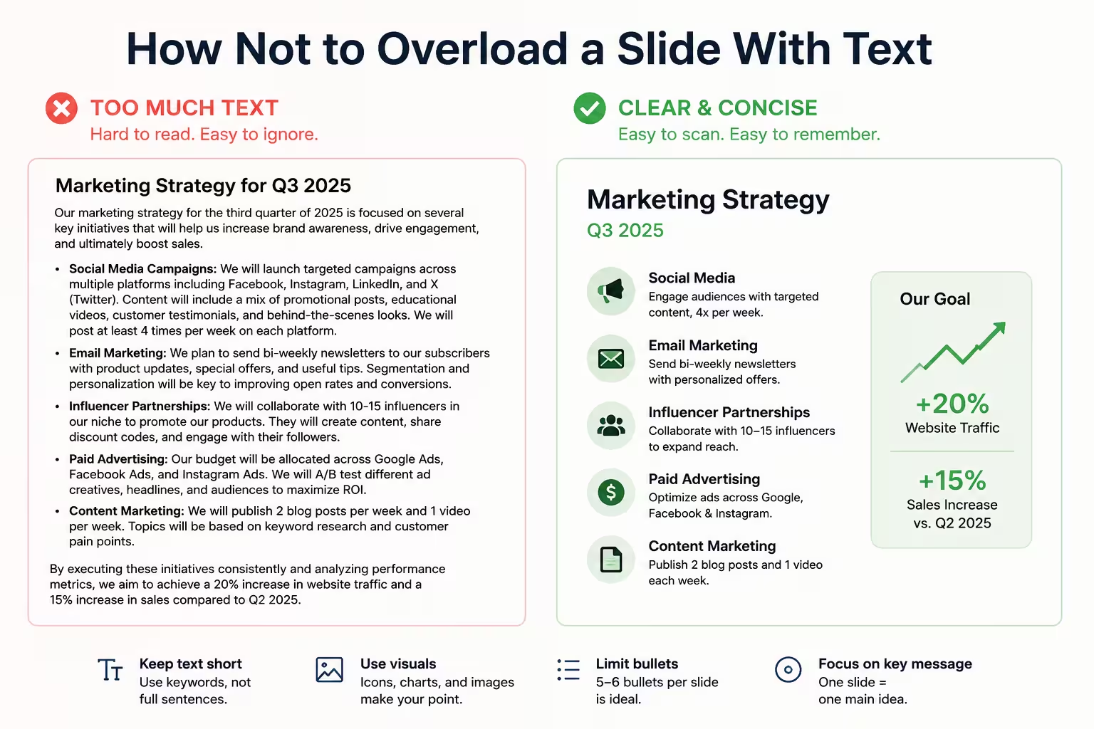
I've lost count of how many decks land on my desk with a full paragraph crammed into a single slide, font size shrunk down to 10pt just to make it "fit." It's almost never because the person doesn't know better. It's because they're scared of leaving something out.
That fear is the actual root of the problem — not a lack of design sense. Once you treat it as a fear-management issue instead of a formatting issue, the fixes get a lot more obvious.
The slide isn't the document
One thing people overlook: a slide and a leave-behind document are not the same object, even though most decks get built as if they were. If your slide has to survive on its own, without you standing next to it explaining anything, it's not a presentation slide anymore — it's a report page with a 16:9 aspect ratio.
Presentation slides are meant to support a speaker. That means the slide can be incomplete. It can say less than you know. What's missing from the slide is supposed to live in your mouth, not in a text box. If you're not going to be there to say it, you don't need a slide — you need a one-pager, and that's a different design problem with different rules.
One idea, one slide
I wouldn't recommend trying to fit a claim, three supporting reasons, and a caveat all on the same slide. That's four ideas, and an audience can really only hold one main idea per slide at a glance.
If you find yourself writing "and" or "also" in a bullet point, that's usually a sign the content wants to split into two slides, not squeeze onto one. Splitting a dense slide in half often makes the deck feel more thorough, not less — because now each idea gets a beat instead of getting skimmed.
Cut sentences down to labels
Full sentences on slides do a strange thing: they make people read instead of listen. As soon as there's a complete sentence on screen, most of the room switches into reading mode, and reading and listening to you talk at the same time doesn't work well — people either tune you out or skim past the point you're mid-sentence on.
Try converting sentences into labels or fragments:
- "Our onboarding process takes too long and causes drop-off" becomes "Onboarding: too slow, losing users"
- "We recommend increasing the marketing budget in Q3" becomes "Q3 budget: increase"
It reads faster, and — this is the part people don't expect — it usually forces you to actually know your material better, because you can't lean on the full sentence as a crutch while presenting.
Use hierarchy instead of density
Not all text on a slide carries equal weight, but a lot of slides are formatted as if it does — same size, same weight, same color, top to bottom. That flattens everything into noise.
A simple hierarchy fix: pick one headline-level statement per slide, and let everything else visually recede — smaller, lighter, or grouped under it. The eye needs somewhere to land first. Without that, an audience spends the first five seconds of every new slide just figuring out where to start reading, which is five seconds they're not listening to you.
Move detail to speaker notes, not the slide margins
In my experience, the instinct to "just make the font smaller" or "add it in a corner" almost never works. If the detail matters, put it in speaker notes or an appendix slide the audience never sees unless someone asks. If it doesn't matter enough for that, it probably didn't need to be on the slide at all.
This is uncomfortable for a lot of people building decks, because it feels like deleting work. It isn't. The research and thinking still shaped the slide — it's just not all sitting on the surface anymore.
A quick gut-check before you finalize a slide
A few questions worth running through on any slide that feels crowded:
- Could I present this slide with the text hidden, just from memory?
- Is there more than one idea competing for attention here?
- Would this line make sense to someone skimming it in two seconds?
- Is anything here just there because I was afraid to cut it?
If a slide fails more than one of those, it's probably not ready — not because the design is ugly, but because it's still doing the job of a document instead of a slide.
Where teams usually go wrong (and how to catch it)
The overload problem rarely shows up on slide one. It creeps in around slide 15, once the deadline is closer and there isn't time to restructure — so instead of splitting content, people just add another line to an existing slide. It's worth a pass near the end of any deck build specifically looking for slides that have grown since the first draft. Those are usually the ones that need trimming most.
Hypothetically, imagine a strategy deck where the "market analysis" slide started with three bullets and quietly grew to nine over a week of edits, each one added by a different stakeholder wanting their point included. Nobody removed anything along the way. That's not a hypothetical failure of design skill — it's a process failure, and it's fixable with a simple rule: every addition to a slide requires someone to also propose a cut.
If your next deck feels heavy, don't start by shrinking the font. Start by asking which slides are actually trying to be documents in disguise — and let those become documents instead.
Comments (0)