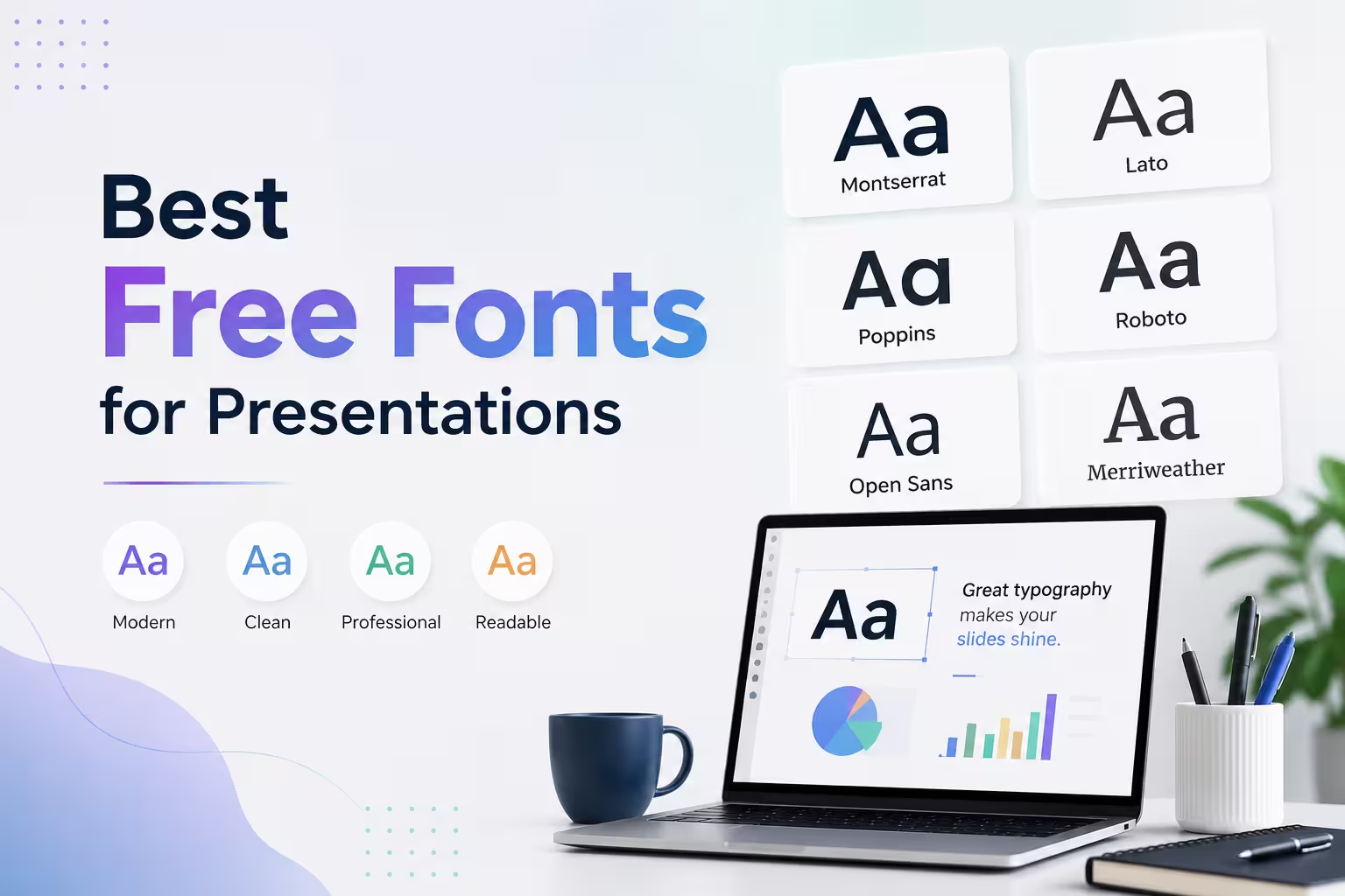
Open ten random decks from your company drive and count how many use Calibri. I'd bet on eight. Not because Calibri is bad — it's fine, actually — but because nobody stopped to ask whether a better free option existed. It usually does.
Font choice is one of those decisions that feels cosmetic until a slide is projected onto a screen twelve feet wide and the client in the back row squints at your body text. At that point, typography stops being a design opinion and becomes a legibility problem. The good news: you don't need a paid license to fix it. Several of the strongest presentation fonts available right now cost nothing and are cleared for commercial use.
Why Most Default Fonts Fall Short on Slides
Word processing fonts and presentation fonts are optimized for different distances. A font that reads comfortably at 11pt on a printed page can turn muddy at 24pt on a projector, especially once you factor in a dim conference room or a webcam compressing your screen share.
In my experience, three things separate a font that works on slides from one that doesn't:
- Open counters — the enclosed spaces inside letters like "a," "e," and "o" need room to breathe, or the text blurs together at a distance.
- A tall x-height — lowercase letters that are proportionally larger stay legible even when shrunk to fit a crowded slide.
- Consistent stroke weight — fonts with dramatic thick-thin contrast (many serif faces) can look elegant in print and shaky on a screen.
This is why so many strong presentation fonts are grotesque-style sans-serifs. They were built for signage and interfaces first, which happens to be exactly the use case a slide deck shares.
Sans-Serifs Worth Actually Using
Inter is probably the safest recommendation on this list. It was designed specifically for UI and screen legibility, has an enormous range of weights, and includes tabular figures — genuinely useful if your deck has any data tables. It's become a bit of a default in tech decks lately, which is the one knock against it: it can read as slightly generic if the rest of your deck doesn't do much visual work either.
IBM Plex Sans is the one I'd point beginners toward. It has more personality than Inter without sacrificing clarity, and the full Plex family (Plex Sans, Plex Serif, Plex Mono) pairs cleanly if you need a monospace font for code snippets or technical specs.
Archivo deserves more attention than it gets. It's geometric, slightly condensed, and holds up extremely well in headlines — I've used it for conference-style title slides where you want something confident but not shouty.
Manrope and Space Grotesk both lean modern and slightly quirky. Manrope is quieter and works well as body text; Space Grotesk has more character in its letterforms and reads better at large sizes, so it suits headers more than paragraphs.
Public Sans, from the U.S. government's design system, is unglamorous in the best way. It was built for accessibility compliance, which means it was stress-tested for legibility far more rigorously than most commercial fonts ever are. One thing people overlook: government and civic design systems are an underused source of genuinely solid, battle-tested typefaces.
When You Want Something Less Neutral
Not every deck needs to look like a SaaS landing page. If you're presenting something with more editorial or creative energy — a brand pitch, a portfolio review, a keynote — a few options break from pure neutrality without becoming illegible:
Fraunces is a serif with enough personality to anchor a title slide, though I wouldn't recommend it for body copy at small sizes — the optical-size variants matter here, and if your software doesn't support variable fonts properly, it can look uneven.
Sora has rounded terminals and a slightly friendly feel, which suits decks aimed at consumers rather than enterprise audiences.
Karla is a good middle ground: humanist enough to feel warm, structured enough to stay professional.
Pairing Fonts Without Overcomplicating Things
A common mistake I see, especially from people newer to deck design, is treating font pairing as an opportunity to use three or four typefaces. Two is almost always enough — one for headers, one for body text, and occasionally a third for captions or data labels if you're building something dense.
A safe formula: pick a header font with more character (Space Grotesk, Archivo, Fraunces) and a body font that's quietly excellent (Inter, Public Sans, IBM Plex Sans). If in doubt, use the same font family for both and lean on weight and size to create hierarchy instead. It's a less interesting choice, but it's a much harder one to get wrong.
Licensing: The Part People Skip
Almost everything mentioned above is available through Google Fonts, which means it's free for commercial use, embeddable, and doesn't require attribution. That said, always check the license file for the specific version you're downloading, especially if you're sourcing it from a font marketplace rather than Google Fonts directly — terms can vary by distributor even for the same typeface family.
If your presentation software doesn't support custom font embedding (this trips people up more than it should), check whether it can export to PDF with fonts embedded, or confirm the font is installed on whatever machine will actually be running the show. A perfectly chosen typeface does nothing for you if the projector laptop swaps it out for Arial the moment you walk into the room.
If you're rebuilding a deck this week, try this: swap your current font for one of the sans-serifs above, keep everything else the same, and look at the difference from across the room. Most people notice it before they can articulate why.
Comments (0)