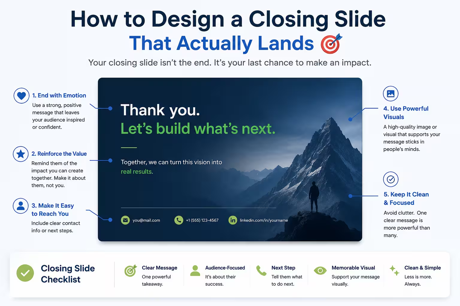
I've sat through hundreds of decks where the presenter nailed the opening, kept the middle tight, and then... the last slide was just a logo and a "Thank you" in size 60 font. Nothing wrong with that, exactly. It's just a wasted opportunity.
The last slide is the one people remember longest, purely because of where it sits. Recency does a lot of work in how an audience recalls a presentation. And yet it's usually the slide that gets the least design attention — often built in the last five minutes before a meeting, almost as an afterthought.
What the Last Slide Is Actually For
Before touching layout or color, it helps to be clear on the job of this slide. It's rarely just "closing." Depending on the presentation, it needs to do one (or a mix) of these things:
- Reinforce the single idea you want remembered
- Prompt a specific action (approve, reply, schedule, sign)
- Provide contact details in a usable, not decorative, way
- Leave a visual anchor that ties back to your opening
One thing people overlook: the last slide should almost never introduce new information. If there's a new stat or a new argument on your final slide, it probably belongs two slides earlier.
"Thank You" Is Not a Message
I wouldn't recommend ending on a bare "Thank You" slide if you can help it — not because it's rude, but because it's a missed beat. The audience's attention is still there for another five to ten seconds. Use it.
Compare these two approaches, both hypothetical:
- Version A: "Thank you." Logo. Email address.
- Version B: "Here's what changes if we move forward this quarter" — followed by the one number or outcome you most want remembered, plus contact details.
Version B isn't harder to build. It just requires deciding, before you design it, what you actually want people to walk away with.
Match the Slide to the Type of Presentation
A sales pitch, an internal status update, and a conference talk all need different closing moves. Treating them the same is a common mistake.
Sales or investor decks usually need a clear next step: a date, a decision, a specific ask. Vague endings like "Let's discuss" tend to stall momentum rather than build it.
Internal or status presentations often do better with a summary slide — three lines, no more, showing what was decided and what happens next. Nobody needs persuasion at this point; they need clarity.
Conference or keynote talks can close on something more memorable — a quote, a striking visual, a single sentence. There's more room for a stylistic flourish because there's no immediate decision being requested.
Keep the Visual Language Consistent With the Opening
In my experience, one of the simplest ways to make a deck feel intentional rather than assembled is to visually bookend it. If your opening slide used a particular color block, icon style, or layout grid, echo it on the last slide. It doesn't need to be identical — a variation is often more effective than a repeat — but the visual thread should be recognizable.
This is a small detail, and it's easy to skip when you're rebuilding a deck under time pressure. But it's also one of the cheapest ways to make a presentation feel designed rather than patched together.
Don't Overload It
The instinct to add "just one more thing" is strong on the final slide — a QR code, three social handles, a legal disclaimer, a secondary CTA. Resist most of it. A closing slide with five competing elements usually communicates less than one with a single clear message, simply because attention has nowhere to land.
If you genuinely need multiple pieces of information (contact, next steps, and a resource link, say), give them a clear hierarchy — one primary element, the rest smaller and secondary. Don't give them equal visual weight just because they're all technically important.
A Practical Layout Habit
When I'm building a closing slide, I tend to work backward from one question: if someone screenshots only this slide and shares it with a colleague who wasn't in the room, does it still make sense on its own? If the answer is no, the slide is probably too dependent on what was said out loud, and it's worth tightening.
That test alone catches a surprising number of weak closings — the ones that rely on the presenter's spoken words to land, rather than standing on their own.
Where This Fits in the Bigger Picture
None of this replaces having a strong middle section or a clear argument earlier in the deck. A good last slide can't rescue a weak presentation. But a rushed one can undercut a strong one — it's the difference between an audience leaving with a clear takeaway and an audience leaving with a vague sense that it's over.
Next time you're finishing a deck, try building the last slide before the rest of the middle content. It forces you to know what you're building toward — and it usually makes everything before it a little more focused too.
Comments (0)