Why Professional PowerPoint Templates Often Make Presentations Look the Same
The reason your templated deck feels familiar isn't the template's fault — it's which parts of it you left untouched.
Design tips, tutorials, product updates, and industry insights.
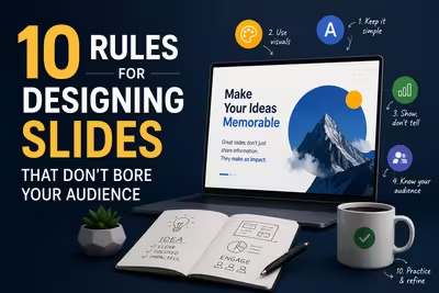
Tired of blank stares during your presentations? These 10 practical slide design rules help you keep attention without gimmicks or clutter.

Learn what separates pitch decks investors fund from ones that get ignored — structure, pacing, and the slides founders usually get wrong.
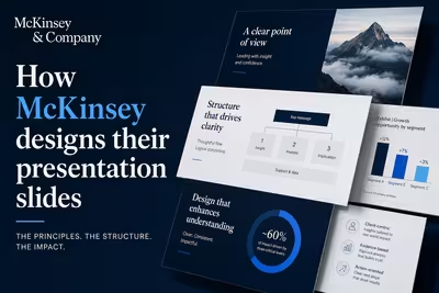
McKinsey's slide design isn't about polish — it's a structured argument system. Here's how the Pyramid Principle actually works in practice.

The reason your templated deck feels familiar isn't the template's fault — it's which parts of it you left untouched.
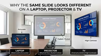
Your deck looked perfect on your laptop — then the room's projector made your brand blue look teal and your dark slide look grey, and here's the actual reason why.
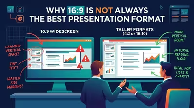
Widescreen became PowerPoint's default the moment nobody had to ask for it anymore — which is exactly why so few people stop to check if it still fits.
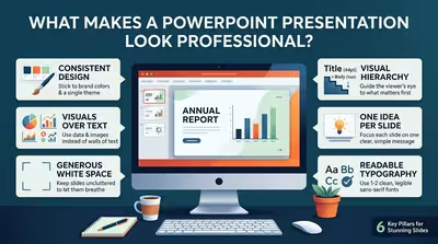
It's rarely the color palette — it's the half-millimeter of misalignment nobody consciously notices but everybody feels.
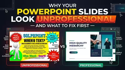
It's rarely the "wrong" font or color — it's the thing your audience never consciously names.

Amazon banned slide decks from its most important meetings — the reasoning behind that choice says less about PowerPoint and more about what kind of thinking a format can actually hold.
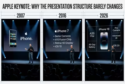
Same three-act shape, different decade, different presenter — here's the structural skeleton Apple never touches, and why.
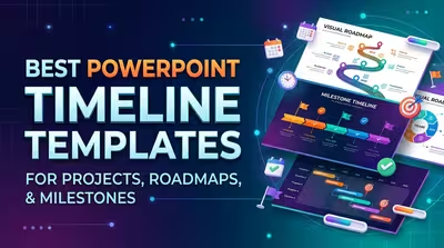
The best PowerPoint timeline template is not simply the prettiest one—it is the layout that matches how your information actually moves through time.

Build a KPI dashboard in PowerPoint that makes performance, targets, trends, and problem areas understandable within seconds.