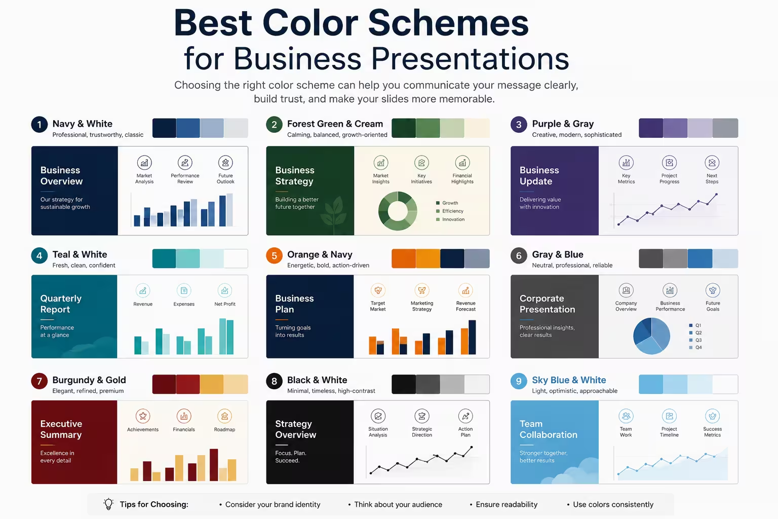
I've sat through enough internal reviews to notice a pattern: the decks that get picked apart aren't usually the ones with weak arguments. They're the ones where the color palette fights the content — a slide with four competing accent colors, text that disappears against a busy background, or a "brand-safe" template stretched so thin it looks like nothing at all. Color is one of the few design decisions that gets noticed even by people who don't think of themselves as visual. They won't say "the contrast ratio is off." They'll just say the deck "felt cluttered" or "hard to follow," and color is usually why.
Why color choice matters more than people think
A presentation's color scheme does three jobs at once: it signals professionalism, it guides attention, and it reinforces hierarchy. Most people only think about the first one — does it look clean, does it match the logo. But the second and third jobs matter more in practice. If every element on a slide is a different color, the audience has no idea what to look at first. If the accent color is used for both the important callout and a decorative divider, it stops meaning anything.
In my experience, teams spend a lot of time debating exact hex values and very little time deciding what the color is actually supposed to communicate. That's backwards. Once you know which element needs to draw the eye, the palette choice gets a lot easier.
The safe, reliable base: neutral background, one accent
For most business contexts — internal reports, client updates, quarterly reviews — the palette that holds up best is a neutral base (white, off-white, or a dark charcoal for a heavier feel) with a single accent color used sparingly. The neutral base keeps text legible and doesn't compete with charts or data visuals. The accent color is reserved for the things you actually want people to notice: a key metric, a call-to-action slide, a highlighted row in a table.
One thing people overlook here is restraint. It's tempting to use the accent color everywhere once it's chosen, because it's "on brand." But an accent that appears on every slide stops functioning as an accent. I'd rather see it used on 20% of a deck and genuinely mean something than used everywhere and mean nothing.
A common, low-risk combination is a near-black or dark navy for text, white or light gray for backgrounds, and a single saturated color — blue, teal, or a muted orange — for emphasis. It's not exciting, but it's dependable, and dependable is usually what a stakeholder deck needs.
Corporate versus creative: how much color is too much
Not every presentation needs to play it safe. A pitch deck for a design agency or a marketing team's internal brainstorm can carry more color without losing credibility — sometimes the color range is part of what's being sold. The mistake is applying that same energy to a finance review or a board update, where a busy palette reads as unpolished rather than bold.
I wouldn't recommend more than two accent colors in a business context outside of data visualization, where color is doing structural work rather than decorative work. Charts are the exception — a well-designed chart might reasonably use four or five colors to distinguish categories, and that's fine, because each color is carrying real information, not just filling space.
Color combinations that consistently hold up
A few pairings show up again and again in professional design work, not because they're trendy but because they're legible and low-risk:
- Navy and warm gold — reads as established and a little more premium than plain blue-and-white
- Charcoal and teal — modern without feeling like it's chasing a trend
- Deep green and cream — calmer, often used where "corporate but not cold" is the goal
- Black, white, and a single bold accent (red, orange, or electric blue) — high contrast, works well for pitch decks that need energy
None of these are rules. They're starting points that reduce the number of decisions you have to make under deadline pressure, which is often when color choices go wrong in the first place.
Accessibility and contrast — the part people skip
This is the section that gets cut when a deck is due in an hour, and it shouldn't be. Low-contrast text — light gray on white, pastel-on-pastel — looks refined on a laptop screen and becomes unreadable projected in a bright conference room. If a client or executive is colorblind (red-green colorblindness alone affects a meaningful share of men), a red-versus-green comparison chart with no other visual distinction can genuinely fail to communicate.
The fix isn't complicated: keep body text at a strong contrast ratio against its background, and when color is carrying meaning (good/bad, up/down), pair it with a second cue — an icon, a label, a pattern — so the information doesn't depend on color perception alone.
Matching the palette to the deck's purpose
The same palette doesn't need to serve every use case. A pitch deck is trying to create momentum, so a bolder accent and more visual energy usually helps. An internal operations report is trying to be scanned quickly by people who don't want to be sold anything, so a quieter, more neutral palette tends to land better. A webinar deck sits somewhere in between — enough color to stay visually interesting over 30–40 minutes, but not so much that it's fatiguing on a screen share.
If there's one habit worth building, it's asking "what is this deck actually for" before opening a template, rather than after.
A practical starting point
If you're not sure where to begin, pick one neutral, one accent, and one rule for when the accent gets used — first slide, key data points, and the closing call-to-action, for example. Everything else stays neutral. It's a small constraint, but it does more for a deck's professionalism than most people expect from something as simple as color.
What's the last presentation you sat through where the colors actually made the message harder to follow?
Comments (0)