Most color mistakes in presentations aren't about bad taste. They're about picking colors before deciding what the deck needs to do.
I've sat through decks with gorgeous gradients that made every chart unreadable, and I've seen four-color, no-frills decks land a funding round because the colors did exactly one job: guide attention. Color in a presentation isn't decoration. It's a functional layer, the same way spacing or font size is. Once you treat it that way, most of the confusing advice out there (matching brand palettes, "use no more than 5 colors," warm vs. cool psychology) starts to make more sense — because you can weigh it against what the slide actually needs.
Start With Function, Not Aesthetics
Before opening a color picker, ask what color needs to communicate in this specific deck. A sales deck needs color to build trust and highlight a call to action. An internal ops report needs color to make anomalies in data pop instantly. A conference talk needs color that stays legible on a projector in a half-lit room with a laptop screen that's been color-shifted for three years.
These are different jobs. A palette that's perfect for one will actively hurt the other. I wouldn't recommend picking a "presentation color scheme" off a design blog and reusing it everywhere — that's how you end up with decks that look nice in isolation but say nothing about the content.
Build From a Base, Not a Rainbow
A workable structure that holds up across most business presentations:
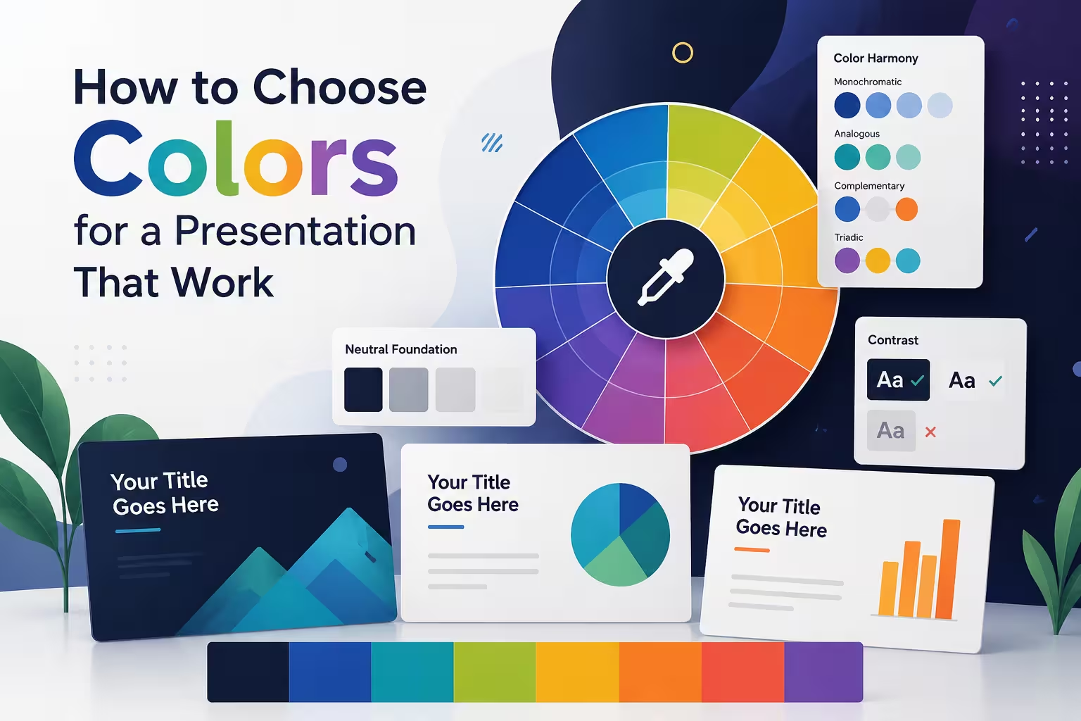
- One dominant neutral (background) — usually white, near-white, or a dark charcoal, not pure black
- One primary brand or theme color — used for headers, key shapes, and emphasis
- One accent color — reserved for the thing you want people to notice first (a highlighted bar in a chart, a CTA button, a warning)
- One or two supporting neutrals — grays for secondary text, muted lines, and de-emphasized data
That's it. Four to five colors, most of the time. Anything beyond that and you're usually compensating for a lack of hierarchy rather than adding clarity. In my experience, decks that "need" eight colors usually need better slide structure, not a bigger palette.
Contrast Is Not Optional
This is the one rule I won't bend on: text and background need enough contrast to be read from the back row, on a bad projector, by someone glancing at their phone half the time. Light gray text on white looks refined on your laptop screen and disappears entirely on a conference room screen.
A simple gut check — if you have to squint at your own monitor to confirm the text is legible, it will fail in the room. WCAG contrast guidelines exist for web content, but the underlying principle applies directly to slides too: don't rely on subtlety where legibility is required.
Color Psychology Is Real, But Overrated as a Starting Point
Blue reads as trustworthy and calm. Red signals urgency or risk. Green suggests growth or approval. This is true, broadly, across a lot of design research — but it's not where you should start, because context overrides psychology almost every time. Red in a financial report usually means "loss." Red in a brand deck for a company whose logo is red just means "on brand." One thing people overlook is that psychology only works when it's not fighting the audience's existing associations with your industry, your brand, or the data itself.
Use color psychology as a tiebreaker, not a foundation.
Data Visualization Has Its Own Rules
Charts are where color choices get punished fastest, because the audience is trying to extract meaning, not just impression.
- Use a single hue with varying opacity or shade for sequential data (low to high)
- Use genuinely distinct hues only when categories are truly separate and comparable
- Never rely on red/green alone to signal good/bad — colorblindness affects a meaningful share of any audience, and red-green is the most common form
- Keep the "hero" color for the one data point you want remembered, and mute the rest
I've reworked decks where every bar in a chart was a different bright color "for visual interest," and the presenter had to verbally explain what each one meant. If a legend is doing more work than the chart, the coloring failed.
Consistency Beats Cleverness
A palette that repeats predictably across 20 slides reads as more professional than one that varies "for creativity" slide to slide. Once you've decided what blue means (say, "primary data" or "our company"), don't let a different blue mean something else three slides later. Small inconsistencies — a slightly different shade of the same accent color, a chart that suddenly uses a new hue — register subconsciously as sloppiness even when the audience can't name why.
This is also where templates earn their keep. Locking your palette into master slides or a shared style guide removes the temptation to "just try something different" mid-deck under deadline pressure.
Test It the Way It'll Actually Be Seen
A palette that looks balanced on a color-calibrated laptop screen can shift noticeably on a projector, especially older ones that wash out saturation. If the stakes are high — an investor pitch, a board presentation — view the deck on the actual hardware beforehand, or at minimum on a second, uncalibrated monitor. It's a five-minute check that catches problems no color theory can predict.
Color in a presentation should be almost invisible in the sense that no one in the room should be thinking about it. They should just be following the argument, spotting the number that matters, and trusting the design enough not to question it. If your palette is doing that quietly, it's working. If it's the thing people comment on afterward, it's probably competing with your content instead of supporting it.
What's the last deck you saw where the colors actually got in the way of the message?
Comments (0)