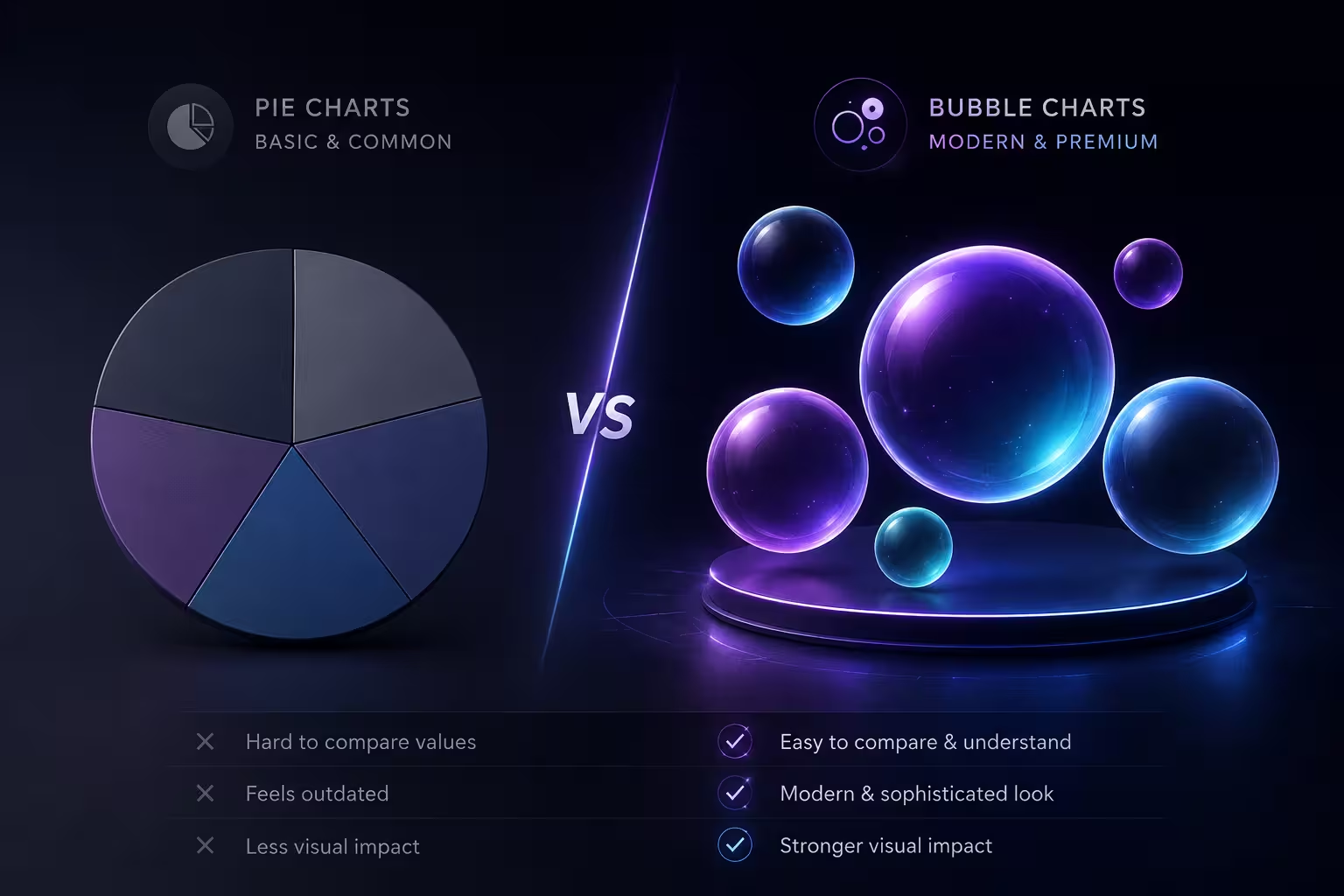
Put a pie chart and a bubble chart on adjacent slides in a deck review and watch what happens: nobody scrutinizes the pie chart's proportions, but three people lean forward at the bubble chart and ask what the size actually represents. That reaction — mild confusion followed by attention — is usually treated as a design failure. In my experience, it's closer to the opposite. The chart that makes people work a little is the one they remember as "high-end." The one that reads instantly gets forgotten five minutes later, right along with its slide number.
That's strange, because if you test the two chart types on pure accuracy, the bubble chart loses.
The uncomfortable part: bubble charts are measurably harder to read correctly
A pie chart encodes value as an angle — how wide a slice is compared to the full circle. A bubble chart encodes value as area, or sometimes radius, which readers then have to translate into area in their heads. Neither is a great way to communicate a number, but they're not equally bad. Cleveland and McGill's 1984 study on graphical perception ranked how accurately people judge different visual encodings, and found that people read position and length far more precisely than angle, and read angle more precisely than area. Pie charts sit in the angle tier. Bubble charts sit in the area tier, one step further from accurate. If your only goal is "the audience correctly perceives the numbers," the pie chart — a format most style guides love to hate — technically wins.
So the format that reads as more sophisticated is, by the numbers, the harder one to decode. That's not a coincidence, and it's not really a contradiction either, once you separate two things that get treated as the same question: how accurately something communicates, and how much effort it visibly represents.
Why "harder to decode" reads as "worth more"
A pie chart is something everyone has built in five minutes inside default Excel settings. There's no visible decision-making in it — the software drew the slices, you didn't. A bubble chart, even a simple one, implies somebody chose an x-axis, a y-axis, and a third variable to represent as size, then had to work out where each dot actually belongs. The chart looks like the output of analysis rather than the output of a formatting menu, and audiences pick up on that difference without being able to articulate it.
This is the part most articles skip past on the way to a template recommendation: the "expensive" feeling isn't really about the circles. It's about what building a bubble chart implies you had to think through. A pie chart with six slices communicates "I have a breakdown." A bubble chart communicates "I have a dataset with structure," which is a more impressive claim even when the underlying numbers are just as thin.
Except that impression only survives contact with a small number of bubbles
Here's where the premium feeling has a ceiling most people don't notice until they've hit it. Pie charts fail visibly once you add too many slices — past six or seven, the thin ones become unreadable and everyone can see it happening. Bubble charts fail less visibly and more expensively: past a certain density, circles start overlapping, small bubbles hide behind big ones, and the eye can no longer compare more than three or four sizes at once without a legend and a magnifying glass. The chart still looks sophisticated in a thumbnail. It stops working the moment someone in the room actually tries to compare bubble four to bubble eleven.
I wouldn't build a bubble chart with more than about eight to ten data points on a single slide unless the size variable is genuinely secondary to the x/y position — a case where readers are mainly comparing clusters, not individual bubble sizes against each other.
Where the premium read is actually earned, not borrowed
A bubble chart genuinely does something a pie chart can't: it shows three variables in one image — position on two axes plus size as a third dimension. Market share by region (x), growth rate (y), and revenue (bubble size) is a real three-variable relationship, and no pie chart, however cleverly nested, communicates that in one glance. In that situation, the bubble chart isn't performing sophistication, it's delivering it. The visual is earning its cost.
The trap is reaching for a bubble chart when you only have one variable — market share by category, say — and using size instead of a bar or a pie purely because it photographs better in a deck screenshot. That's the version where the "expensive" look is decoration wearing the costume of analysis, and it tends to fall apart the moment someone asks a follow-up question the chart wasn't built to answer.
When the pie chart is still the correct, if less flattering, choice
None of this is an argument for retiring pie charts. If you genuinely have two or three categories and the point of the slide is "this one thing is most of the total," a pie chart states that in half a second, which is exactly the job. Swapping it for a bubble chart to look more rigorous, when there's no second or third variable to justify the format, adds a decoding step for no informational gain — the audience now has to work harder to learn less.
The same logic shows up in other chart pairs, not just this one — the standard "bars for categories, lines for trends" rule has its own exceptions once the data gets sparse or dense enough, which is worth knowing if you're rethinking more than one chart type in a deck.
A rough way to decide, instead of defaulting to whichever looks nicer
- One variable, few categories, the point is "this is most of the total" — pie chart, and don't apologize for it.
- Two or three variables that genuinely relate to each other (position plus size, or position plus color) — bubble chart, sized to under ten data points per slide.
- One variable with more than seven or eight categories — neither; consider a sorted bar chart instead.
- You're choosing bubbles purely because the slide "needs to look more analytical" — that's the moment to stop and check whether a second variable actually exists in your data, or whether you're about to hide a simple number behind an unnecessary decoding step.
If a pie chart genuinely covers your case, a set of pie chart templates built with cleaner proportions than the default software output will usually close most of the visual gap without adding a variable you don't have. For decks that do have a real second or third variable to show, the broader PowerPoint chart template library covers bubble and scatter layouts built for exactly that structure.
Next time a bubble chart earns a nod of approval in a review, it's worth asking what it's actually being praised for — the data relationship it's showing, or the extra half-second it took someone to read it.
Comments (0)