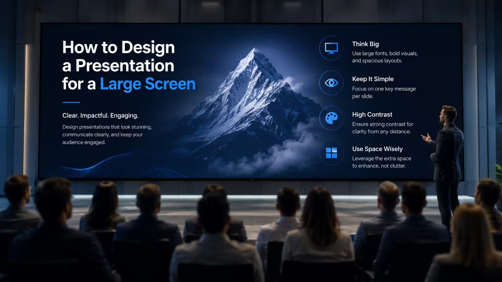
I once watched a presenter open her deck on a 75-inch boardroom display five minutes before a client pitch — and watch the right third of every slide disappear behind the TV's bezel. The file was fine. The laptop preview was fine. The screen just didn't show what she thought it would show. That gap between "looks right on my screen" and "looks right on the screen" is where most large-screen presentations quietly fall apart, and almost none of the fixes are about font size.
The screen isn't the problem — the mounting is
Most consumer and commercial TVs apply overscan: they crop a small margin off every edge to hide signal noise from old analog broadcasts, a habit the hardware never fully dropped even in the HDMI era. Some displays let you disable it in settings; plenty don't, or the setting is buried in a menu nobody in the room knows how to reach. If your title, page number, or a critical data label sits within about 5% of any slide edge, there's a real chance it gets clipped on someone's TV even though it renders perfectly on your laptop and in the file preview.
The practical fix isn't "add more padding everywhere" — that just shrinks your usable canvas for no reason on displays that don't overscan. It's building a safe margin into your master slide only for elements that would actually break the design if cropped: titles, key numbers, logos. Body text that runs slightly into the margin usually survives; a chopped-off percentage sign in a headline number does not.
Aspect ratio math gets stranger on shared displays
16:9 is the safe default, and if you're presenting on a laptop, a projector, or a standard conference TV, that's the end of the conversation. It stops being the end of the conversation the moment the room has an LED video wall, a curved display, or a dual-screen setup split across two TVs — increasingly common in modern boardrooms and hybrid meeting spaces.
Those displays often run at non-standard ratios (21:9, or two 16:9 panels bridged into one ultra-wide canvas), and the room's AV system usually handles the stretch automatically. That's the part that catches people off guard: automatic scaling doesn't mean correct scaling. Circular logos become ovals, evenly spaced icons drift apart unevenly, and grid layouts that felt balanced on a normal screen start looking subtly off in a way that's hard to name but easy to notice. If you know in advance the room has a non-standard display, it's worth asking the AV contact whether the system stretches, crops, or letterboxes 16:9 content — the three behave completely differently, and only one of them keeps your layout intact.
Font size is the wrong first question
Ask most people how to make text readable on a large screen and they'll say "make it bigger." That's true, but it's the second decision, not the first. The first is contrast, and specifically contrast under the room's actual lighting — not the lighting in your home office when you designed the deck.
A slide with pale gray text on white looks clean and modern on a calibrated laptop screen at your desk. Put it on a boardroom TV with afternoon sun coming through a window wall, and that same slide can go nearly illegible from six feet away, regardless of point size. I wouldn't recommend judging contrast decisions from a design screen at all if the venue has uncontrollable light — judge them from a phone photo taken in bright light, which exposes weak contrast far faster than staring at your monitor does. Font size then does the rest of the work: a common practitioner heuristic in AV and events work is that if the farthest viewer sits beyond roughly eight times the screen's height, everything needs to scale up accordingly — not a formal study, just a working rule that holds up in practice.
What actually changes when you switch from laptop to display
Here's the part that surprises people who've mostly presented on their own laptop screen: video and animation are often the first thing to break, not text. Embedded video that plays smoothly on your machine can stutter over an HDMI extender or a wireless casting dongle, especially in older conference rooms running signal over long cable runs. Custom fonts you installed locally may silently fall back to a system default the moment the file opens on a different machine connected to the display — same layout, different font, different line breaks, different overflow.
There's also a mode setting that trips up more presentations than any design choice: extend versus mirror. Extend treats the large screen as a second monitor, which is what lets presenter view and speaker notes work — but if you build your slides assuming mirror mode and the room is set to extend, your actual output on the big screen may not be what's on your laptop at all. This is worth checking with whoever runs the room's AV, not assuming.
Testing on your own screen tells you almost nothing
The uncomfortable truth is that a deck can pass every design review on a laptop and still fail on-site, because the two environments share almost nothing except the file. Different scaling engine, different color profile, different ambient light, different viewing distance, sometimes a completely different aspect ratio. None of that shows up until the file is actually open on the real hardware.
If you can get even five minutes in the actual room — or on the actual model of display, if it's a recurring venue — that's worth more than another hour of polishing the deck on your laptop. Load the real file, stand at the back row, and look at it the way your worst-positioned audience member will. It's a small step that gets skipped constantly, usually because it feels like a formality rather than a design decision. It isn't. For decks going into recurring formats like timeline or roadmap layouts, or ones built from templates with pre-set masters and slide sizing, this check is faster — the structural risk is already reduced — but it's still worth the five minutes.
The next time a deck looks perfect on your laptop, treat that as a starting point, not a finish line. The screen it's actually going to live on has its own opinion about your slides — cropping, scaling, lighting, all of it — and that opinion is the one that counts in the room.
Comments (0)