Analysis PowerPoint Diagrams
This collection contains analysis diagram slides designed to turn raw numbers into executive-ready visuals. A financial analyst preparing the quarterly performance review or a strategy consultant mapping market entry risks opens these files because the chart frameworks and color logic are already locked to corporate standards.
Instead of rebuilding the same funnel or SWOT layout every quarter, you simply update the data cells and the entire narrative stays consistent. The slide master carries the brand palette so no slide ever drifts off-message.
Select the diagram pack that fits your current project and begin editing.
 (1029)
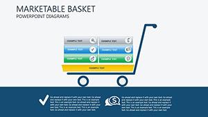
 Marketable Basket PowerPoint Diagrams: Download PPTXID: #PD00139$25.00
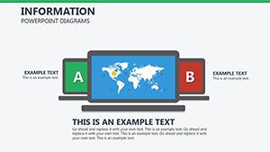 (35)
(35) Information PowerPoint Diagrams: Clarity in Every CurveID: #PD00205$22.00
 (835)
Marketing Strategy PowerPoint Template PPTXID: #PD00194$19.00
(835)
Marketing Strategy PowerPoint Template PPTXID: #PD00194$19.00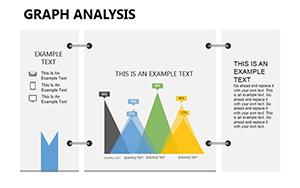 (699)
Graph Analysis PowerPoint Diagrams: Decode Data with Designer FlairID: #PD00185$15.00
(699)
Graph Analysis PowerPoint Diagrams: Decode Data with Designer FlairID: #PD00185$15.00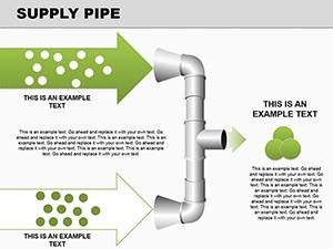 (47)
(47) Supply Pipe 3D Flow Diagrams - Instant DownloadID: #PD00145$22.00
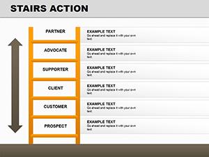 (1064)
Stairs Action PowerPoint Diagrams: 16 Dynamic SlidesID: #PD00141$17.00
(1064)
Stairs Action PowerPoint Diagrams: 16 Dynamic SlidesID: #PD00141$17.00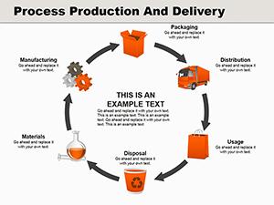 (22)
Process Production and Delivery PowerPoint Diagrams: Transform Your Business NarrativesID: #PD00140$28.00
(22)
Process Production and Delivery PowerPoint Diagrams: Transform Your Business NarrativesID: #PD00140$28.00 (362)
14 Finance Icons Diagrams - Editable PPTXID: #PD00133$14.00
(362)
14 Finance Icons Diagrams - Editable PPTXID: #PD00133$14.00 (539)
(539) Tourist Services PowerPoint Diagram TemplateID: #PD00131$22.00
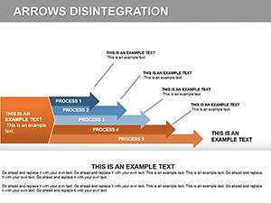 (815)
Arrow Disintegration PowerPoint Diagrams Template: Elevate Your PresentationsID: #PD00123$24.00
(815)
Arrow Disintegration PowerPoint Diagrams Template: Elevate Your PresentationsID: #PD00123$24.00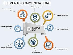 (286)
Elements Communication PowerPoint Diagram: Visualize Data RelationshipsID: #PD00122$19.00
(286)
Elements Communication PowerPoint Diagram: Visualize Data RelationshipsID: #PD00122$19.00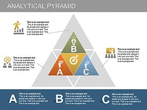 (604)
Analytical Pyramid PowerPoint Diagrams: Master Performance AnalysisID: #PD00121$24.99
(604)
Analytical Pyramid PowerPoint Diagrams: Master Performance AnalysisID: #PD00121$24.99 (382)
3D Cube PowerPoint Diagrams - Editable PPTX | ImagineLayoutID: #PD00117$20.00
(382)
3D Cube PowerPoint Diagrams - Editable PPTX | ImagineLayoutID: #PD00117$20.00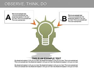 (1148)
Observe, Think, Do PowerPoint Diagrams: Empower Your AnalysisID: #PD00116$16.00
(1148)
Observe, Think, Do PowerPoint Diagrams: Empower Your AnalysisID: #PD00116$16.00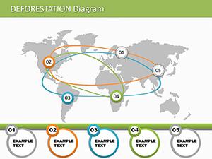 (449)
Deforestation PowerPoint Diagrams: Illustrate Environmental ImpactID: #PD00112$16.00
(449)
Deforestation PowerPoint Diagrams: Illustrate Environmental ImpactID: #PD00112$16.00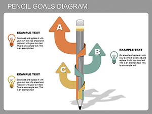 (627)
Pencil Goals PowerPoint Diagram: Fuel Your CreativityID: #PD00111$18.00
(627)
Pencil Goals PowerPoint Diagram: Fuel Your CreativityID: #PD00111$18.00 (71)
Strategic Market Analysis PowerPoint Diagrams: Drive Business GrowthID: #PD00110$15.00
(71)
Strategic Market Analysis PowerPoint Diagrams: Drive Business GrowthID: #PD00110$15.00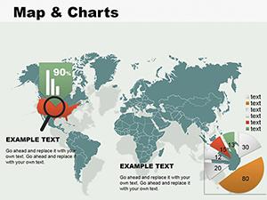 (1064)
Map and Charts PowerPoint DiagramsID: #PD00098$24.00
(1064)
Map and Charts PowerPoint DiagramsID: #PD00098$24.00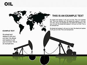 (659)
OIL PowerPoint Diagram TemplateID: #PD00097$19.00
(659)
OIL PowerPoint Diagram TemplateID: #PD00097$19.00
Why Most Analysis Slides Look the Same
Without structure every presenter reinvents the wheel: same arrow style, same three shades of blue, same misalignment between bars. These templates fix the visual language so the audience focuses on the insight instead of the formatting.
What You Lose When You Start Diagrams from Scratch
You spend forty minutes aligning a pyramid, another twenty picking complementary icons, then another thirty making sure every label sits on the same baseline. That is time taken directly from the thinking that actually moves the business forward.
Real Analysis Moments These Diagrams Support
The operations director presents supply-chain bottlenecks to the C-suite. The fishbone diagram already groups root causes by department; he only updates the percentages and the story is ready.
A market-research lead reviews competitor positioning with the board. The radar chart template shows five dimensions at a glance, saving the team from building six separate bar graphs.
A product manager maps feature prioritization in a steering committee. The Eisenhower matrix layout is pre-colored by urgency so stakeholders immediately see trade-offs.
An ESG consultant compiles the annual impact report. The circular process diagram already includes the four pillars; data drops in and the narrative holds together.
How Linked Charts Keep Large Decks Consistent
Paste your Excel range once into the embedded data sheet and every instance of that chart across fifty slides refreshes automatically. Change the brand color on the slide master and the update cascades without touching individual objects.
Non-Obvious PowerPoint Trick for These Files
Select any grouped diagram, right-click and choose "Ungroup" twice. The vector layers separate cleanly so you can recolor a single segment or stretch one axis without distorting the rest. Re-group when finished and the animation settings remain intact.
If you also prepare executive summaries, see our energy and power Word templates for supporting documents or explore cycle PowerPoint diagram templates when your story needs to show repeating processes.
Download the analysis pack that matches your current dataset and finish the deck before the deadline.
FAQ
Are the diagrams compatible with Google Slides?
Most templates import directly; a few complex grouped objects may need one manual ungroup step after import. Once placed, all text boxes and data links remain editable. Test the file in your Google Workspace before the live presentation to confirm animation behavior.
Do the templates support Excel-linked charts?
Yes. Each chart is already connected to an embedded datasheet. Paste your own range, close the sheet and the visuals update instantly across the deck. This works in both desktop PowerPoint and when the file is opened in Microsoft 365 online.
Can I change the entire color scheme in one action?
Open the slide master, select the theme colors and update the six accent swatches. Every diagram on every slide inherits the new palette because the shapes reference those theme slots rather than hard-coded RGB values.
What is the commercial license scope?
The license covers internal company use and client presentations. You may not resell the original PPTX files or include them in a template marketplace. Finished exported PDFs or images are unrestricted.