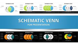
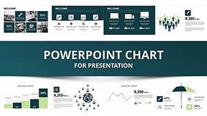
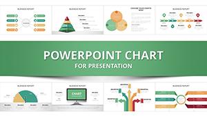
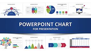
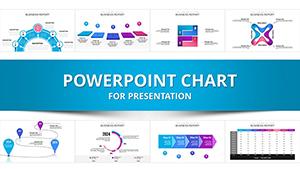
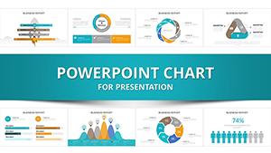
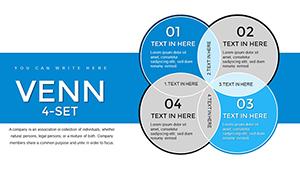
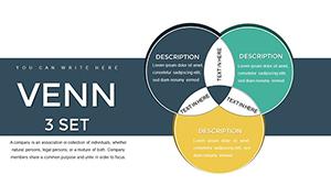
Unlock the power of visual clarity with our comprehensive collection of Venn diagram PowerPoint templates. Perfect for business analysis education or creative brainstorming
Enhance your slides with ready-to-use editable designs that save time and elevate your presentation impact
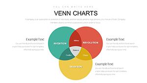
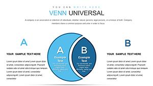
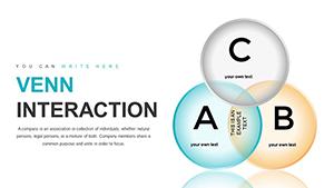
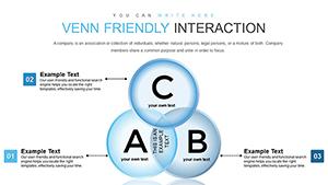
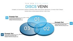
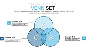
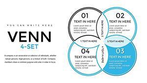
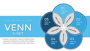
Our templates provide a professional edge over standard diagrams by offering customizable colors layouts and data integration. They are ideal for illustrating relationships overlaps and set comparisons in a visually appealing way.
Real-World Use Cases
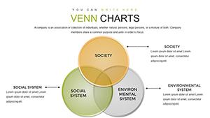
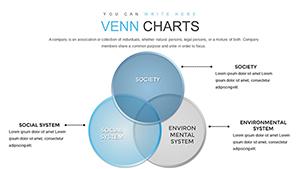
Business Reports: Visualize market segments or competitive overlaps
Education: Simplify complex concepts for classroom explanations
Marketing: Display target audience overlaps or campaign intersections
Benefits vs Default Templates
Unlike default diagrams our Venn templates include editable elements color schemes and multiple layouts. This flexibility reduces design time and ensures professional consistency across presentations
Creative Tips & Best Practices
Use contrasting colors to highlight key intersections
Label each segment clearly for quick comprehension
Combine with icons or images to enhance storytelling
Download today and start creating impactful Venn diagrams that communicate insights effectively
Frequently Asked Questions
Can these templates be edited in PowerPoint
Yes all elements are fully editable including colors shapes and text
Are these templates suitable for education
Absolutely they help simplify complex concepts making them ideal for classroom use
Can I customize colors and fonts
Yes you can fully customize colors fonts and layout to match your branding
Do these templates save time
Yes pre-designed layouts reduce setup and formatting time allowing faster presentation creation