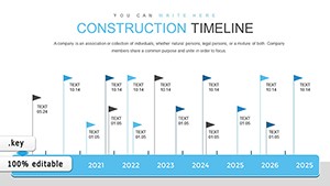
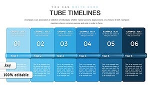
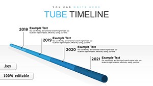
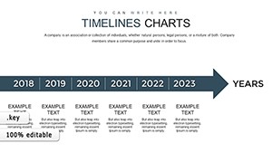
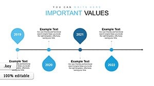
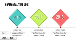
Sequence your stories with our Keynote timeline chart templates, ideal for plotting events, phases, and achievements in a linear narrative. These visuals turn chronological data into engaging roadmaps.
For planners, historians, and coordinators, they provide scalable tracks with markers that adjust to any duration. Tailor durations, labels, and accents in Keynote for personalized timelines that motivate.
Review our gallery for varied styles. Infuse timelines into your decks for compelling progress tales. Initiate exploration immediately.
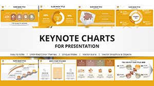
Development Indicators Charts - Fully Editable | ImagineLayout
ID: #KC00387
$16.00
(713)
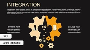
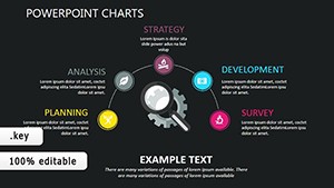
Dark Infographic Mastery: Business Keynote Charts
ID: #KC00364
$14.00
(983)
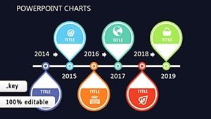
Dynamic Timeline Keynote Charts - Free Download
ID: #KC00363
$14.00
(669)
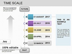
Time Scale Keynote Charts: Mastering Timelines for Business Success
ID: #KC00219
$18.00
(40)
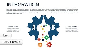
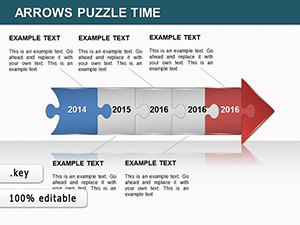
Unlock Architectural Timelines with Puzzle Precision
ID: #KC00214
$20.00
Unlocking Value in Keynote Timeline Charts
Exceeding simple lines, our templates layer milestones with icons and progress bars, narrating journeys richer than plain dates. They flex for short sprints or decade spans.
Anchor with start/end points, spacing evenly for rhythm. Color-code categories - vibrants for highs, neutrals for routines. Add tooltips for details on hover.
Vignette: A firm tracked innovation pipeline via curved timelines, curving breakthroughs, accelerating approvals. Museums narrated exhibits, dating artifacts immersively.
Unconventional Timeline Tactics
Gantt Hybrids: Bar overlays for resource allocations.
Vertical Flows: Portrait orientations for print.
Branching Paths: Decision trees along timelines.
For agile, iterative loops embed feedback cycles. Monthly syncs refresh for currency.
Propel your plans - grab a template for timed triumphs.
Frequently Asked Questions
Discover wavy timelines for non-linear tales or milestone-only dots for high-level scans. Campaigns timeline touchpoints, pacing engagements.
Developers plot releases, versioning increments. Shun overcrowding with phased zooms.
Amplifying Narratives
Sync with calendars for auto-populates, easing maintenance. Fuse with charts for metric-backed progress.
Our timeline trove timelines your successes stylishly.