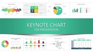
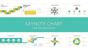
Tables remain one of the most trusted ways to present structured information and when they are designed well they instantly improve clarity credibility and decision making. This collection of Keynote table chart templates is built for professionals who need to present numbers comparisons and structured data without visual noise.
Instead of spending hours aligning rows adjusting spacing and fixing typography these ready to use designs help you focus on insights not formatting. Every table slide is editable scalable and designed to look sharp on large screens and projectors making them ideal for meetings pitches and reports where accuracy matters.
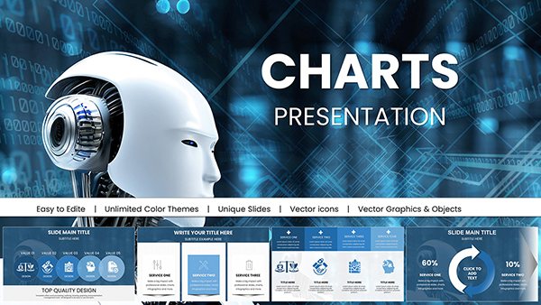
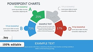
AI-Powered Robot Charts Template: Fuel Your Tech Visions with Futuristic Flair
ID: #KC01054
$20.00
(14)
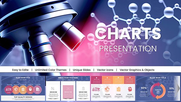
Microbiology Keynote Charts Template
ID: #KC01044
$22.00
(377)
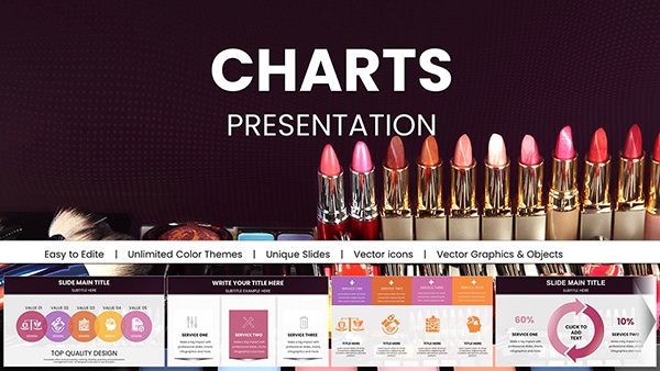
Vibrant Beauty Makeup Cosmetic Keynote Charts for Presentation
ID: #KC01004
$22.00
(490)
Data Financial Keynote Charts Template: Empower Fiscal Storytelling
ID: #KC00973
$20.00
(331)
Travel-Themed Keynote Charts Template: Visualize Adventures with Style
ID: #KC00970
$20.00
(1002)
Eco Sustainable Keynote Charts Template: Green Visuals for a Better Tomorrow
ID: #KC00967
$20.00
(527)
Future Solar Energy Keynote Charts Template Presentation
ID: #KC00966
$20.00
(944)
Hydropower Energy Keynote Charts Template for Presentation
ID: #KC00965
$20.00
(597)
Powerful Wind Energy Keynote Charts Template
ID: #KC00964
$20.00
(591)
Communication Process Chart Keynote Template - Editable Messaging Flow Diagrams
ID: #KC00935
$20.00
(352)
Decode Financials Like a Pro: Financial Statement Analysis Keynote Charts Template
ID: #KC00932
$24.00
(556)
Master Your Finances: Statement of Financial Position Keynote Charts Template
ID: #KC00931
$24.00
(88)
Financial Clarity in Design: Interim Financial Statements Keynote Charts
ID: #KC00919
$22.00
(243)
Business Report Keynote Charts Template: Craft Professional Insights
ID: #KC00887
$15.00
(32)
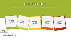
Our Portfolio Keynote Charts
ID: #KC00886
$20.00
(604)
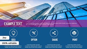
Essential Elements Keynote Charts Template: Visual Mastery Unleashed
ID: #KC00758
$15.00
(1112)
Energy Power Company Keynote Charts: Fuel Your Industry Presentations
ID: #KC00750
$25.00
(1164)
16 Laptop Data Charts - Editable Keynote | ImagineLayout
ID: #KC00649
$15.00
(1145)
Business Model Canvas Keynote - Fully Editable | ImagineLayout
ID: #KC00612
free
(643)
Alternative Solutions Keynote Charts Template: Innovate Your Decision Processes
ID: #KC00531
$23.00
(84)
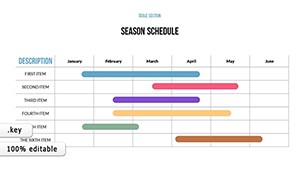
Schedule Keynote Charts Template: Organize with Precision and Style
ID: #KC00515
$18.00
(1175)
Animated Speed Charts for Keynote Pros
ID: #KC00451
$18.00
(418)
User Experience Keynote Charts: Bridging the Digital Divide
ID: #KC00404
$12.00
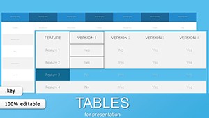
Why Use Keynote Table Chart Templates
Default table styles often look flat inconsistent and difficult to read especially when data grows. Professionally designed table chart templates bring hierarchy spacing and contrast that guide the audience through the numbers. Headers stand out totals are easy to scan and comparisons feel natural.
Designed for Business Academic and Marketing Use
These templates work across industries and scenarios. Consultants use them to compare KPIs and pricing models. Finance teams rely on them for quarterly summaries. Educators present structured lessons and schedules while marketers showcase feature comparisons and performance snapshots.
Financial statements and budget breakdowns
Product comparison tables for pitches
Research data and survey summaries
Training materials and lesson plans
Benefits Compared to Default Keynote Tables
Using prebuilt table chart templates saves time and raises the perceived quality of your presentation. Instead of adjusting column widths and fonts slide by slide you start from a clean structured layout that already follows presentation best practices.
Clear visual hierarchy for faster understanding
Consistent spacing alignment and typography
Easy color customization to match your brand
Optimized for screen and projector readability
Creative Tips for Better Table Slides
Limit the number of columns to what your audience can scan in seconds. Highlight key values with subtle color accents. Use icons or symbols sparingly to guide attention without clutter. When data is dense consider splitting one large table into two focused slides.
For executive presentations pair tables with a short takeaway line above the chart explaining what the numbers mean. This turns raw data into a clear message.
Download professional Keynote table chart templates and upgrade how your data is perceived in every presentation.
Frequently Asked Questions
Are these table chart templates fully editable in Keynote
Yes all tables text colors fonts and layouts can be edited directly in Keynote without additional software.
Can I use these templates for client presentations
You can use them in commercial and client facing presentations according to the license terms.
Do the tables support large datasets
They are optimized for clarity. For very large datasets we recommend splitting content across multiple slides.