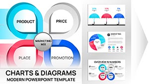
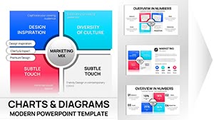
Illuminate your strategic visions through our PowerPoint chart templates. Geared toward teams, analysts, and leaders, these elements decode data into compelling stories. Encompassing org charts to scenario models, they facilitate informed dialogues.
Imagine a waterfall chart cascading revenue streams or a combo line-bar hybrid forecasting synergies - powered by PowerPoint`s robust toolkit. Smart connectors auto-adjust, keeping visuals pristine amid changes.
Essential for remote huddles, report compilations, or investor showcases, they scale across devices. Harness cloud syncing for group inputs. Browse and bolster your presentations today.
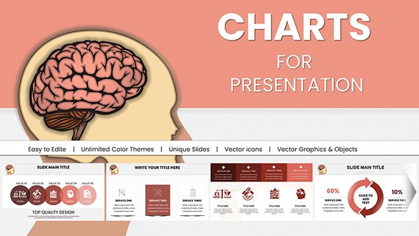
Brain Five Senses PowerPoint Infographics Template
ID: #PC00948
$18.00
(383)
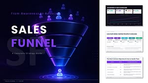
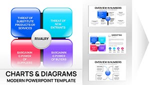
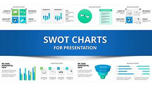
SWOT Analysis PowerPoint Charts Template Download
ID: #PC00296
$20.00
Charts as Catalysts for Strategic Clarity
Our PowerPoint templates embed charts that pulse with relevance, using morph transitions to evolve views fluidly. Segmented colors flag variances, while sparklines in tables add micro-insights.
Executives embed them in dashboards, pulling from Excel for real-time pulses. Consultants animate competitor matrices, sharpening pitches. This interactivity sparks `aha` moments in meetings.
Key Deployment Areas
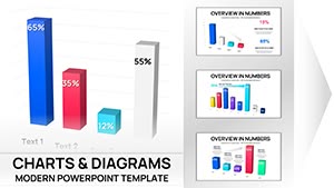
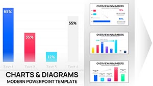
Performance Reviews: Gauge KPIs with donut slices and trend arrows.
Change Management: Adoption curves with milestone markers.
Demonstrating integral roles in decision-making.
Edge Over Stock Graphics
Default inserts feel generic; ours infuse strategy motifs, like pivot icons for agility. This elevates professionalism, with users noting 50% faster assembly via preset formats.
Superior morphing and accessibility tags outshine rivals, ensuring inclusive views. Print exports maintain fidelity for handouts.
Enhancement Techniques
Source Cleanly: Validate data before charting.
Morph Smartly: Link shapes for seamless evolutions.
Label Precisely: Use data labels over legends for directness.
Collaborate Live: Share via Teams for instant feedback.
Refine with these for standout visuals.
Unexpected Chart Uses
Apply to wedding timelines or recipe yield analyses. Charities visualize aid distributions, educators chart learning outcomes. A marketer mapped campaign funnels for ROI stories.