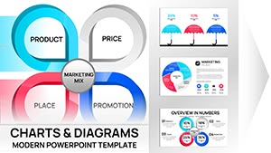
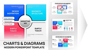
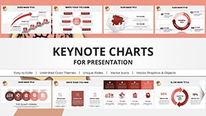
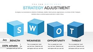
Navigate corporate horizons using our strategy Keynote chart templates. These visual assets are crafted for analysts, managers, and visionaries plotting courses via interactive diagrams. From SWOT matrices to funnel breakdowns, they illuminate paths forward.
Picture a PERT chart animating dependencies or a radar plot pulsing with performance metrics - all within Keynote`s elegant ecosystem. Editable nodes and data links update effortlessly, maintaining accuracy across revisions.
Tailored for strategy sessions, board updates, or pitch rehearsals, they turn numbers into narratives. Compatible with iOS for mobile tweaks, our charts keep you agile. Dive in and download to graph your ambitions.
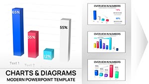
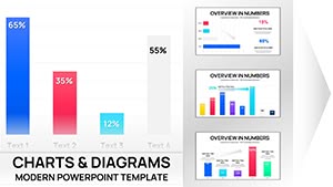
Keynote charts in our templates transcend static images, employing builds that reveal insights layer by layer, mirroring strategic unfolding. Color gradients denote priorities, while tooltips on hover add depth without clutter.
Planners integrate them into master decks, syncing data from Numbers for live updates. Freelancers visualize client journeys, enhancing proposal persuasiveness. This dynamic quality fosters deeper discussions and clearer decisions.
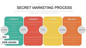
Strategic Scenarios for Chart Deployment
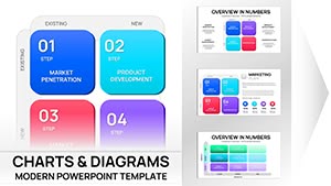
Goal Tracking: Gantt variants for milestone monitoring with progress bars.
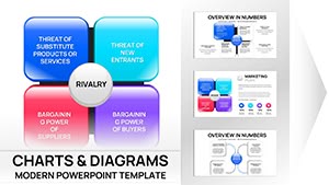
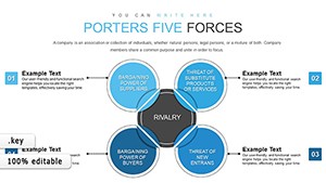
Market Analysis: Bubble plots sizing opportunities by impact and feasibility.
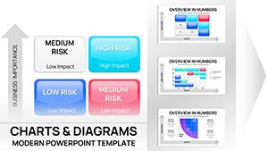
Risk Assessment: Heat maps coloring threats by likelihood and severity.
These illustrate broad utility in planning cycles.
Outpacing Default Chart Makers
Built-in tools lag in customization; ours offer pre-styled series with strategy icons, like arrow clusters for vectors. This specificity halves build time, with vector scalability preventing pixelation on exports.
Compared to web alternatives, native Keynote performance ensures lag-free zooms during demos. Testers report 40% higher engagement from thematic coherence.
Chart Creation Tips
Data Prep: Clean inputs in spreadsheets before linking.
Animation Sync: Time reveals to speech for rhythmic delivery.
Accessibility: Add alt text and high-contrast palettes.
Iteration: Duplicate masters for variant scenarios.
Master these for charts that command attention.
Novel Chart Applications
Repurpose for personal finance waterfalls or fitness progress radars. Nonprofits chart impact metrics for donors, while educators map curriculum linkages. A chef used process flows for menu evolution pitches.
Innovation abounds, turning data into stories.
Plot precisely - download and animate your strategy.