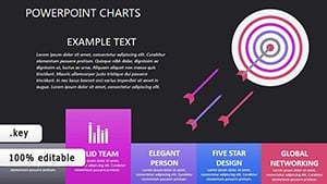
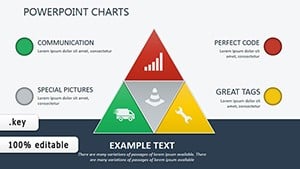
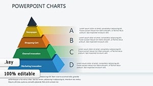
Transform raw data into compelling narratives using our sequence chart templates for Keynote. These specialized charts blend timelines with metrics, perfect for tracking progress, budgets, or performance over time.
Analysts, executives, and consultants appreciate the precision and polish, with built-in scales and labels that update automatically. Customize bars, lines, or Gantt styles to match your data story, all within Keynote`s refined interface.
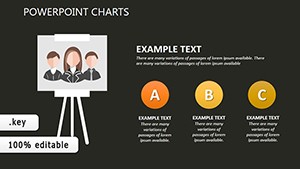
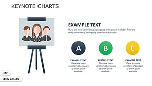
Ideal for quarterly reviews or project updates, they turn numbers into actionable visuals. Explore options from simple progress bars to multi-series trackers.
Start charting your success - browse our Keynote sequence charts today.
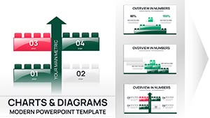

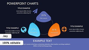
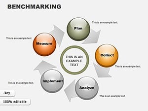
Sequence charts go beyond static graphs by incorporating time-based flows, making trends immediately apparent. Unlike basic Keynote charts, these templates include sequential connectors and milestone markers for holistic views.
Finance teams track ROI sequences; marketers monitor campaign trajectories. In academia, they illustrate experimental timelines. UVP: Auto-scaling axes and theme-sync colors.
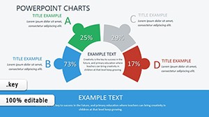
For product managers, sequence feature rollouts with adoption rates. HR uses them for talent pipeline charts. Best practice: Highlight peaks with callouts to focus discussions.
Animations reveal data progressively, building suspense and clarity.
Blend chart types - mix lines with bars for hybrid insights. Import CSV for instant population. Adjust opacity for overlaid sequences.
Examples: A retailer`s seasonal sales sequence or a research grant`s expenditure flow. Enhanced visuals correlate with 50% better decision-making.
Sustainability reports sequence carbon footprint reductions. Fitness apps chart user milestones. Modularity allows for dashboard integrations.
Ensure color-blind friendly palettes; cap series at four. Validate with trend lines. Share via Keynote Live for remote feedback.
Chart your course - select a template and illuminate your data.
Drive decisions with data - download sequence charts and sequence your metrics masterfully.
Copyright © 2009-2026 ImagineLayout All rights reserved.