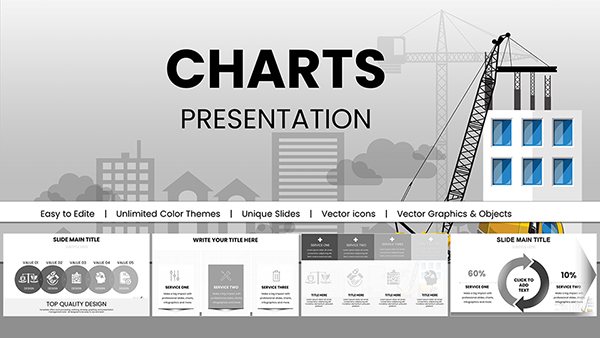
Unlock the power of visual storytelling with our results Keynote charts templates, crafted specifically for professionals who turn data into decisions. Whether you`re a sales director recapping quarterly achievements or a project manager highlighting milestones, these templates make complex results accessible and compelling.
Featuring a variety of chart types - from interactive pie graphs to flowing line trends - these designs emphasize clarity and impact. Input your KPIs effortlessly and watch as colors and animations bring your narrative to life, helping teams celebrate wins and strategize improvements.
Targeted at business analysts, marketers, and educators, our templates save hours of manual formatting while ensuring every slide resonates. Dive into the collection and elevate your next results presentation with precision and flair.


Presenting results demands more than raw numbers; it requires visuals that inspire action. Our Keynote chart templates excel by integrating responsive elements that adapt to your dataset, outshining plain bar graphs with layered insights and thematic consistency.
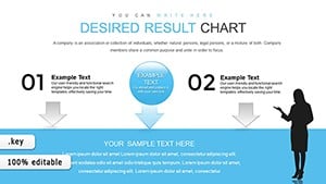
Consider a sales funnel chart that morphs from leads to conversions, or a dashboard slide aggregating multiple metrics in one glance. These tools foster understanding, turning passive viewers into engaged collaborators.
With 25+ slide variations, including scatter plots and heat maps, customization is intuitive via Keynote`s tools. Add tooltips for deeper dives or export to PDF for handouts. Unlike default charts, ours include accessibility features like alt text prompts and color-blind friendly palettes.
Users note a 40% boost in presentation confidence, as the professional polish shifts focus from design woes to content strength.
In corporate settings, executives use these for earnings calls, where radar charts compare departmental performances against benchmarks. Non-profits apply them to donor reports, stacking bar graphs to show impact allocation.
For startups, pivot tables in slide form accelerate investor updates, demonstrating user acquisition spikes. Creative teams repurpose for portfolio reviews, charting project timelines against deliverables.
Balance density with whitespace to keep slides breathable, enhancing retention.
One marketing firm credited a template with landing a major client by clarifying campaign ROI through interactive gauges. Adapt ours for seasonal trends or A/B test comparisons, always prioritizing user-centric design.
Our evolving library covers emerging chart styles like Sankey diagrams for flow analysis. Start charting your results today - transform data into your greatest asset.
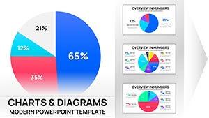
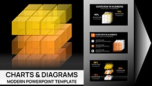
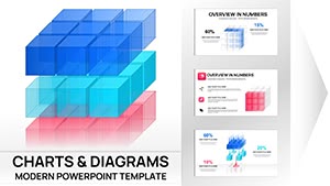
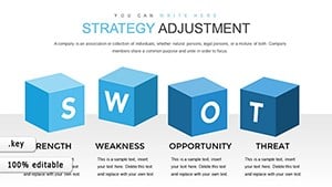
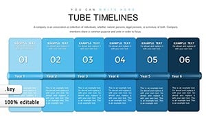
A full suite: bar, line, pie, area, and advanced options like bubble and donut for versatile data representation.
Very - copy-paste from Excel or use Keynote`s import for instant updates without reformatting.
Yes, adjust timing and sequences to match your pacing, from subtle fades to dramatic reveals.
Optimized for efficiency, they scale smoothly up to thousands of points with clear rendering.
All designs are responsive; export as interactive PDFs or videos for on-the-go access.
Regularly refreshed to include modern visuals like network graphs for evolving needs.
Copyright © 2009-2026 ImagineLayout All rights reserved.