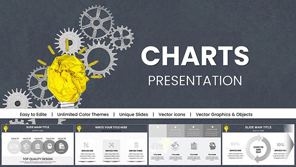
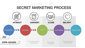
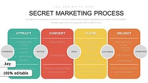
Effective project planning hinges on clear visualizations, and our Keynote chart templates make it effortless. Tailored for managers and coordinators who juggle timelines, milestones, and resources, these designs transform chaotic schedules into streamlined narratives. From Gantt charts that track dependencies to pie charts for budget allocation, every element is built to foster better decision-making.
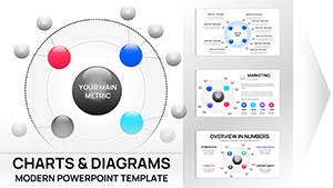
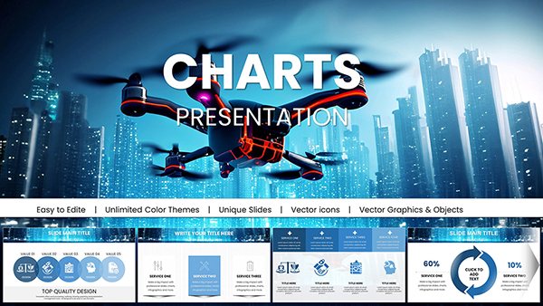
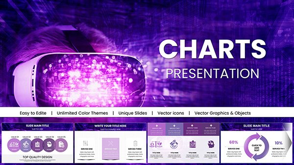
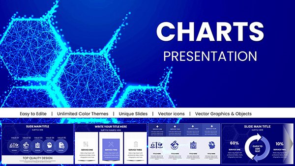
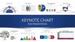
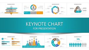
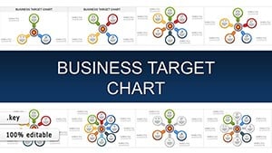
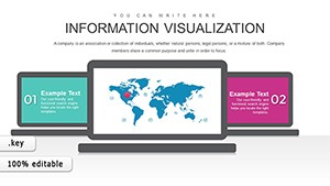
Discover a curated selection of over 40 charts that blend functionality with aesthetic appeal. High-fidelity icons, gradient fills, and responsive layouts ensure your presentations look polished on any screen. Whether outlining phases for a product launch or monitoring team workloads, these tools help you anticipate delays and celebrate progress.
Compatible with Apple`s ecosystem, they leverage Keynote`s smart guides for precise alignment. Ignite your planning process today - browse our collection and chart a course to success.
Unlike basic spreadsheet exports, our charts are presentation-ready with embedded formulas for automatic updates. A Gantt template, for example, links task durations to progress bars, saving hours of manual adjustments. They outperform default Keynote options by offering layered data views - drill down from overview to details seamlessly.
Customization is at the core: swap themes for seasonal reports or industry-specific palettes, all while maintaining data integrity. This level of flexibility turns planning sessions into collaborative triumphs.
In educational contexts, instructors use them for curriculum pacing, while nonprofits adapt for grant timelines. The adaptability shines in hybrid environments, where visual clarity bridges remote gaps.
Begin with audience needs - opt for horizontal Gantts for executive overviews or vertical for detailed dives. Incorporate color thresholds for at-risk items, and pair with annotations for context. Practice exporting to PDF for archival, ensuring fidelity across formats.
Picture a tech startup employing our roadmap chart to secure funding; the visual narrative secured a 20% larger investment. Such stories underscore the power of well-crafted charts in driving outcomes.
Peruse our charts and select one that aligns with your vision. Instant access means you`re planning smarter from the first slide. Grab your template now and lead with confidence.
Beyond mere tools, these charts are catalysts for efficient execution. From inception to completion, visualize every step and steer projects toward triumph. Delve deeper into our offerings for holistic planning solutions.
Your projects deserve visuals that inspire action - empower your team with designs that deliver results.
Copyright © 2009-2026 ImagineLayout All rights reserved.