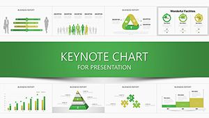
Bring your data to life on the big screen with our premium Keynote chart templates, tailored exclusively for Apple Keynote users. These templates offer sleek designs for bar graphs, line trends, pie distributions, and more, ensuring your visuals align with Keynote`s elegant interface.
Professionals in creative industries, tech startups, and academia will appreciate how these charts simplify complex information, from market analysis to research findings. With drag-and-drop editing, tweak layouts, add transitions, and incorporate your branding in minutes.
Experience the seamless blend of form and function that makes Keynote shine. Our templates enhance engagement, making every slide a conversation starter. Dive into the collection and craft presentations that resonate.


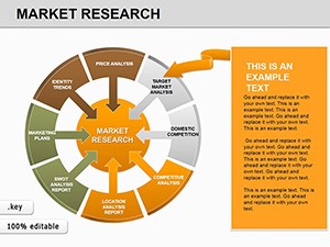
Keynote chart templates excel in dynamic environments like design agencies, where area charts map project timelines, or in tech demos using bubble charts to showcase feature correlations. For sales pitches, column charts highlight growth metrics, driving home persuasive points.
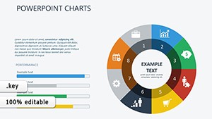
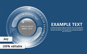
Artists and designers use radial charts to balance color palettes, turning abstract concepts into tangible visuals.
Founders leverage funnel charts to illustrate user acquisition flows, captivating investors with clarity.
While Keynote`s native charts are solid, our templates add polished animations and thematic consistency, cutting design time in half. They include high-fidelity icons and shadows for that premium Mac aesthetic, outperforming defaults in visual appeal.
What sets our templates apart is their focus on minimalism - clean lines and ample white space prevent overload. Tip: Pair charts with Keynote`s Magic Move for fluid storytelling. For innovation, embed live data links for real-time updates during rehearsals.
Unlock creativity with hybrid designs, like overlaying photos on heat maps for environmental reports. These approaches make data not just seen, but felt.
Curious to try? Explore the variety and select templates that fit your vision.
Imagine a product launch where a stacked bar chart evolves to reveal feature benefits, synced with your narrative. Or in education, a doughnut chart breaks down historical events by impact, sparking discussions.
Such integrations show how our templates amplify messages, fostering deeper connections.
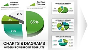
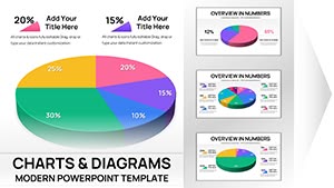
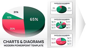
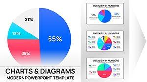
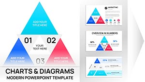
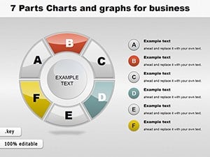
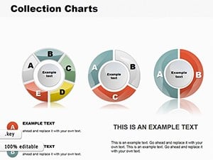
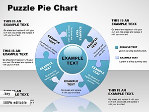
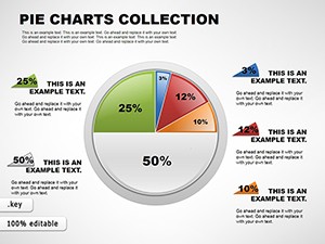
We offer bar, line, pie, area, bubble, and funnel charts, all fine-tuned for Keynote`s rendering engine.
Yes, copy-paste from Excel updates charts automatically, preserving Keynote`s smooth animations.
Absolutely, with options for fade-ins, builds, and path animations to reveal data progressively.
By using intuitive visuals and subtle effects, they guide focus, encouraging interaction and recall.
Yes, templates include variants that adapt seamlessly to Keynote`s dark mode for versatile viewing.
Export as PDF or PowerPoint for cross-platform compatibility while retaining core visuals.
Harness these tools to make your Keynote sessions unforgettable. Download and design with confidence.
Copyright © 2009-2026 ImagineLayout All rights reserved.