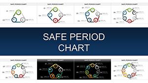
Period charts in PowerPoint illuminate timelines, cycles, and phased developments, helping you contextualize events over time with precision. From project milestones to market evolutions, these templates anchor your data in a chronological framework.
Suited for historians, project leads, and strategists, they provide scalable layouts that adapt to any duration or complexity. Effortlessly edit dates, events, and annotations to craft timelines that inform and inspire.
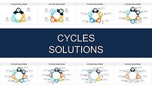
Our collection includes Gantt-inspired bars, circular cycles, and linear progressions - each primed for impactful delivery. Explore now and timeline your success in PowerPoint.
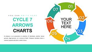
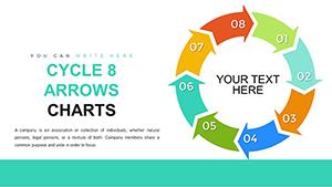
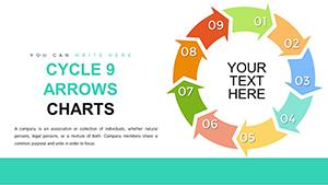
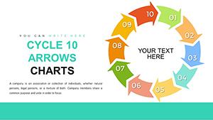
Period charts dissect time into meaningful segments, using bars or arcs to denote durations and overlaps, far more effectively than text-heavy recaps. In PowerPoint, they support milestone icons and progress indicators, turning chronology into a compelling journey.
Versus basic timelines, our templates add curvature and depth shading for modern appeal, preventing monotony in long decks.
Essential Use Cases Spanning Sectors
Corporate Strategy: Chart quarterly goals across fiscal years, aligning teams on phased achievements.
Historical Narratives: Sequence events in educational decks, linking eras to outcomes vividly.
Event Planning: Outline preparation periods leading to execution, mitigating delays proactively.
These implementations reveal period charts` strength in sequencing narratives coherently.
Strategic Advice for Period Chart Design
Scale axes proportionally to real durations, avoiding distortion, and cluster related periods with grouping tools. Animate reveals chronologically to build suspense, and embed hyperlinks to detailed appendices for deeper exploration. Ensure font consistency for scannability across projections.
For data-heavy views, toggle between overview and zoomed segments via slide navigation.
Ingenious Applications to Try
Depict software release cycles in dev updates, highlighting sprints and betas. In sustainability reports, timeline carbon reduction efforts over decades. Templates empower these visualizations, merging history with strategy seamlessly.
Vector precision in these templates guarantees sharp prints or screens, with theme-syncing for deck unity. Quick-import from calendars streamlines setup for recurring reports.
Chronicle your achievements - grab period charts and present eras with authority.