Harness the flow of time in your visuals with Period PowerPoint chart templates, specialized for charting eras, cycles, and progressions. From leadership ladders to agile scrums, these designs segment data into intuitive timelines - suited for analysts tracking quarterly shifts, historians plotting epochs, or managers forecasting via cycle graphs.
Geared toward data-driven pros, they offer modular bars and lines that scale from days to decades, with era-evoking aesthetics like 3D gears for industrial vibes. Edit effortlessly to overlay trends or highlight peaks, turning raw numbers into compelling stories that drive decisions.
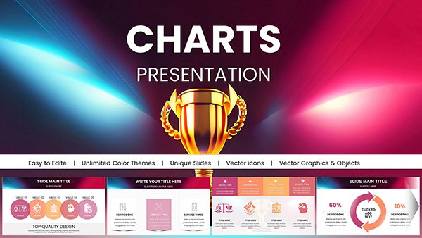
Timeline your triumphs - check out our Period charts and sequence success.


These charts illuminate paths in finance, where cycle utilities map fiscal waves, or HR, visualizing promotion periods. In marketing, scrum flows chart campaign phases, aligning teams on milestones.
Researchers deploy them for climate era stacks, educators for literary timelines - each use reveals patterns hidden in linearity.
Stack bars for revenue eras, spotting seasonal swells to steer budgets astutely.
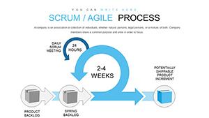
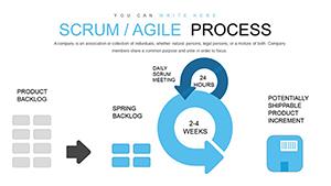
Diagram sprints as period links, chaining tasks into cohesive epics.
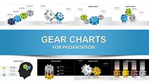
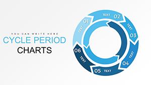
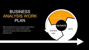
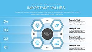
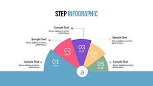
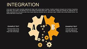
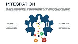
Standard charts plot points flatly, but Period versions layer temporal depth - segmented axes that contextualize changes, unlike isolated bars. They auto-scale intervals, easing irregular data over manual tweaks in defaults. Thematic overlays, like gear icons for processes, add narrative absent in plain plots.
Export fidelity shines, with vector timelines crisp in prints, outpacing raster-heavy basics.
Distinguishing trait: Adaptive eras that morph with data loads. Wisdom: Anchor starts with context labels, ending with forward projections for closure. Use legends sparingly, letting colors cue eras.
Hybridize with Gantts for sub-period tasks, enriching boardroom briefs.
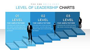
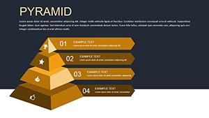
3D cubes stack authority levels over time, illustrating ascents with tangible depth.
Chart your chronicle - snag a Period template and epoch your excellence.
Yes, flexible grids handle leaps like fiscal years.
Built-in sequences reveal periods progressively.
Paste from Excel; auto-populates segments.
Up to five overlays with clear legends.
From vintage to modern eras.
Optimized for responsive playback.
These charts don`t merely mark time - they chronicle triumphs. In research halls, era stacks dissect evolutions; in sales floors, cycles pulse with potential.
Layer narratives via callouts, turning data deserts into oases of insight. The modular magic means one template serves myriad missions, from policy pulses to project pulses.
Work history as period bars, each segment a chapter of competence - recruiters read resumes anew.
Such disciplined depiction demystifies dynamics, Period-style.
Copyright © 2009-2026 ImagineLayout All rights reserved.