Presenting time-based data demands clarity and impact. Our collection of over 100 period chart templates for Keynote delivers exactly that - clean, modern designs that turn complex timelines and trends into clear, engaging visuals.
From smooth line charts tracking monthly growth to detailed timeline layouts for project milestones, every template is built with professional aesthetics and effortless customization in mind.
Fully editable, animated, and ready-to-use, these charts work seamlessly on Mac, iPad, and iPhone. Whether you`re preparing a quarterly business review, an academic timeline, or a personal progress report, you`ll find the perfect fit.
Start creating presentations that leave a lasting impression today.
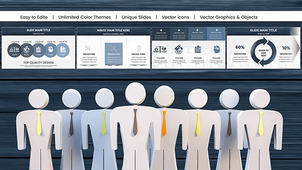
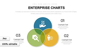
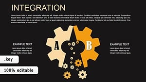
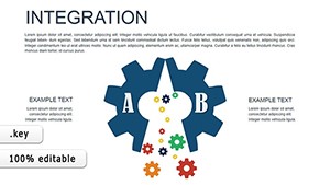
Integration Keynote Charts: Weave Data Threads into Cohesive Narratives
ID: #KC00433
$16.00
(204)
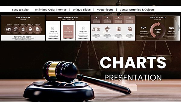
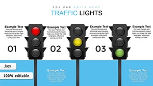
Direct Marketing Keynote Charts: Fuel Your Campaigns with Precision Visuals
ID: #KC00395
$13.00
(983)
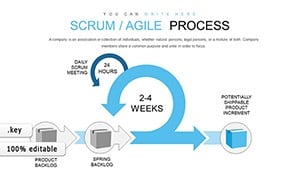
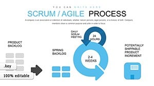
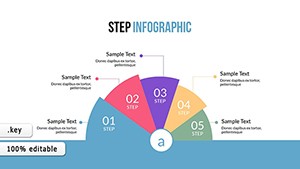
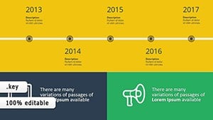
Dynamic Timeline Keynote Charts - Free Download
ID: #KC00363
$14.00
Why Period Charts Matter in Presentations
Period charts help your audience instantly understand change over time. They reveal patterns, highlight growth, and make forecasts credible. Our templates go far beyond Keynote`s built-in options with layered designs, subtle animations, and contemporary color palettes that feel fresh in.
Key Advantages Over Default Charts
Default Keynote charts are functional but often look generic. Our templates offer:
Pre-built animations for progressive data reveals
Professional typography and spacing
Multiple variations in a single file
High-resolution elements that stay sharp on any screen
You save hours while achieving a polished, branded look.
Real-World Applications
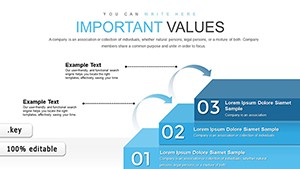
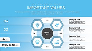
Business & Finance
Show quarterly revenue trends, year-over-year comparisons, or budget evolution with clear line or bar charts.
Project Management
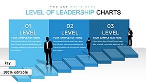
Build Gantt-style timelines or milestone trackers that keep teams aligned.
Education
Create historical timelines or semester progress charts that engage students.
Marketing
Demonstrate campaign performance across months or seasons.
Explore the collection below and download the template that fits your story.
Best Practices for Period Charts
Choose the right time scale to avoid clutter
Use color strategically to highlight key periods
Add concise annotations for important events
Reveal data progressively with animations
Maintain consistent branding across slides
Our templates already follow these principles, giving you a professional foundation to build on.
Creative Ways to Use Period Charts
Combine line charts with icons for infographic-style slides. Use area charts for cumulative progress. Add hyperlinks to dive deeper into specific periods. These small touches turn good presentations into memorable ones.
Ready to elevate your next presentation? Pick a template and get started today.
Frequently Asked Questions
What types of period charts are included?
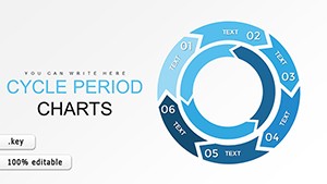
Line charts, bar charts, area charts, timelines, Gantt-style layouts, and combination charts for time-based data.
Are the templates fully compatible with current Keynote?
Yes - designed and tested for the latest Keynote versions on Mac, iPad, and iPhone.
How easy is it to customize the charts?
Extremely easy. Change data, colors, fonts, and layout with just a few clicks - no advanced skills needed.
Are there free period chart templates available?
Yes, we offer a selection of free templates alongside premium options.