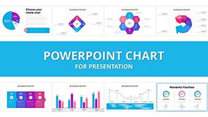
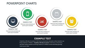
Our performance chart PowerPoint templates empower analysts and managers to turn metrics into meaningful stories. Built for Microsoft PowerPoint, these slides feature advanced charts like Gantt, radar, and combo types, ideal for quarterly reviews or project updates.
Business leaders appreciate the drag-and-drop editing for quick tweaks to KPIs such as sales growth or efficiency rates. With built-in color palettes for branding, they ensure consistency across decks.
From workforce productivity to system benchmarks, visualize trends effortlessly. Compatible with Excel imports, they handle large datasets smoothly. Browse now and make your data shine.
Competition Meaning and Purposes PowerPoint Charts Template
ID: #PC00670
$19.00
(738)
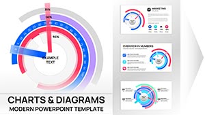
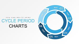
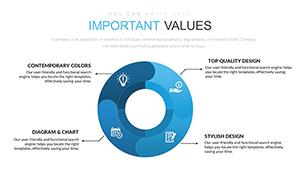
Stunning Circular Ring Charts: PowerPoint Mastery for Architects
ID: #PC00667
$18.00
(1126)
Professional Corporation PowerPoint Charts Template: Elevate Your Business Narratives
ID: #PC00525
$25.00
(653)
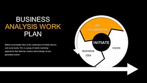
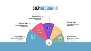
Step and Cycle Infographic PowerPoint Charts: Visualize Processes with Ease
ID: #PC00493
$22.00
(748)
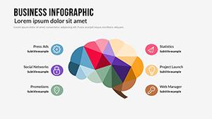
Business Infographic PowerPoint Charts Template - Download Presentation
ID: #PC00479
$21.00
(137)
Animated Timeline and Process Flow PowerPoint Template - Fully Editable & Instant Download
ID: #PC00460
$18.00
(234)
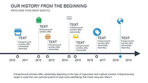
Engaging History Beginning PowerPoint Charts Template
ID: #PC00453
$12.00
(1122)
Animated Market Development Charts - Editable PPTX | ImagineLayout
ID: #PC00449
$18.00
(359)
Decision Support System PowerPoint Charts for IT Analysis
ID: #PC00428
$16.00
Use Cases for Performance Chart PowerPoint Templates
Marketing teams track campaign ROI with funnel charts, while operations visualize supply chain efficiencies. HR uses them for talent retention analytics in leadership meetings.
Startups pitch investor metrics via growth curves, and educators grade student progress with scatter plots. Fitness coaches adapt for client progress dashboards.
Financial Reporting: Bar graphs for revenue streams.
Project Management: Milestones in waterfall formats.
Health Monitoring: Line trends for key indicators.
Universal appeal for any performance narrative.
Better Than Default Chart Tools
PowerPoint`s defaults are rigid; ours offer 60+ pre-animated variants with axis auto-scaling and trendlines. Reduce creation time by 50% with smart templates that suggest layouts based on data types.
Advanced shading for 3D effects without distortion, plus legend auto-positioning for clutter-free views.
Data Integration Perks
Pull from SQL queries or Google Sheets for live refreshes. Conditional formatting highlights outliers instantly.
Tips for Charting Mastery
Choose chart types wisely - pies for parts of whole, lines for changes over time. Label axes clearly and avoid 3D unless emphasizing depth.
Incorporate 2025 ESG metrics for holistic views. Test on varied screens for color fidelity.
Creative Chart Applications
Animate for storytelling sequences or embed in reports as interactive elements. A retail chain visualized store performance, optimizing layouts for 15% uplift.
Combine with photos for hybrid infographics, blending numbers and narratives.
Chart Your Way to Clarity
Check out more visualization aids and start plotting success.
Frequently Asked Questions
Spanning 1,300 words, these tools unlock the power of performance visualization.