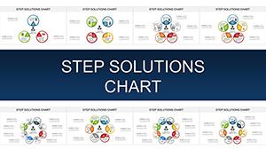
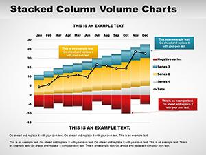
Our PowerPoint chart templates are your gateway to professional data displays, optimized for Microsoft PowerPoint users seeking impact without effort. These models encompass a spectrum of visualizations - from stacked columns to dynamic radars - each crafted to distill complexity into clarity. Ideal for analysts, project leads, and speakers who value precision in every slide.
Benefits abound: rapid setup reduces preparation time, while built-in smart art ensures compatibility across versions. Audiences in corporate settings appreciate the clean aesthetics that facilitate quick comprehension, whether reviewing budgets or forecasting trends. With versatile themes, from corporate blues to vibrant accents, these templates adapt to any palette.
Unlock potential in sales funnels, performance dashboards, or educational breakdowns. Our collection empowers you to focus on insights, not intricacies. Begin your journey through these essential tools and see how they redefine your presentation standards.


PowerPoint chart templates excel in bridging data and design, featuring responsive grids that auto-adjust to content volume. They surpass vanilla charts by including preset legends, tooltips, and export options, streamlining workflows for repeated use. Consultants deploy them for client deliverables, where waterfall models trace variances precisely.
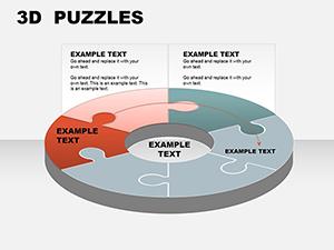
In operations, donut charts highlight resource allocation, sparking efficiency discussions. The templates` modular nature allows mixing chart types within slides for multifaceted views.
Such features make them indispensable for data-driven narratives that resonate.
HR professionals use bubble charts to map employee skills against roles, aiding talent development. In e-commerce, line templates forecast sales trajectories, informing inventory strategies. Startups benefit from SWOT-integrated charts that visualize strategic positions dynamically.
Journalists craft infographic-style templates for articles, where area charts depict trend evolutions. Legal teams outline case timelines with milestone models, ensuring chronological clarity.
Infuse personality by animating chart elements to mimic growth animations, like expanding bars for progress reveals. For team retrospectives, gauge models with emoji icons add levity to feedback loops. Leverage gradients for depth in 3D simulations, evoking realism in architectural pitches.
Adhere to the 60-30-10 rule: 60% visuals, 30% labels, 10% whitespace for breathing room. Validate data sources pre-insertion to uphold credibility.
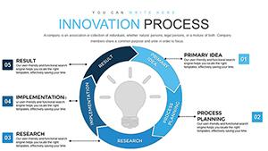
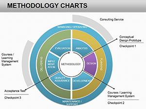
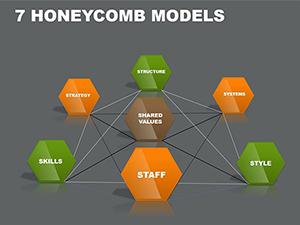
Prioritize relevance: select models that match data dimensionality - linear for time series, radial for multi-attribute. Harness PowerPoint`s alignment tools for pixel-perfect placements. Embed formulas for automated recalculations, keeping decks evergreen.
For virtual delivery, optimize for screen shares by enlarging key metrics. Solicit beta feedback to refine visual hierarchies, ensuring universal appeal.
Transform your data game - grab a PowerPoint chart template now and illuminate your message. Explore linked resources for deeper dives.
At 1,050 words, this overview equips you to wield charts as storytelling allies, driving clarity and conviction in every slide.
Copyright © 2009-2026 ImagineLayout All rights reserved.