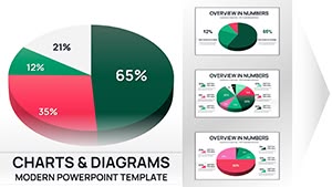
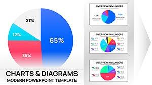
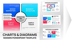
Keynote`s prowess in visuals meets marketing`s data demands through our specialized chart templates. Aimed at creative directors, analysts, and brand managers, these designs convert raw metrics into mesmerizing slides that propel strategies forward. Encompassing heatmaps to scatter plots, they cater to campaign evaluations and growth forecasts.
Native to Keynote, templates support Magic Move transitions and shape morphing for fluid storytelling. Swap datasets, tweak palettes, or layer effects with minimal effort. Core benefits: Deeper stakeholder insights, accelerated decisions, and a creative edge in presentations.
For Mac-centric teams, this collection streamlines workflows. Identify the chart that captures your vision and elevate your marketing discourse with precision and panache.
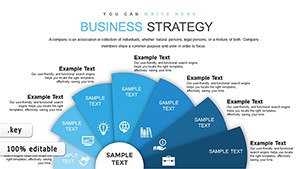
Business Model Canvas Keynote - Fully Editable | ImagineLayout
ID: #KC00612
free
(639)
Economic Analysis Keynote Charts Template: Transform Data into Actionable Insights
ID: #KC00607
$17.00
(326)
Logic of Operational Analysis Keynote Charts
ID: #KC00603
$17.00
Targeted Applications for Keynote Marketing Charts
Keynote chart templates power pivotal moments. Brand strategists animate SWOT matrices, revealing opportunities dynamically. Social media leads radar engagement quadrants, benchmarking platforms. Product managers timeline launches with milestone bubbles, syncing teams.
PR pros gauge sentiment via donut distributions, quantifying tones. Adaptability fits agile sprints or annual summits.
Why Keynote Charts Trump Standard Options
Basic inserts lack seamlessness; ours align with Keynote`s physics engine for realistic animations, plus vector scalability. Collaborative iCloud edits outpace shared files.
Hallmark Qualities and Charting Wisdom
Distinctives: Haptic feedback cues and AR preview modes. Wisdom: Select sparklines for trends, treemaps for hierarchies - cap at 7 colors. Build charts element-by-element for suspense.