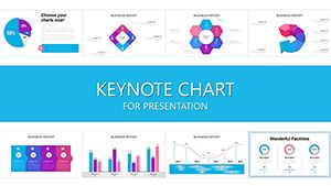
For management pros navigating complex decisions, our Keynote chart templates provide the clarity needed to lead effectively. Focused on business intelligence, these designs cover org structures, performance metrics, and growth projections with Apple`s intuitive flair.
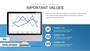
Ideal for executives crafting board updates or team leads visualizing goals, they integrate data seamlessly while maintaining a executive polish. Adjustable axes, legends, and trends make every slide a strategic asset.
Lead with data that inspires confidence. Explore our management-specific collection and chart your path to success.
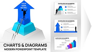
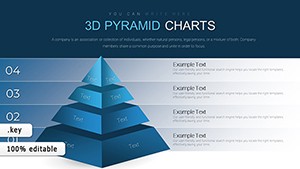
3D Pyramids Keynote Charts - Fully Editable | ImagineLayout
ID: #KC00652
$24.00
(358)
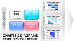
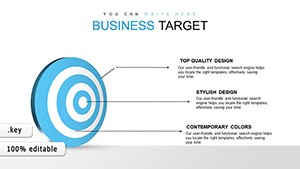
Business Target Keynote Charts - Fully Editable | ImagineLayout
ID: #KC00636
free
(1136)
Assessment of Technical Condition Keynote Charts: Precision in Process
ID: #KC00605
$18.00
Empowering Management with Precision Charts in Keynote
In the realm of leadership, charts are compasses guiding teams through uncertainty. Our templates specialize in management contexts, featuring radial org charts for hierarchies and cascade diagrams for process flows, all optimized for Keynote`s smooth rendering.
HR managers track talent pipelines, while operations heads monitor KPIs - each template accelerates insight delivery.
Targeted Strengths
Decision-Focused: Highlight variances and forecasts prominently.
Collaborative Ready: Shareable links for instant feedback loops.
Scalable Analytics: Handle large datasets without lag.
Real Applications in Corporate Environments
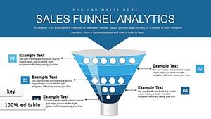
During mergers, bubble charts map synergies, easing stakeholder concerns. Sales directors use funnel visuals to pinpoint bottlenecks, refining tactics on the fly.
A CEO`s quarterly review, powered by our templates, reduced meeting times by 25% through concise, compelling data stories.
Superior to Generic Management Tools
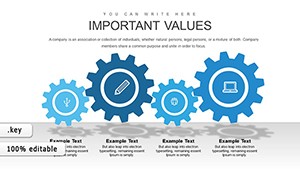
Standard charts in Keynote suit basics, but ours embed management-specific icons like gears for processes or arrows for growth, plus conditional formatting for real-time alerts. This elevates reports from informative to influential.
Teams report enhanced strategic alignment post-adoption.
Optimization Techniques for Leaders
Prioritize key metrics: Limit to 5-7 per slide for focus.
Incorporate benchmarks: Overlay industry averages for context.
Schedule automations: Refresh data via scripts for ongoing reports.
Elite move: Embed dashboards linking to live sources for dynamic updates.
Illustrative Examples and Strategic Twists
A finance team`s variance analysis chart exposed cost savings, averting overruns. Innovate with 360-degree views for holistic risk assessments, blending multiple chart types.
These fuel proactive management, from agile sprints to long-term visions.
Steer ahead - secure your chart template for commanding presence.
Frequently Asked Questions
What management metrics do these charts cover?
KPIs, ROI, org structures, and SWOT elements tailored for exec overviews.
Are they suitable for remote team presentations?
Optimized for screen sharing with high-contrast and zoom features.
How to link charts to external data?
Use Keynote`s data import from Numbers or CSV for automatic syncing.
Can charts be exported to reports?
Yes, to PDF or image formats preserving vector quality.