Line Keynote Charts

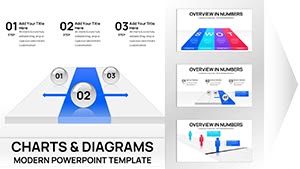
Bring your data to life in Keynote with our line-oriented chart templates, meticulously designed to visualize trends, comparisons, and forecasts with elegance and accuracy. These assets are tailored for those who need to communicate insights swiftly and stylishly.

For data enthusiasts, financial advisors, and conference speakers, the templates deliver immediate value through responsive grids and trend lines that adapt to your datasets. They eclipse basic bar graphs by incorporating artistic flourishes like subtle curves and interactive hotspots.

Benefits abound: effortless data import from spreadsheets, theme synchronization, and export-ready formats for seamless sharing. Perfect for quarterly reports or research overviews, they ensure your charts not only inform but also inspire action.

Peruse our gallery and choose charts that fit your story. Download now to harness the power of visual data in your presentations.


View by: Last Added | Most Popular
  • like 3
    (653)
    Makeup Brush Charts for Keynote Presentation
    ID: #KC01003
    $25.00
  • like 2
    (162)
    Makeup Charts for Keynote Presentation
    ID: #KC01002
    $22.00
  • like 5
    (85)
    Editable Analytical Charts for Keynote: Transform Data into Dynamic Narratives
    ID: #KC00971
    $20.00
  • like 4
    (1096)
    Segment Circle Keynote Charts Template: Unlock Consumer Insights
    ID: #KC00821
    $15.00
  • like 4
    (732)
    Targeting Aspects Branching Keynote Charts for Presentation
    ID: #KC00784
    $18.00
  • like 4
    (898)
    Circle Thumbs Puzzle Keynote Charts Template: Solve Visually
    ID: #KC00704
    $15.00
  • like 5
    (612)
    Analytical Circles Keynote Template: 14 Animated Slides
    ID: #KC00648
    $14.00
  • like 4
    (668)
    Simple Chevron Steps Free Keynote Charts Template
    ID: #KC00611
    free
  • like 3
    (691)
    Importance of Choice Keynote Charts Template: Visualize Decisions Dynamically
    ID: #KC00600
    $20.00
  • like 5
    (165)
    Creative Thinking Keynote Charts: Where Ideas Take Flight
    ID: #KC00533
    $23.00
  • like 4
    (84)
    Schedule Keynote Charts Template: Organize with Precision and Style
    ID: #KC00515
    $18.00
  • like 3
    (62)
    Optimizing Performance Keynote Charts: Elevate Architectural Metrics
    ID: #KC00491
    $18.00
  • like 3
    (43)
    Flow Linear Arrows Keynote Charts: Streamline Your Architectural Narratives
    ID: #KC00489
    $17.00
  • like 3
    (642)
    Animated SEO Keynote Charts: Visualize Your Path to Search Dominance
    ID: #KC00478
    $18.00
  • like 5
    (997)
    Creative Light Coloured Keynote Charts: Illuminating Pathways to Brilliance
    ID: #KC00475
    $18.00
  • like 2
    (108)
    Best Choice Download Keynote Charts: Curate Ideas That Click
    ID: #KC00379
    $16.00
  • like 2
    (171)
    Dark Performance Indicators Keynote Charts: Illuminate Your Data in the Shadows
    ID: #KC00352
    $17.00
  • like 3
    (207)
    Business Process Flow Keynote Charts Template
    ID: #KC00205
    $17.00
  • like 2
    (761)
    Spot Analysis Charts Template for Keynote Impact
    ID: #KC00141
    $10.00
  • like 2
    (912)
    Relative Relationship Keynote Charts Template
    ID: #KC00115
    $12.00
  • like 4
    (742)
    Dynamic Rounding Lines Keynote Charts: Weaving Architectural Timelines with Grace
    ID: #KC00106
    $7.99
  • like 5
    (844)
    Infographic Color Circles Keynote: Orbit Your Data with Flair
    ID: #KC00077
    $17.00
  • like 3
    (1038)
    Finish Line Keynote Charts: Race to Presentation Excellence
    ID: #KC00075
    $22.00
  • like 5
    (842)
    Stacked Column Volume Charts for Keynote
    ID: #KC00053
    $14.00


Harnessing Line Charts in Keynote for Superior Data Presentation

Line charts in Keynote are masters of temporal data, tracking changes over time with graceful trajectories that reveal patterns at a glance. Enhanced by Keynote`s motion graphics, they support zoomable axes and hover effects for deeper dives during Q&A.

Geared toward economists, marketers, and educators, these templates resolve issues like monotonous spreadsheets by emphasizing flow and continuity. Visual aids like this can amplify message retention by 55%, per cognitive research.

  • Financial Planning: Plot revenue growth lines to forecast expansions.
  • Marketing Analytics: Trace campaign performance across channels.
  • Educational Tools: Chart historical events or scientific evolutions.

In contrast to default charts, ours include multi-series support out-of-the-box, with customizable markers that denote milestones without extra effort.

Expert Strategies for Line Chart Mastery

Anchor your chart with a compelling axis label, then layer multiple lines for comparative analysis - use dashed variants for projections. Keynote`s chart inspector lets you fine-tune scales for precision, avoiding distortion.

Case in point: A sales forecast chart with overlaid budget lines, animated to build confidence in projections. Integrate legends that fade in for clean initial views.

Recommendation: Color-code by category for instant readability, and add trend annotations to spotlight inflection points. Validate with audience previews to refine pacing.

Creative Integrations and Industry Spotlights

In sustainability reports, line charts can depict carbon reduction trajectories, curving upward for optimism. For startups, benchmark competitor metrics side-by-side. Our templates` flexibility shines in blending with infographics for holistic dashboards.

Key differentiators: Auto-scaling legends and export-optimized resolutions for print or web. Fuel your data stories with charts that resonate.

Seize the moment - delve into Keynote line charts and download selections to chart your course to success.

FAQ

How to import data into Keynote chart templates?

Copy from Excel or CSV, paste into the data editor, and watch the chart update dynamically.

Do these charts support real-time updates?

Yes, link to live data sources for automatic refreshes during presentations.

Are animations included in the templates?

Pre-set builds animate lines sequentially, with options to customize timing and easing.

Can I use charts for mobile presentations?

Optimized for iPad and iPhone exports, ensuring crisp visuals on touch devices.

What types of line charts are available?

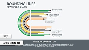
Straight, stepped, smoothed, and area-filled variants for varied data narratives.

Leverage these charts to make your data speak volumes. Download now and turn insights into triumphs.