Spot Analysis Keynote Charts - Fully Editable | ImagineLayout


Type: Keynote Charts template
Category: Illustrations
Sources Available: .key
Product ID: KC00141
Template incl.: 10 editable slides
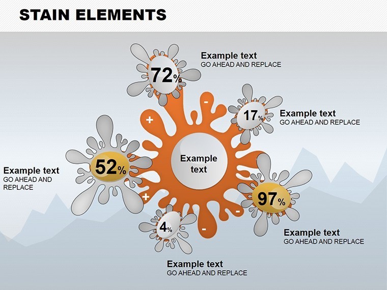
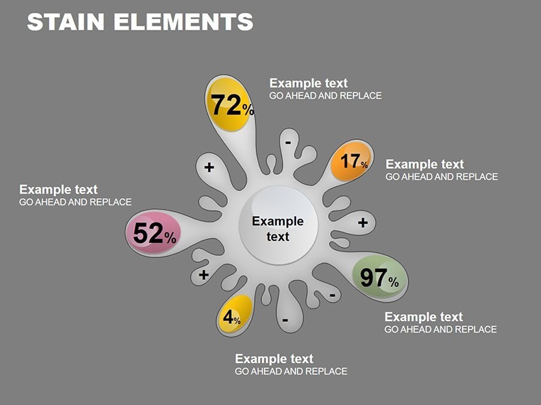
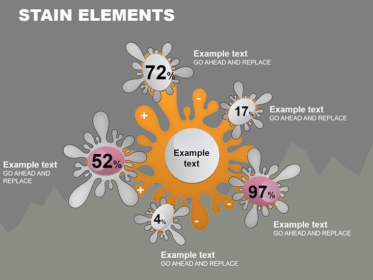
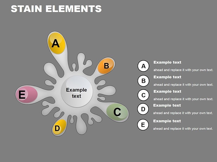
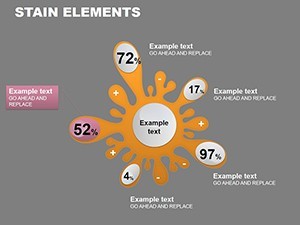
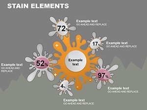
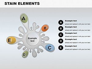
10 Bullseye Diagrams and Gradient Highlights: What You Get
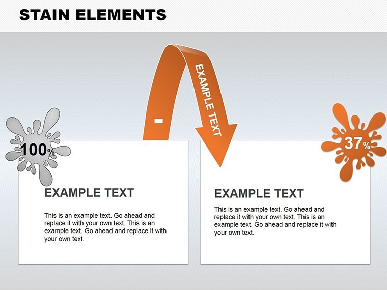
The download contains exactly 10 bullseye chart slides with supporting legends.
Gradient highlights mark priority zones on every diagram.
You receive one single .key file ready for direct import.
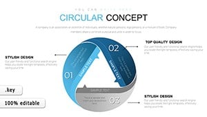
Bullseye focus with gradient highlights sets this apart from the Circular Concept and Infographic Sources Charts by enabling specific goal emphasis.
All elements arrive fully layered for instant use.
Editing Capabilities at a Glance
| Feature | Details |
|---|---|
| Slides included | 10 bullseye charts |
| Diagram categories | concentric spot analysis |
| Editable elements | segments resize and recolor independently |
| Aspect ratio | 16:9 widescreen |
| Keynote compatibility | version 12 and later |
| Color themes | master palette adjustments |
Text labels edit without unlocking groups.
Diagram connectors stay adjustable in direction and weight.
This supports clear visual hierarchy during live meetings.
Flow direction remains consistent across all slides.
How Analysts Use This in Project Presentations
Financial analysts in banking apply the spot diagrams to highlight KPI deviations during quarterly reviews.
They cut deck preparation from 3 hours to 45 minutes by direct data swaps.
Project coordinators in construction use gradient zones for milestone tracking in internal reporting.
They reuse the same file across three reports simply by changing color schemes.
Sales managers in software rely on zone segmentation for goal targeting in strategy workshops.
Download the Spot Analysis Keynote Charts Template now and present in minutes.
Customization in 4 Steps
1. Open the .key file in Keynote 12+ (1 minute).
2. Replace placeholder text labels on any bullseye ring (3 minutes).
3. Adjust gradient colors via the fill inspector to match your brand (2 minutes).
4. Export as PDF for distribution or keep editable (1 minute).
The entire workflow rates moderate difficulty for users familiar with Keynote.
Information spacing stays balanced without extra effort.
Layout composition requires no designer help.
Why This Template, Not a Blank Slide
Building equivalent bullseye charts from scratch demands 4 hours plus advanced shape grouping skills.
Common errors include misaligned rings and inconsistent gradients that fail on projection screens.
This layout keeps labels outside shapes connected by thin lines.
Many presentations place labels directly inside diagram shapes which works on laptops but becomes hard to read during board briefings.
The paid version includes the complete layered .key file with all gradients unlocked unlike free previews.
Get the Spot Analysis Keynote Charts Template for $5 and start targeting goals visually right away.
Which Keynote versions does this template support?
It opens correctly in Keynote 12 and all newer versions. Earlier releases may display gradient highlights incorrectly. Always test the file immediately after download. Contact support with your exact version number if issues appear.
How do I change the color scheme?
Select any ring or segment on the slide. Use the Format inspector to pick new fill colors. Apply the change across the slide master for consistency. Save the updated file and the entire set of 10 diagrams reflects your palette instantly.
What does the license allow for client work?
You may use the template in paid client presentations and consulting decks. Resale or sublicensing of the original file remains prohibited. Internal company modifications stay fully permitted. Always keep the license notice intact when sharing final decks.
What does the paid version include compared to free?
The paid version delivers the complete 10-slide .key file with every layer editable. Free previews on the site show only static images without access. You gain full gradient highlights and bullseye segments right away. No watermarks appear once downloaded.
What software is required and what is the refund policy?
Keynote version 12 or newer is required to open the .key file. Refunds process within 7 days if the file fails to open on your system. Provide your Keynote version and error details when requesting. Support reviews each case individually before approving.