Capture the essence of internal audits through our Keynote chart templates, where precision meets artistry. Tailored for depicting audit trails, control gaps, and mitigation strategies, these charts make abstract concepts tangible and persuasive.
Designed for audit leads, compliance analysts, and executive briefers, they offer perks like effortless scalability, thematic consistency, and the polish that impresses senior leadership. Turn data dumps into directed dialogues.
Suitable for Apple-centric teams, the templates leverage Keynote`s strengths in smooth animations and vector graphics. Peruse our assortment and infuse your audits with visual vitality.
Keynote charts in our templates go beyond visuals, incorporating audit heuristics like variance analysis overlays, outpacing basic shapes with intelligent defaults. This empowers auditors to convey subtleties like residual risks post-controls.
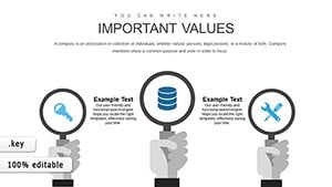
Utilize for ethics audits with radial gauges showing integrity scores or for vendor reviews via comparison radars. The finesse drives informed governance.
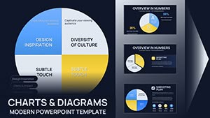
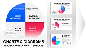
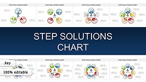
Practical Audit Chart Applications
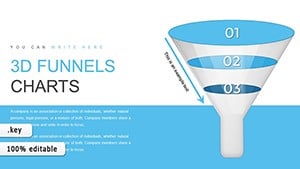
Control Effectiveness: Funnel charts tracing test coverage.
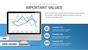
Fraud Indicators: Line series plotting anomaly trends.
Resource Allocation: Pie variants for budget distributions.
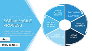
Unlike vanilla Keynote, these feature preset audit legends and accessibility tweaks. Practice: Sequence charts logically to mirror audit flows.
Creative Chart Enhancements
Layer with Keynote`s magic move for evolving risk profiles across slides. In sustainability audits, sunburst charts dissect ESG components hierarchically.
Tip: Harness build orders to reveal data progressively, heightening suspense and comprehension.
Deployment Essentials
Assess data fit for chart selection.
Fine-tune with Keynote`s inspector tools.
Incorporate presenter cues for context.
Share via Keynote Live for remote audits.
These yield charts that catalyze change.
Grow Your Chart Collection
Integrate with broader audit resources. Download to visualize victory.