Enhance your Keynote decks with our versatile charts templates, tailored for data-driven professionals. From financial analysts to educators, these designs make complex datasets accessible and engaging, ensuring your insights land with precision.
Fully responsive elements adapt to your content - resize axes, tweak scales, or swap styles effortlessly. Vibrant yet professional palettes keep focus on the message, while subtle animations reveal trends progressively. Perfect for quarterly reviews, research findings, or motivational keynotes.
Browse our gallery to select charts that match your theme. With quick downloads, integrate them seamlessly and watch your presentations gain authority.
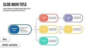
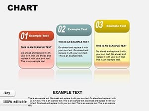
Great Value Keynote Charts Template: Mastering Relationship Visuals
ID: #KC00601
$20.00
(951)
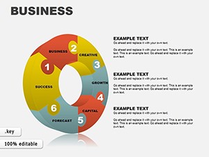
Strategic Analysis Value Chain Keynote Charts: Unlock Business Insights
ID: #KC00571
$24.00
(116)
Construction Keynote Charts: Editable Hexagon Processes
ID: #KC00526
$21.00
(341)
Analysis Slide Show Keynote Charts: Illuminate Data Relationships
ID: #KC00523
$19.00
(643)
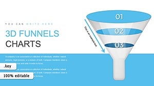
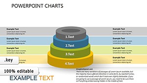
3D Analytics Graphs Keynote Template: Sculpt Your Data into 3D Masterpieces
ID: #KC00353
$19.00
(867)
Training Infographic Keynote Charts - Instant Download | ImagineLayout
ID: #KC00342
$15.00
(303)
Learning Process Keynote Charts: Unlock Analytical Clarity
ID: #KC00313
$20.00
(618)
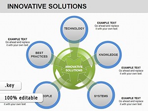
Innovative Solutions Keynote Charts: Visualizing Tech Reliability for Enterprises
ID: #KC00220
$20.00
(938)
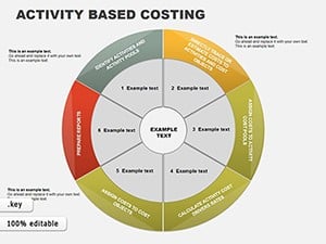
Activity Based Costing Keynote Charts: Precision in Financial Visualization
ID: #KC00095
$22.00
(314)
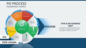
Pie Process Evolution Charts for Keynote: Depict Change Dynamically
ID: #KC00093
$14.00
(357)
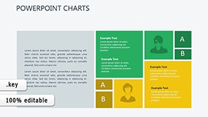
Info Tables Charts Keynote Template: Data Mastery
ID: #KC00063
$7.00
(1190)
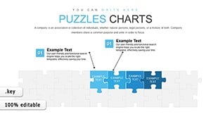
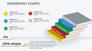
3D Business Puzzle Charts for Keynote: Visualize Strategies in Depth
ID: #KC00058
$22.00
Versatile Use Cases for Keynote Charts Templates
Charts transform raw data into digestible stories across fields. In finance, line charts track stock fluctuations, guiding investment talks. Marketers use pie charts for market share breakdowns, clarifying competitive landscapes.
Educational slides benefit from bar comparisons for test scores, while healthcare pros visualize patient trends with area graphs. Non-profits report impact via stacked columns, demonstrating fund allocation transparently. These tools bridge numbers and narratives effectively.
Financial Reporting Sessions
Layer multi-series lines for revenue forecasts: highlight peaks, dips, and projections to inform strategy.
Marketing Analytics Overviews
Donut charts dissect engagement metrics, with segments popping for emphasis on high-performers.
Superior Features Compared to Built-in Charts
Keynote`s defaults suffice for basics, but our templates offer advanced styling like gradient fills and 3D effects without rendering issues. Auto-updating formulas link to spreadsheets, eliminating manual errors.
Accessibility features include alt text prompts and high-contrast modes, ensuring inclusivity. Plus, modular designs let you mix chart types within slides for comprehensive views.
Choose chart types wisely - bars for comparisons, lines for trends. Label axes clearly and use tooltips for details. Limit colors to 5-6 for cohesion, and animate builds to pace revelations.
Test readability at 10% zoom to mimic audience distance, refining as needed for clarity.
Creative Twists: Combined Charts
Fuse scatter plots with trend lines for correlation analysis, revealing hidden patterns in sales data dynamically.
Mobile Optimization Tips
Simplify legends for touchscreens, ensuring swipe-friendly interactions in app-based reviews.
Empower your data: Select and download Keynote charts templates instantly.
Frequently Asked Questions
Addressing top questions on our Keynote charts templates.
What data sources are supported? Import from Excel, Numbers, or direct entry.
Can charts be animated individually? Yes, sequence elements via build orders.
Are there mobile export options? Export to PDF or video for device compatibility.
How to handle large datasets? Templates support up to 1,000 points; aggregate for performance.
Customization for branding? Apply logos and colors globally with master slides.