Enhance your presentations with high-quality editable geographical maps for PowerPoint and Google Slides. Perfect for showcasing global trends regional statistics and location-based analysis in a clear and engaging way.
Our templates include maps of continents countries and regions with fully customizable colors labels and markers. Instantly download and start creating impactful business educational or marketing presentations.
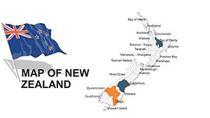
New Zealand PowerPoint Maps: Customizable Presentation Slides
ID: #PM00018
$40.00
(420)
Japan PowerPoint Maps: Detail-Oriented for Cultural and Business Depth
ID: #PM00016
$40.00
Comprehensive Geographical Maps for PowerPoint
Geographical map templates provide an effective way to present data visually. Unlike default slides, these editable maps allow you to highlight regions customize colors add labels and display data clearly.
Real-World Use Cases
Business Reports: Illustrate market research sales distribution and growth strategies.
Educational Lectures: Teach geography historical events or climate zones interactively.
Marketing Strategies: Show target demographics and campaign performance regionally.
Travel Presentations: Highlight locations routes and tourist data effectively.
Research Analysis: Visualize surveys economic trends and environmental data clearly.
Benefits Over Default Templates
Fully editable vector maps
Professional and visually appealing designs
Easy integration with PowerPoint and Google Slides
Supports infographics and data visualization
Creative Tips and Best Practices
Use contrasting colors for different regions add data markers for clarity and maintain consistent font styles to ensure readability. Customize templates to fit your presentation theme and audience.
Download your ideal map template today and elevate your presentation quality.
Frequently Asked Questions
Can I edit colors and labels in the maps?
Yes all templates are fully editable allowing you to change colors labels and markers to match your presentation needs.
Are these maps compatible with Google Slides?
Yes these templates work seamlessly with both PowerPoint and Google Slides.
Can I use these maps for business presentations?
Absolutely these templates are ideal for business reports market analysis and sales presentations.
Do these templates include worldwide maps?
Yes you can find templates for continents countries and regions around the world.
How do I download and start using a template?
Simply select your template click download open in PowerPoint or Google Slides and begin customizing immediately.