Navigate data landscapes with geographic chart templates for Keynote, merging maps with metrics for spatial intelligence. Targeted at researchers, business globetrotters, and educators, these tools demystify location-based trends.
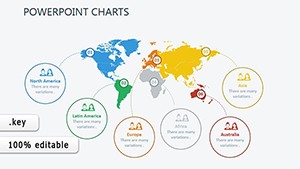
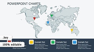
From choropleth maps to overlaid line graphs, designs highlight patterns across regions. Advantages: accurate projections, interactive zooms, and seamless data imports.
Customize legends, toggle layers, and animate routes. Suited for market analyses or travel recaps, they make geography engaging. Survey our offerings and plot your global narrative.
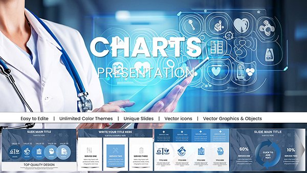
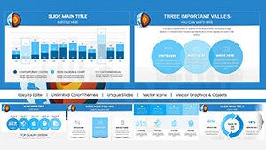
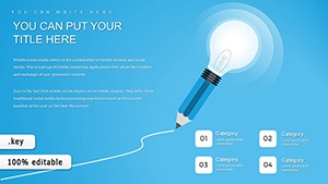
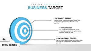
Target Online Keynote Charts: Pie-Slice Your Business Insights
ID: #KC00412
$20.00
(1152)
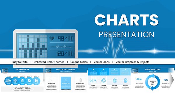
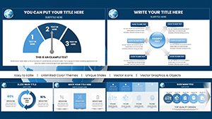
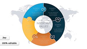
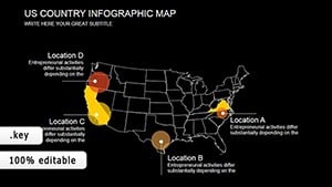
World Development Indicators Keynote Charts: Mapping Global Progress
ID: #KC00403
$15.00
(181)
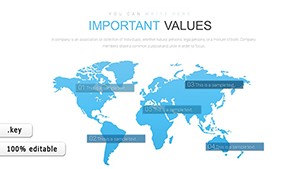
World Development Keynote Charts Template - Fully Editable | Instant Download
ID: #KC00402
$15.00
(388)
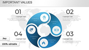
Engaging Map Charts for Keynote Learning
ID: #KC00367
$18.00
(434)
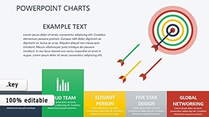
World Economy Charts Keynote Template - Fully Editable | ImagineLayout
ID: #KC00328
$15.00
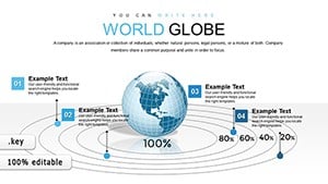
Unlocking Stories Through Geographic Visuals
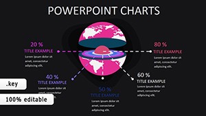
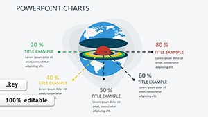
Geographic chart templates in Keynote integrate terrain with telemetry, eclipsing flat spreadsheets. They contextualize stats - sales heatmaps reveal hotspots, migration flows trace movements - fostering informed narratives.
Analysts forecast expansions; teachers explore histories via mapped events. This spatial lens uncovers insights hidden in numbers.
Precision Features for Mapping Pros
Vector Maps: Scalable without loss, covering world to city scales.
Data Binding: Auto-color regions by imported CSV values.
Layer Controls: Overlay charts, labels, and annotations flexibly.
Projection Variety: Mercator, azimuthal for distortion-free views.
Beyond basic maps, they embed analytical depth for dynamic presentations.
Targeted Uses and Transformative Outcomes
Supply chain managers track routes with throughput bars; environmentalists chart climate shifts in gradient maps. Impacts: precise targeting, compelling advocacy, and data-driven dialogues.
Best: Source reliable geo-data, calibrate scales uniformly, and narrate with pointers. Pair with photos for landmark context.
Strategic Application Blueprints
Market Expansion: Bubble charts sizing opportunities by region.
Historical Overviews: Timeline maps with event pins.
Risk Assessments: Heat overlays on vulnerability indices.
Tourism Promos: Itinerary paths with attraction icons.
These drive geographic literacy and action.
Pro Tips for Chart Creation
Launch Keynote, embed a map shape, then chart over it. Sync datasets via tables, refine legends for accessibility. Animate zooms for exploratory feels.
Expert: Integrate GPS traces for real-time path visuals.
Poised for planetary perspectives? Download a template and chart the world anew. Connections span continents.