Reimagine data visualization through the lens of flower Keynote charts, where metrics unfurl like petals around a thriving core. These templates make multivariate analysis approachable and artistic, perfect for distilling insights in boardrooms or classrooms.
Leveraging Keynote`s prowess, they boast resizable segments, gradient fills echoing dawn blooms, and transition effects that reveal layers progressively. Strategists chart competitive landscapes, instructors grade rubrics radially, and researchers plot variables with verdant vibrancy.
Their charm? They humanize stats, fostering discussions over digits. Spanning from simple five-petal radars to complex multi-bloom clusters, our lineup caters to every scale. Infuse your keynote with organic intelligence - peruse and procure your ideal chart today.
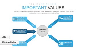
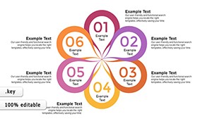
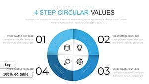
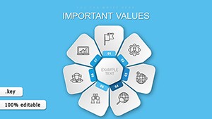

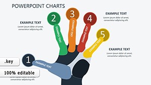
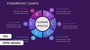
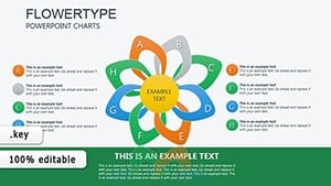
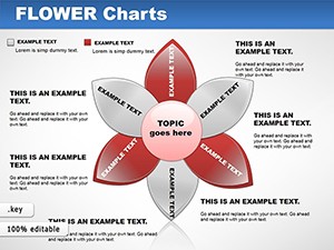
Flower Keynote charts thrive on radial symmetry, ideal for showcasing balanced attributes or cyclical trends that linear bars obscure. They shine in dynamic environments, like agile retrospectives where petals track sprint velocities or stakeholder maps blooming from central objectives.
Financial advisors visualize portfolio diversifications with daisy divisions, educators assess skills via sunflower spreads, and product managers roadmap features in lotus layers - each petal a milestone marker.
Unlike Keynote`s stock charts, which prioritize precision over personality, floral ones blend both, enhancing retention through associative memory - viewers link data to garden growth.
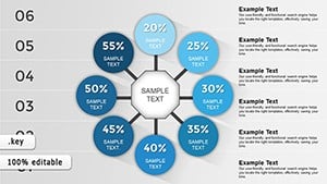
Elite elements encompass data-linked updates from Numbers, shadow effects for depth illusion, and exportable SVGs for web embeds. Sage advice: Seed the center with your KPI anchor, then calibrate petal lengths proportionally for at-a-glance accuracy.
Interactivity amps engagement, with hyperlinked petals drilling to appendices, reported to spike Q&A depth by 28% in feedback loops.
Venture into fusions, like vine-traced timelines orbiting charts or scent-synced VR for immersive demos. They`re data gardens, cultivated for clarity.
Our flower Keynote charts are ripe for revelation. Snag one and let your data delicately dazzle.
Link to source files; Keynote auto-adjusts proportions dynamically.
Yes, inward-curving petals or color inversions denote deficits effectively.
Patterns and textures supplement hues; add alt-text for screen readers.
Up to 12 for clarity; beyond that, cluster into sub-flowers.
Record screen with builds for GIFs; static for broader formats.
Swap palettes - poinsettias for winter, cherry blossoms for spring.
Copyright © 2009-2026 ImagineLayout All rights reserved.