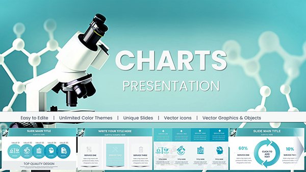
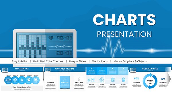
Make complex financial data instantly understandable with our dedicated collection of Keynote financial charts. Built specifically for finance teams, analysts, and executives who need to present numbers with clarity and authority.
More than 100 finance-focused templates cover revenue breakdowns, expense tracking, cash flow projections, ROI calculations, balance sheets, and portfolio performance - all designed with professional color schemes, precise labeling, and subtle animations that enhance without distracting.
These ready-to-use charts help you focus on insights rather than formatting, delivering boardroom-ready visuals in minutes.
Start exploring financial chart templates that combine accuracy with visual sophistication.
Generic charts often fall short when presenting financial data. Our templates use finance-industry conventions: proper decimal places, currency formatting, variance indicators, waterfall structures for profit bridges, and clear hierarchy in grouped bars.
Audiences grasp key messages faster, questions focus on strategy rather than clarification, and your credibility increases with polished, professional visuals.
Common Use Cases in Finance
Investor & Board Meetings
Present quarterly results, growth metrics, or funding requirements with charts that highlight the most important figures immediately.
Budget Reviews & Planning
Compare actual vs. budgeted amounts using variance bars, or show allocation with nested pie or treemap designs.
Financial Reports & Analyst Presentations
Illustrate profitability trends, cost structures, or valuation models with precision and style.
Best Practices for Financial Data Visualization
Always start axes at zero for accurate perception
Highlight positive/negative variance with conditional colors
Use waterfall charts to explain net income changes
Include source notes and time periods clearly
Transform your next financial presentation - browse our specialized Keynote financial charts and download the perfect template today.
Frequently Asked Questions
Do these financial charts support currency formatting?
Yes, templates include pre-formatted currency symbols, thousands separators, and decimal options.
Can I link charts to live data or Excel?
Charts are fully editable in Keynote; you can paste updated data from spreadsheets quickly.
Are variance and growth indicators included?
Many templates feature built-in arrows, percentage change labels, and color-coded variance markers.
Are the designs suitable for printed reports?
Yes - high-contrast versions ensure clarity in both digital and print formats.