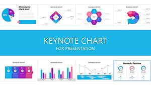
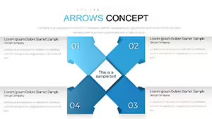
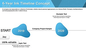
Our financial analysis Keynote chart templates bring Apple`s elegance to data presentation, turning spreadsheets into stunning visuals that illuminate fiscal truths. Specialized for timelines, comparisons, and projections, they make every slide a masterpiece of clarity and style.
Suited for Mac-savvy executives, strategists, and educators, these templates leverage Keynote`s smooth animations and precise controls. Input data via tables or links, and watch charts animate into life - effortless and engaging.
Gain an edge with designs that harmonize with iOS ecosystems, ensuring seamless sharing across devices. From venture pitches to classroom lessons, they adapt to your context. Curate your perfect set from our gallery and elevate your analytical discourse immediately.
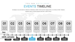


Keynote charts power investor updates, animating revenue funnels to show conversion paths. Risk managers illustrate volatility with radar charts, revealing portfolio exposures dynamically. In fiscal planning, Gantt-style bars track budget milestones interactively.
Marketing analysts map ROI landscapes with bubble charts, sizing impacts visually. Tech startups demo scalability via layered pie animations. Educational settings use them for economics simulations, fostering interactive learning on financial principles.
Keynote`s defaults offer basics, but our templates infuse financial depth with themed gradients and icon sets, absent in stock options. They exploit vector scalability for retina displays, surpassing pixelated alternatives. Magic Move transitions create fluid narratives, unmatched by static inserts.
Collaboration shines via iCloud sync, enabling team refinements. Users acclaim the intuitive bezier curves for custom shapes, yielding bespoke visuals. Embrace these for presentations that feel native to Apple`s ecosystem - polished and potent.
Choose charts by story - lines for continuity, areas for accumulation. Calibrate axes uniformly for trust, and embed hyperlinks for drill-downs. Leverage build orders to pace reveals, syncing with your script. For accessibility, add alt text to elements.
Preview in presentation mode early, adjusting timings for flow. These techniques ensure your Keynote charts not only display data but also dictate the discussion`s direction.
Inspire action with visuals that matter - download your favored template and chart the course ahead.
Refine your craft with more Keynote innovations.
Copyright © 2009-2026 ImagineLayout All rights reserved.