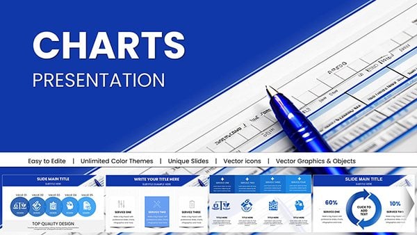
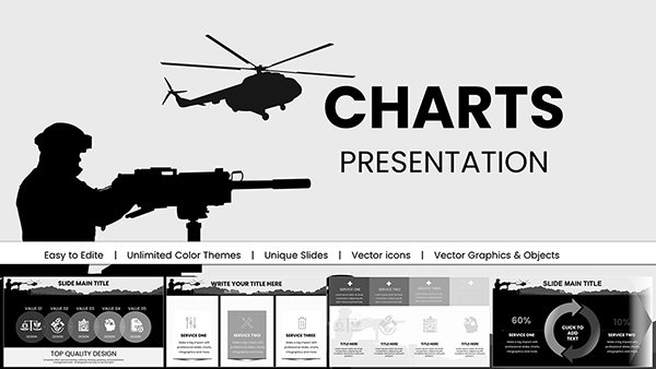
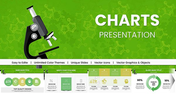
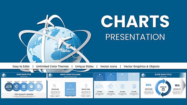
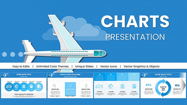
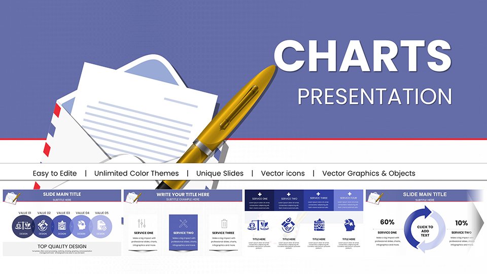
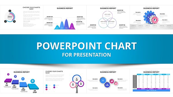
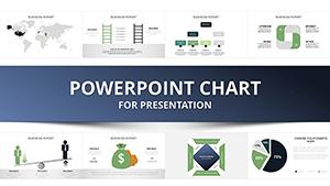
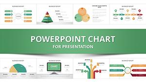
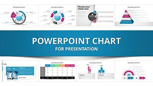
Cycling themed PowerPoint chart templates help you present progress trends and performance data in a clear visual way. These slides are designed for professionals who need structured charts with a cycling or loop concept to explain processes growth stages or continuous improvement.
All templates are fully editable and work perfectly for business analytics education and strategy presentations where recurring cycles matter.
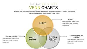
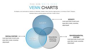
Cycling charts are ideal when your message involves repetition iteration or continuous flow. Instead of static bars or plain diagrams these templates guide the audience through a logical circular story. Each slide is balanced visually so data remains readable while the design supports your narrative.
Real World Use Cases
Business reports showing continuous improvement models
Marketing funnels and customer lifecycle analysis
Education slides explaining scientific or learning cycles
Project management reviews and agile sprints
Benefits Compared to Default Slides
Default PowerPoint charts often fail to show relationships over time. Cycling templates solve this by connecting each step visually. You save time avoid redesign work and deliver a more professional result that looks intentional and clear.
Design Tips for Better Results
Limit text to one idea per cycle step
Use consistent colors to reinforce flow
Animate steps subtly to guide attention
Download cycling PowerPoint chart templates and upgrade your reports with visuals that actually explain your data.
FAQs
Are cycling charts editable in PowerPoint
Yes all elements including colors text and data points are fully editable.
Can I use these slides for client presentations
Absolutely they are designed for professional commercial use.
Do these templates support animations
Yes you can apply PowerPoint animations to each step easily.