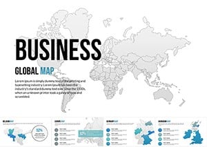
Chart Canada`s vast terrains and insights with our dedicated map templates for Keynote. These vector-based designs offer layered provinces, cities, and topographies, ideal for geographers, business strategists, or travel presenters seeking to visualize spatial stories.
From animated province highlights to customizable data overlays, they bring static maps to life - zoom into regions without losing detail, embed stats via smart shapes. Tailored for Apple users, they harness Keynote`s strengths for fluid animations and seamless exports.
Educators plotting migration patterns or marketers targeting regional markets gain clarity and engagement. With intuitive controls, adjust scales, add pins, or color-code by metrics like population density. Explore our collection and select a map template to ground your presentation in Canada`s geography - navigate narratives effectively today.
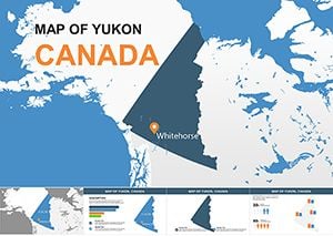
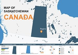
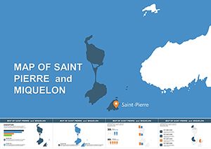
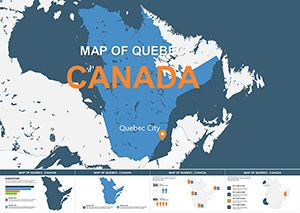
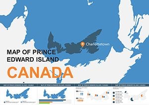
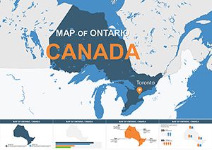
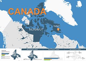
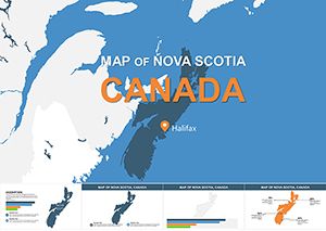
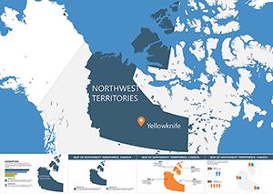
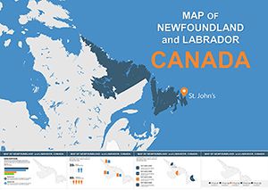
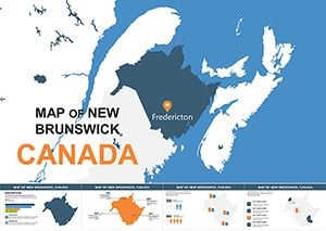
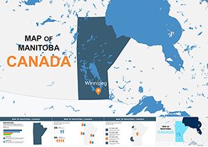
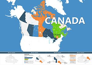
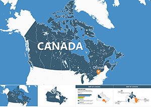
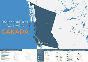
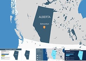
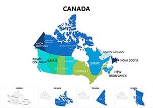
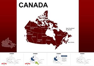
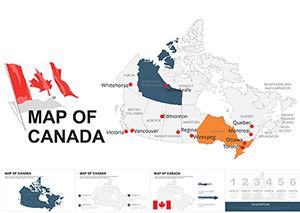
Maps are storytelling tools, and our Canada-specific templates amplify this in Keynote. Featuring precise outlines from Nunavut`s tundra to Vancouver`s coasts, they surpass generic imports by including editable labels and thematic layers - climate zones, resources, urban sprawls.
Teachers illustrating history or analysts forecasting trends appreciate the precision. A template might layer election results over provinces, with build animations revealing vote shifts chronologically.
Unlike basic clipart, these integrate natively, enabling drag-resizes without distortion for superior adaptability.
Group elements for easy manipulation - select provinces to recolor via eyedropper from Canadian palettes (reds, whites). Add hyperlinks to slide zooms, creating virtual tours. Animate paths for migration flows, timing to narrative beats.
Ingenious: Mask photos under map cutouts for hybrid views, like satellite peeks. Standard: Limit layers to five for performance.
SVG imports ensure scalability; include demographic datasets for instant charts. Accessibility baked-in: Descriptive builds for screen readers. Over defaults, provide Canada-centric extras - bilingual labels, indigenous territory outlines.
Variants: Topographic for environmental talks, political for governance reviews.
Dr. Lee`s environmental seminar used a template to map carbon footprints, animating rises province-by-province - audience feedback highlighted the "aha" moments. A real estate firm pitched developments with overlaid growth projections, clinching investor nods.
Extend: Link to live data via widgets, updating maps in real-time for dynamic reports. Or, 3D extrude provinces for immersive overviews.
Structure: Overview slide first, then drill-downs; use consistent scales for comparisons. Keynote`s magic move transitions smoothly between map views. Color theory: Blues for water, greens for forests, aligning with natural hues.
Excelling stock, these foster data-driven tales - quantitative overlays on qualitative contexts - for persuasive power.
Polished maps don`t just show - they guide understanding profoundly.
Keynote 11+, with legacy exports for older builds.
Fully - ungroup to adjust boundaries, colors, or add elements.
Yes, via Keynote`s data import or linked spreadsheets.
Optional layers available for respectful inclusion.
Use build-in/order out for sequential reveals; paths for routes.
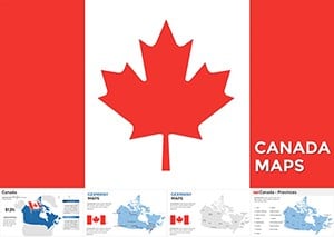
Map your success - download a Canada map template for Keynote. Present with the clarity of northern lights.
Copyright © 2009-2026 ImagineLayout All rights reserved.